Online service for ordering baked goods
• +87% increase in online sales after restructuring the funnel into a single landing-to-checkout flow
How I built a single-page, modal-first ordering web app that increased bakery delivery sales by 87% across a European chain
Context
Bricket is a European bakery chain with multiple physical locations and strong offline demand. Their digital experience was stuck in a legacy website model (2002-era structure) with PDFs, separate “Shops” pages, and multi-level category navigation. Most orders were coming from mobile, but the UI and funnel were built for browsing, not purchasing. The business needed a fast, mobile-first ordering flow that converts immediately and supports habitual repeat orders.
Problem
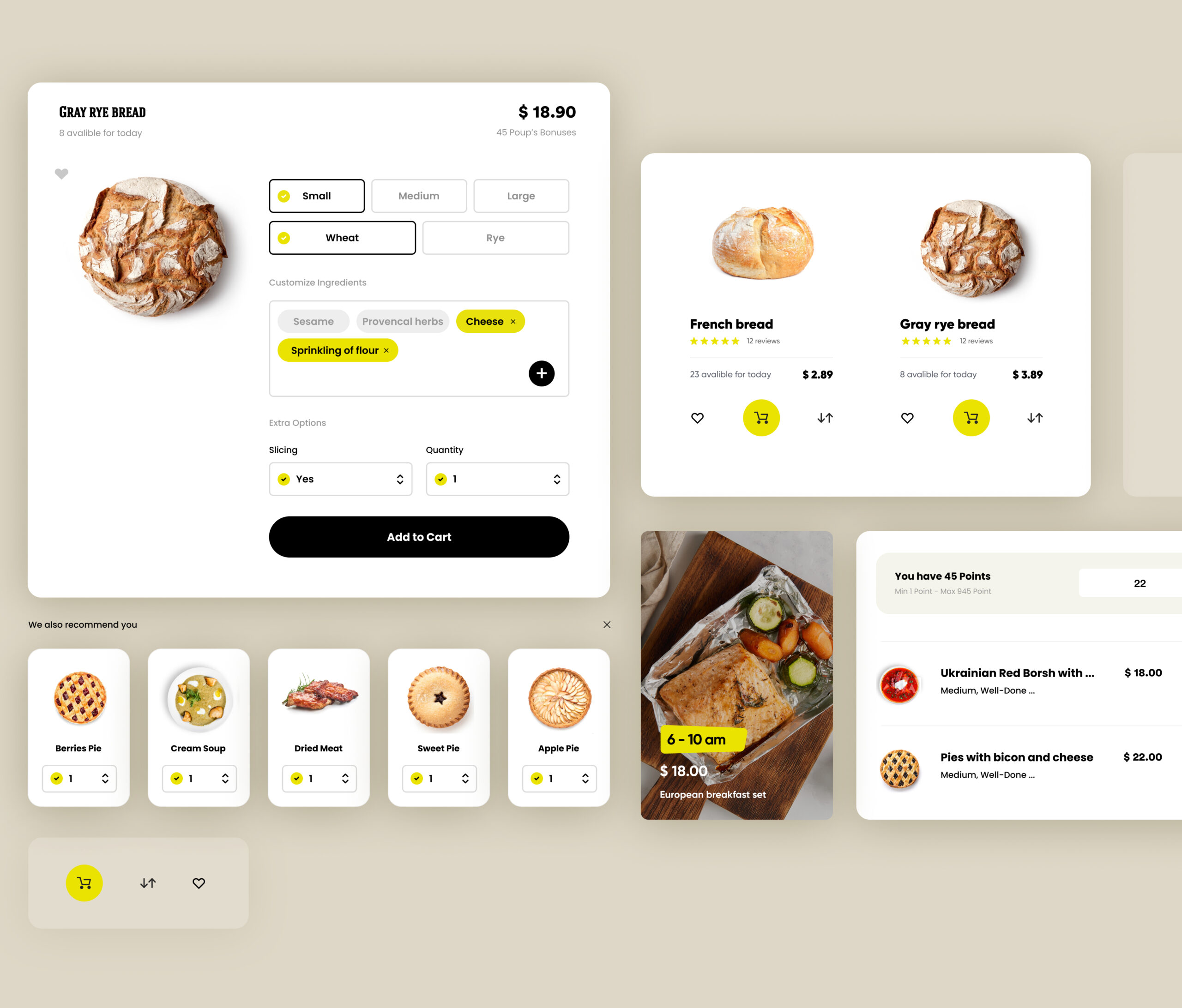
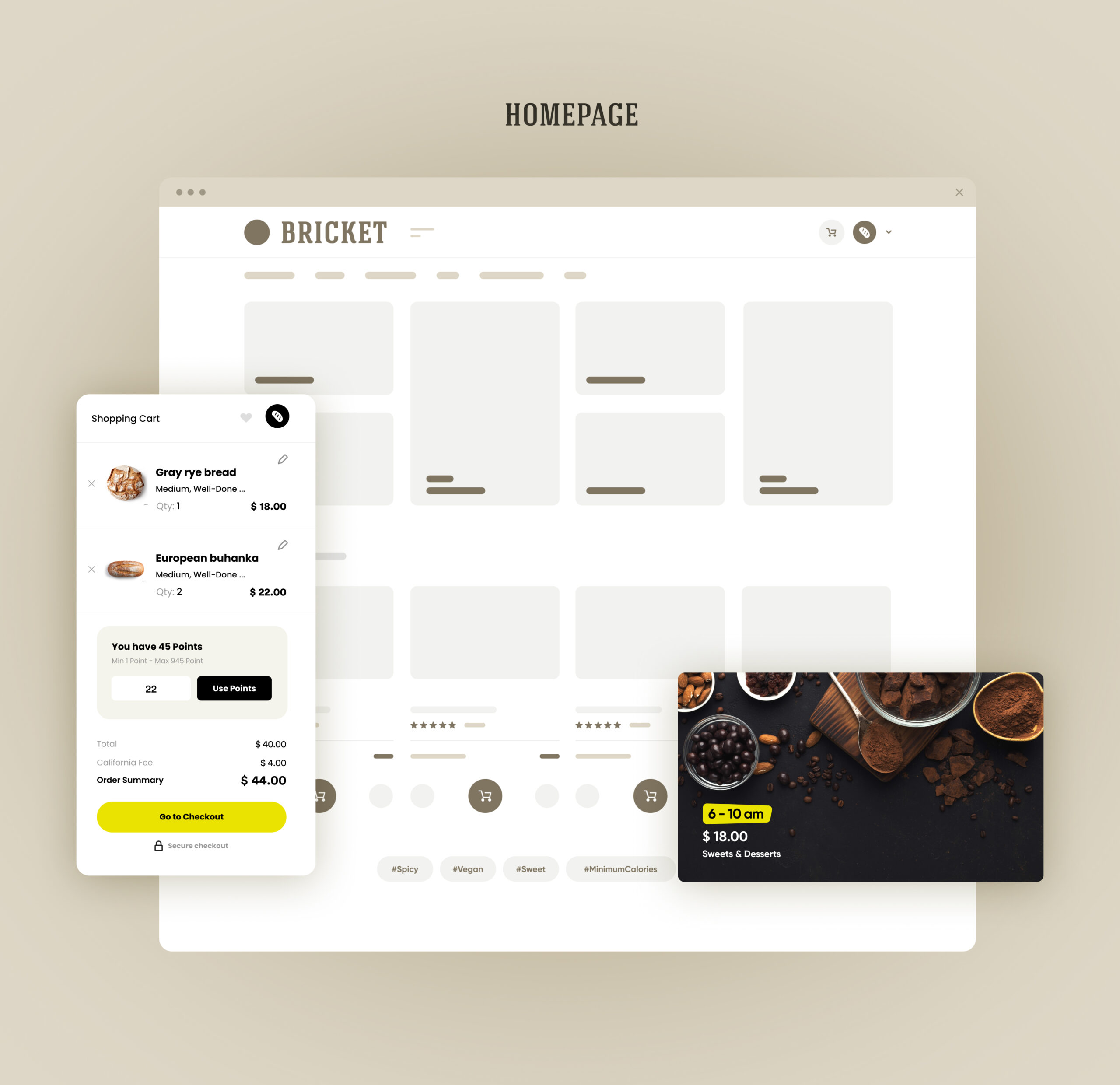
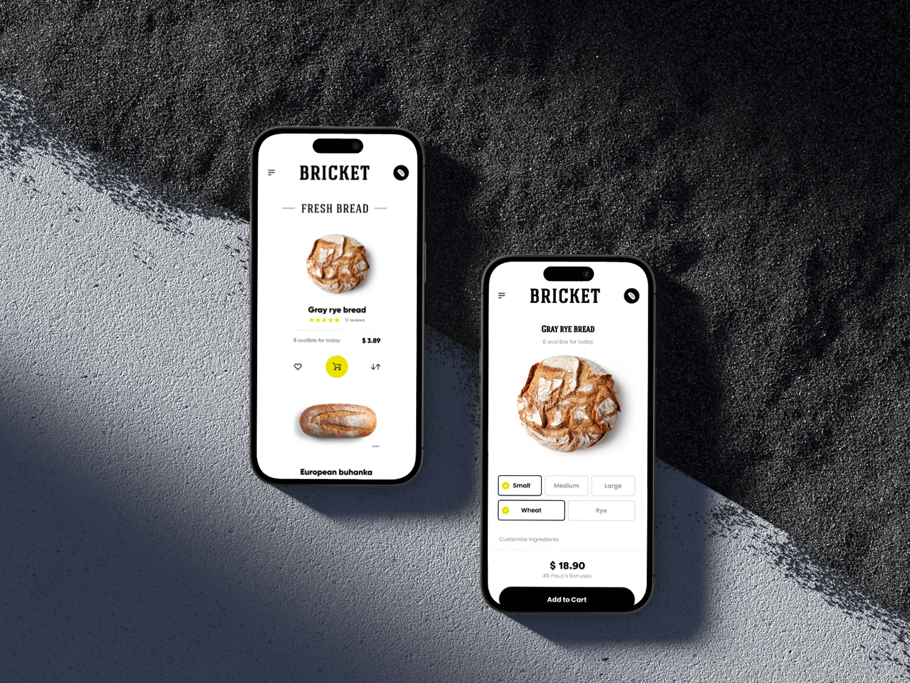
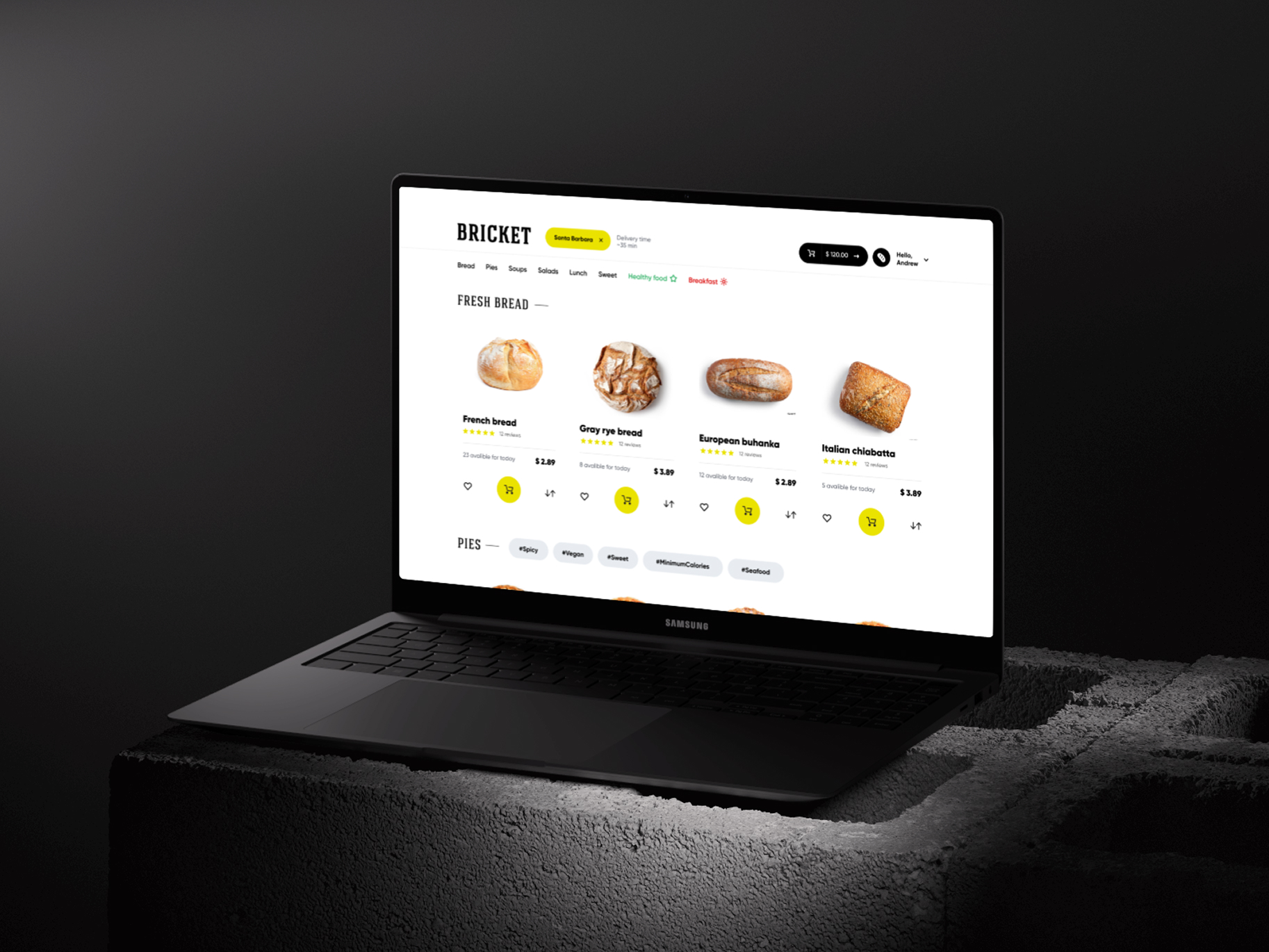
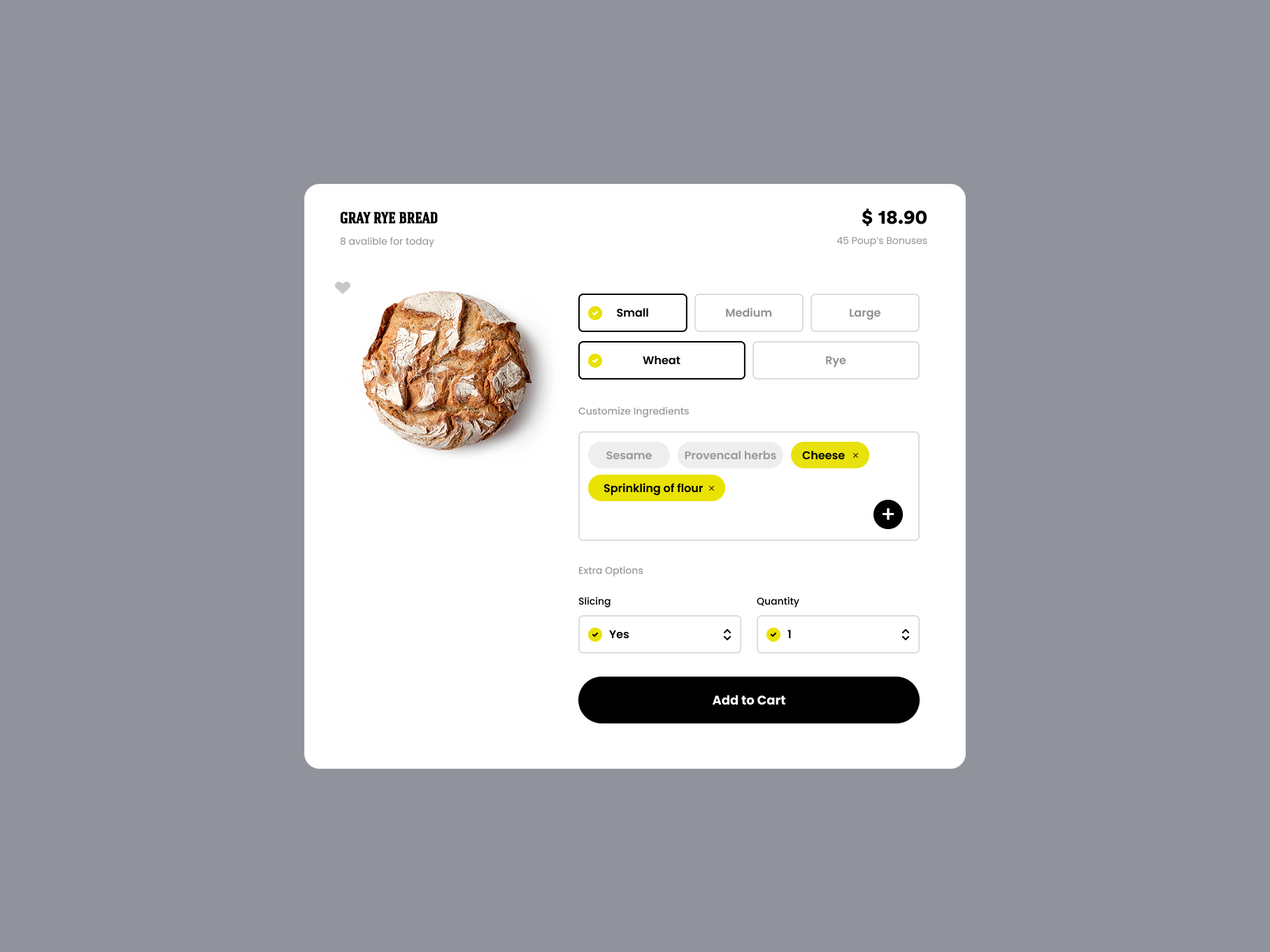
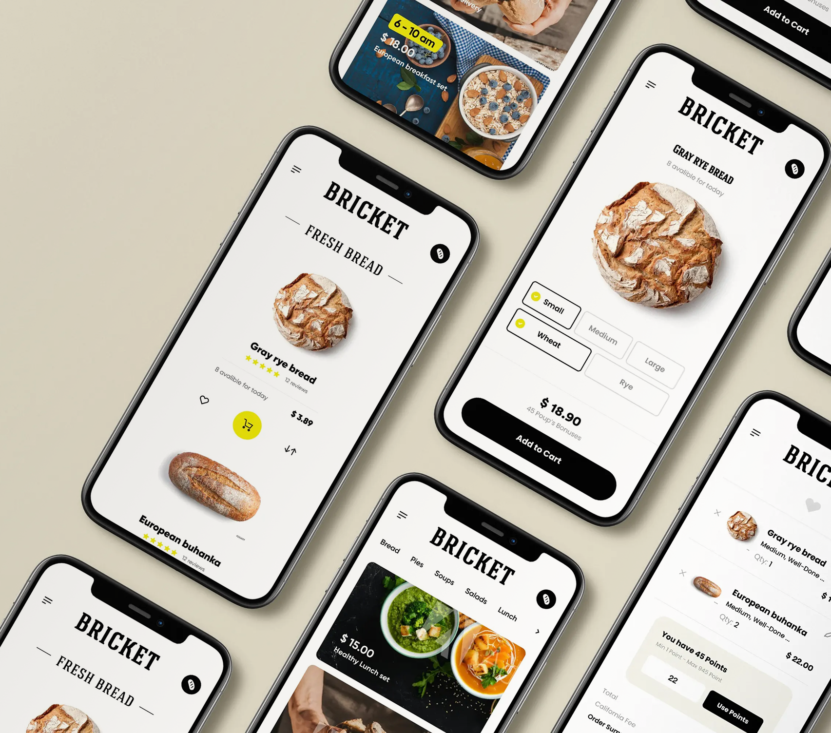
The core issue was decision architecture, not aesthetics. The old experience encouraged wandering: users moved between pages, scanned PDF menus, and got lost in category/subcategory trees. On mobile, every extra click increased drop-off. The site wasn’t designed as a product funnel — it was a fragmented information space. As a result, users abandoned before checkout, ordering speed was slow, and the digital channel underperformed relative to offline demand.
What I owned
As a Product Designer, I owned the end-to-end structure and interaction model of the ordering experience. This included the funnel strategy (landing → purchase), information architecture, modal-based product UX, cart mechanics, mobile-first hierarchy, and the checkout path. My focus was building a high-conversion purchase flow with minimal exits, optimized for phone usage and time-sensitive food ordering behavior.
increase in online sales after restructuring the funnel into a single landing-to-checkout flow
reduction in ordering time due to mobile-first modal architecture and simplified checkout
Key decisions
I removed the traditional website structure entirely and rebuilt the product as a single-page ordering system. I eliminated PDFs, the “Shops” page, and category/subcategory pages to prevent browsing loops. The entire catalog, product details, customization, and upsells were moved into modal windows so users never leave the landing page. The only page transition in the experience is checkout. This created a deliberately compressed “buy or leave” funnel: landing → product modal → checkout. The interface behaves like a lightweight web application rather than a website, making purchasing faster on mobile and reducing cognitive load by removing all non-essential navigation.
Outcome
The new funnel dramatically improved mobile conversion by keeping users inside one continuous purchase environment and removing drop-off points created by page transitions. The experience shifted from “explore and think” to “see and buy,” matching real bakery ordering behavior. After launch, the new ordering model increased sales by +87%, turning digital ordering into a highly efficient revenue channel instead of a legacy add-on.
