Loading, please wait..

Surfing school website

• +81% conversion rate from cold traffic click to booking

How I transformed a template-based surf school website into a high-converting, single-page landing system built for cold traffic.

Context

Castlery is a furniture e-commerce brand with a strong visual identity and high-quality product photography. The existing online store functioned well but lacked a clear visual hierarchy and structured navigation logic. The interface felt visually heavy, and users had to rely more on effort than intuition to move through categories and products.

Problem

The store needed a clearer UI structure to improve navigational clarity and subconscious guidance. Too many third- and fourth-priority elements competed for attention, reducing focus on core actions and product exploration. The challenge was to simplify the interface without losing brand depth while improving perceived quality and usability.

What I owned

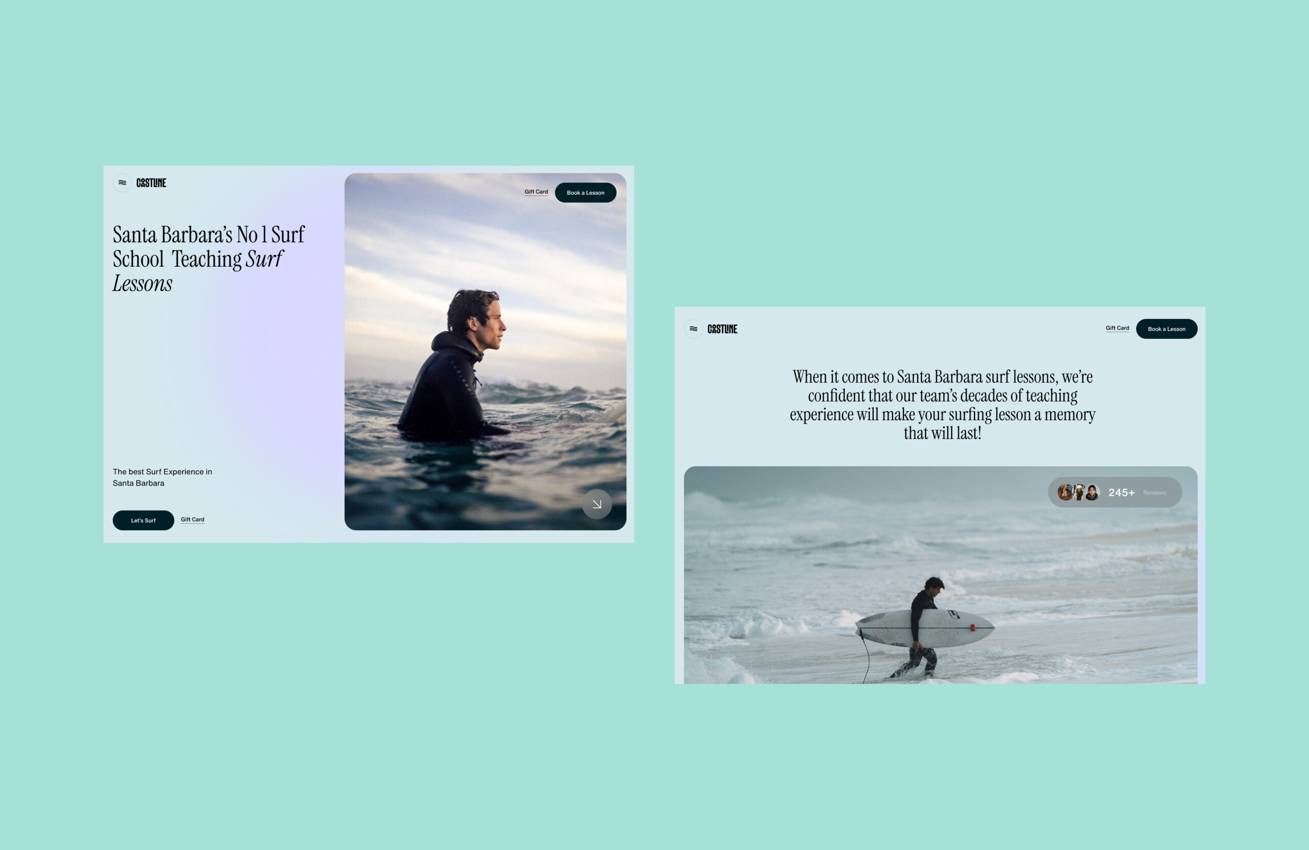
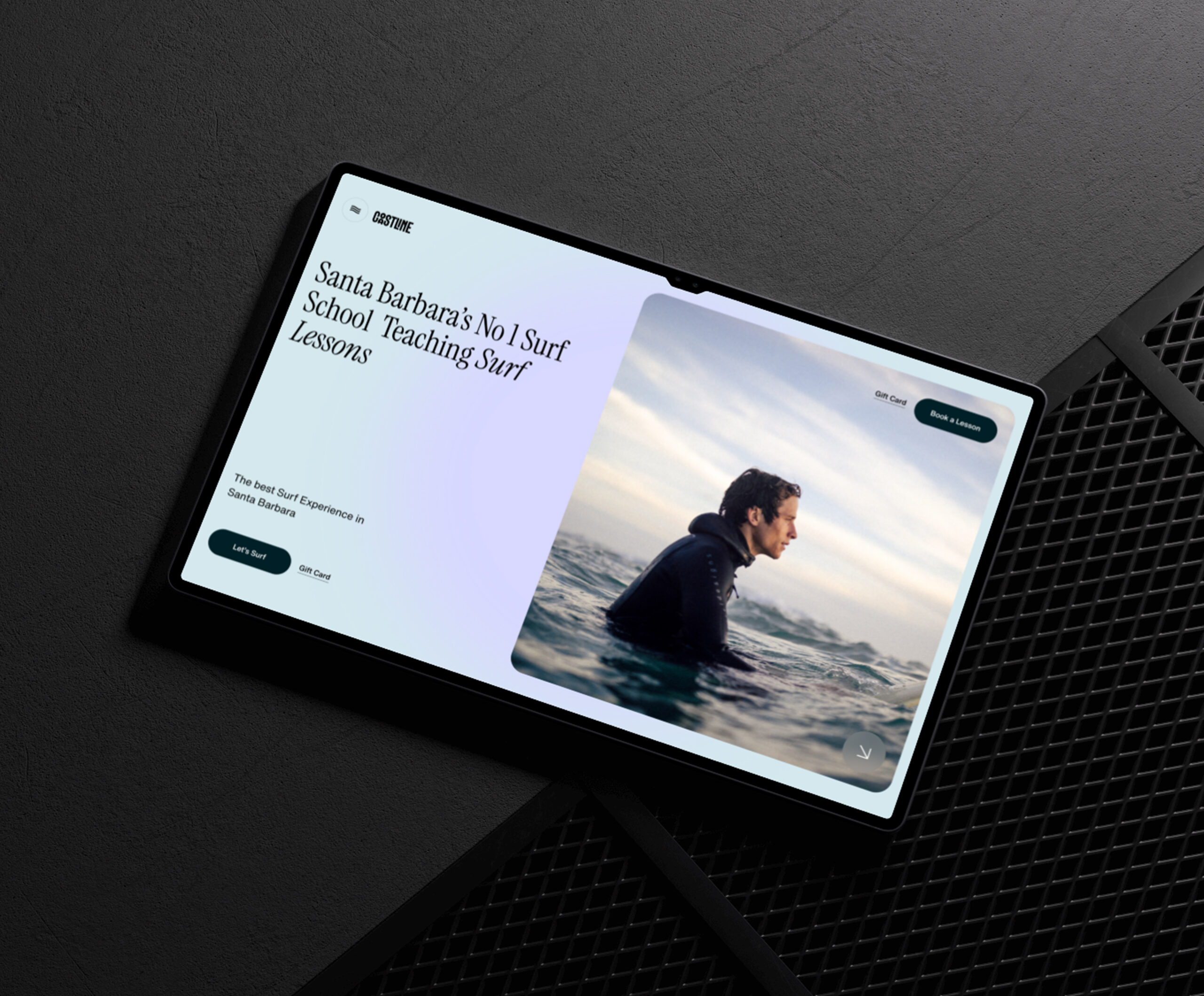
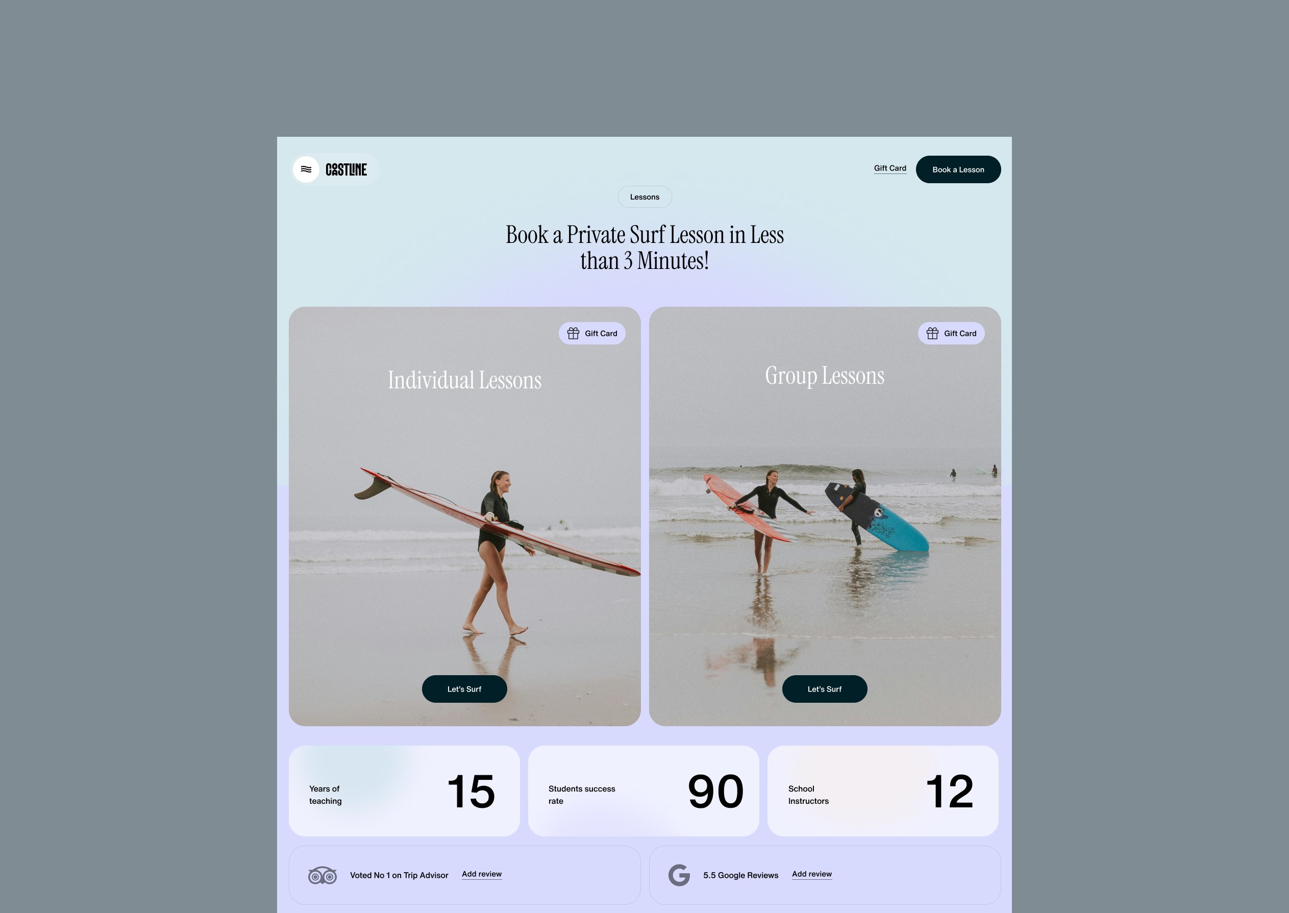
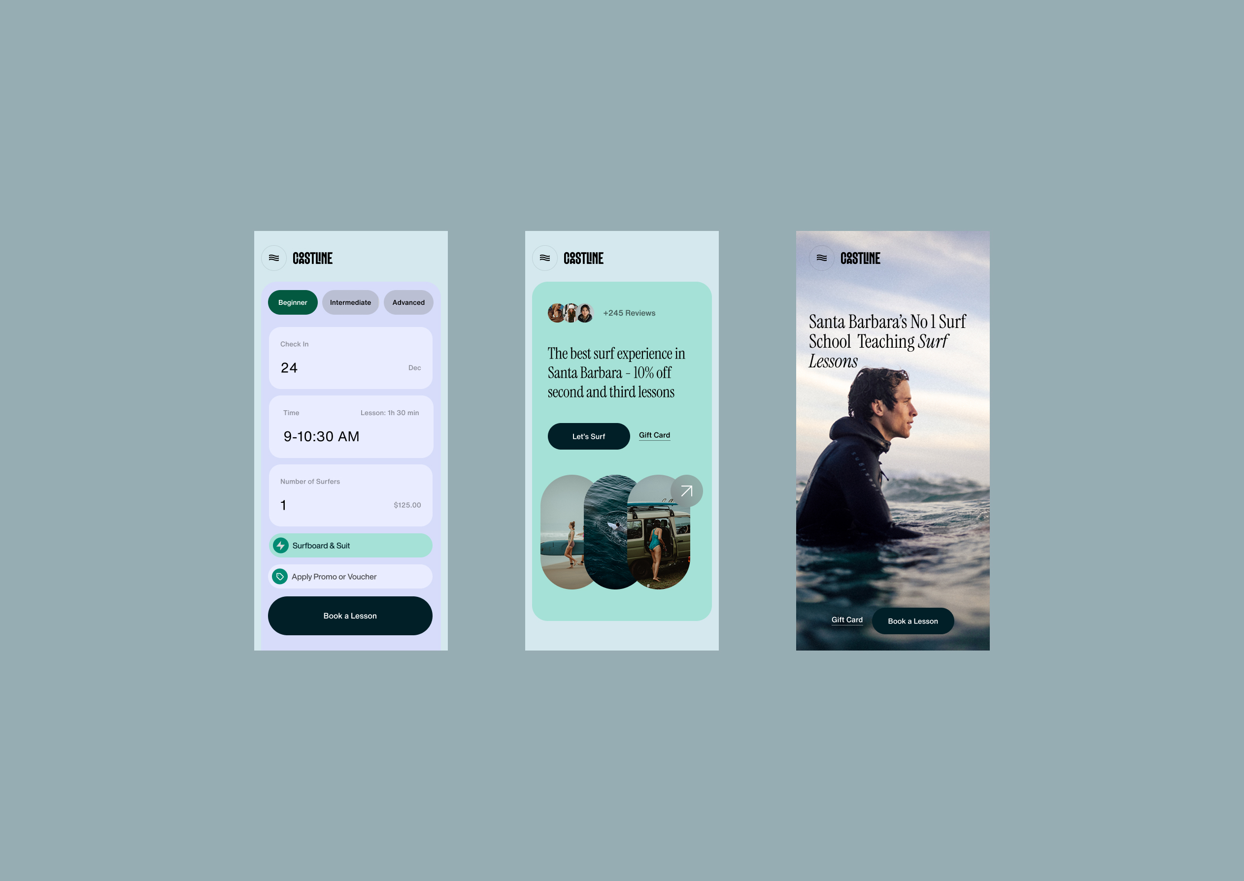
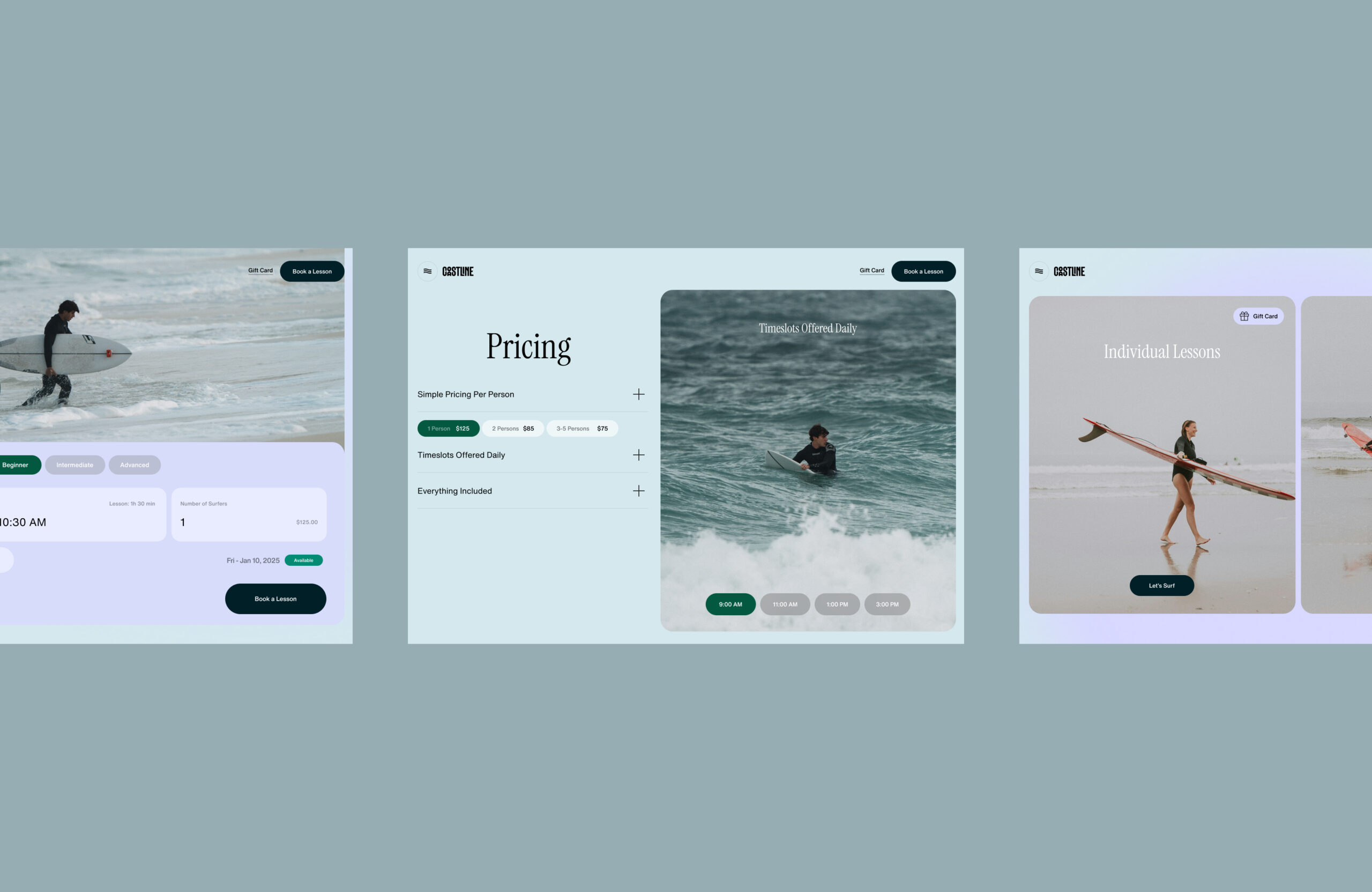
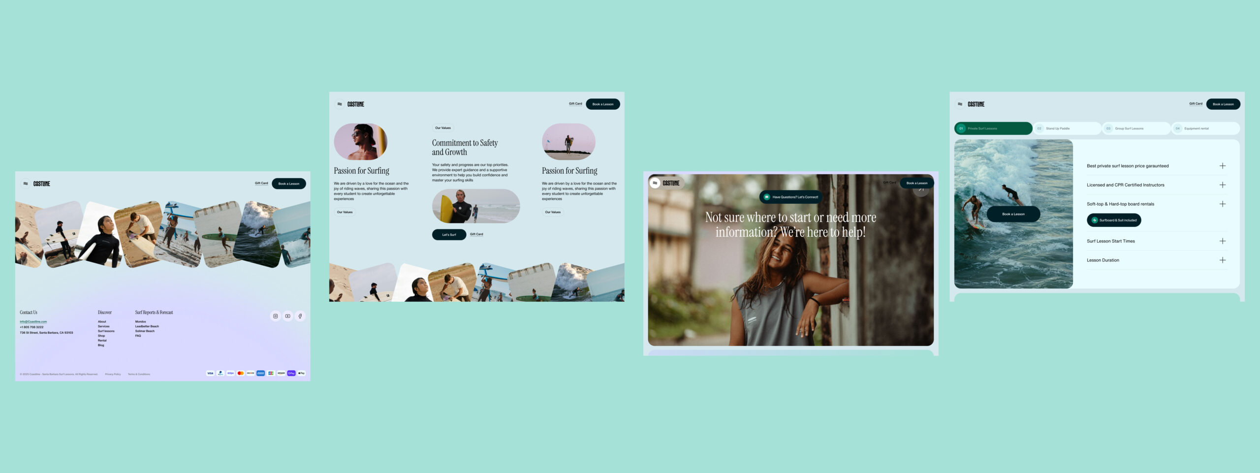
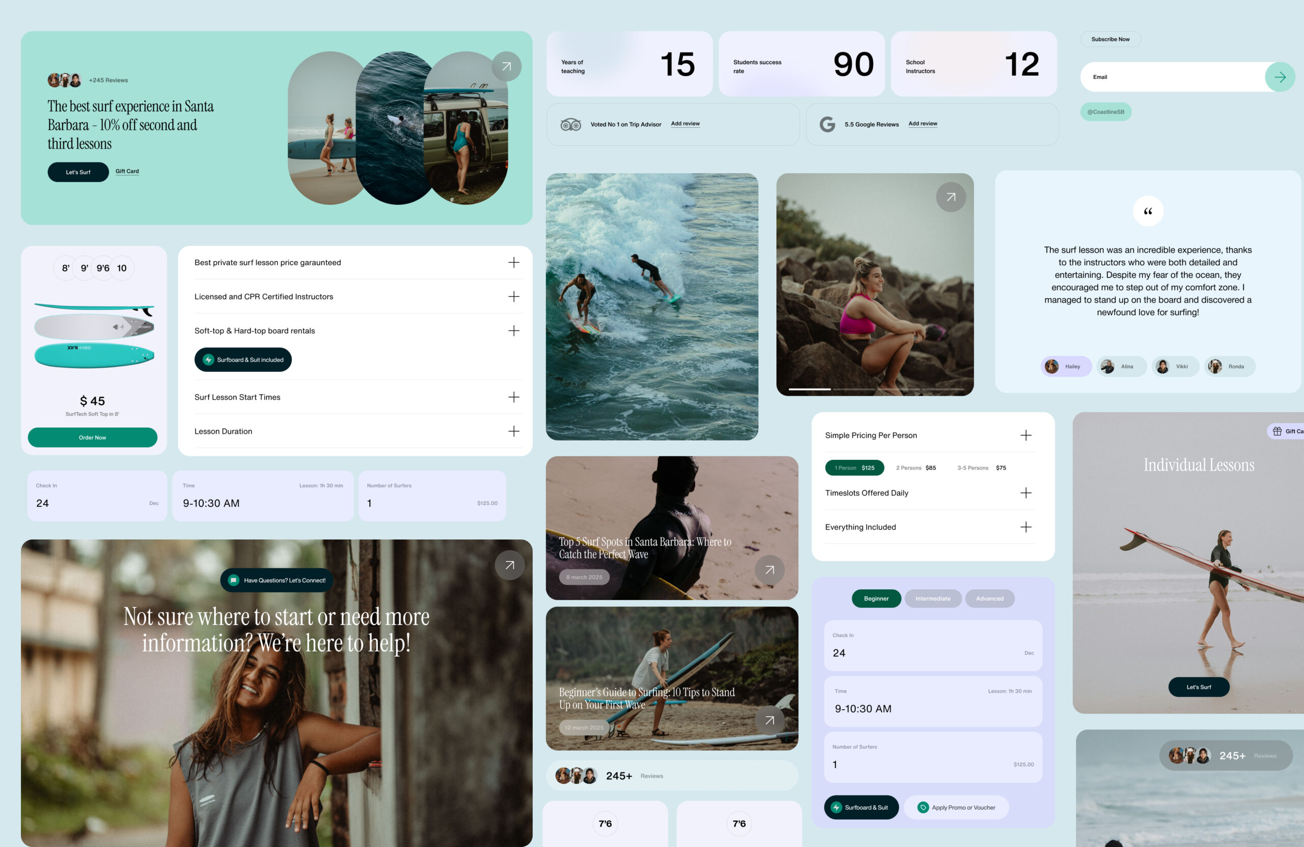
I led the full visual UI restructuring of the online store. I redesigned the color hierarchy system, simplified typography roles, rebuilt navigation logic, and introduced a clear visual prioritization framework. I removed low-priority interface elements to test performance impact and created a more structured and intuitive category system. I also designed unique iconography and custom interface components, including elements supporting 3D furniture viewing.

+ %

increase in average time on site

+ %

conversion rate from cold traffic click to booking

Key decisions

I reduced visual noise by keeping only first- and second-priority elements visible. I introduced a color-coded hierarchy that allowed users to subconsciously identify categories and sections through consistent visual signals. Navigation was redesigned to feel predictable and guided rather than exploratory. Typography, spacing, shapes, and icon systems were aligned to support faster cognitive processing and product discovery.