Loading, please wait..

Vitality

• 12% increase in homepage retention

How I increased product discovery and retention by redesigning a bedding DTC store around emotional UX and visual trust.

Context

Benalio is a direct-to-consumer bedding brand operating in a competitive mid-to-premium segment. While the products themselves were high quality, the digital experience didn’t reflect their value. The interface felt visually dense, product storytelling was fragmented, and the overall experience didn’t support a confident, premium buying decision. As a result, users disengaged early, struggled to explore product lines, and spent limited time with the brand.

Problem

The main issue was not traffic or pricing, but perception and focus. The interface felt visually dense and distracted attention away from the product itself. Product grids and PDPs were overloaded, visual hierarchy was weak, and users struggled to understand differences between collections and comfort levels. As a result, exploration across product lines was limited, engagement dropped early, and retention remained below potential.

What I owned

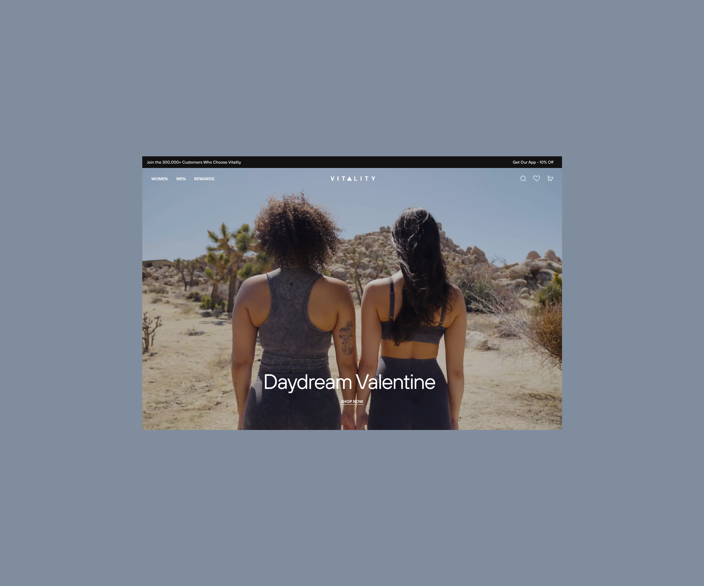
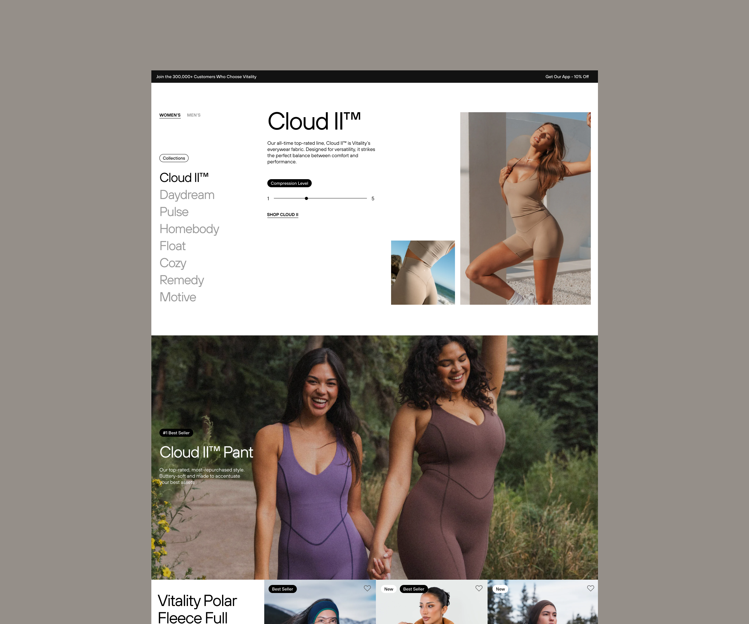
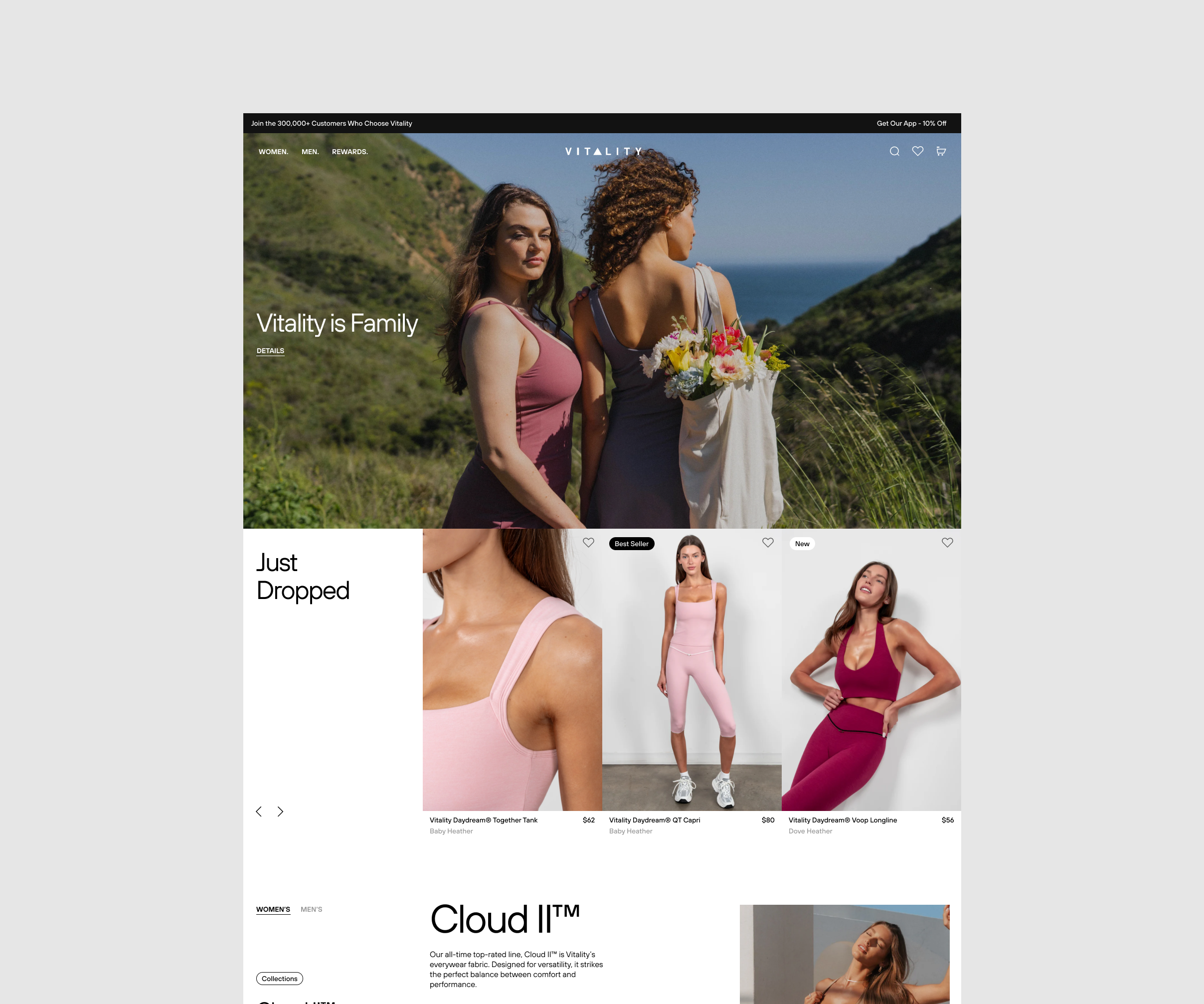
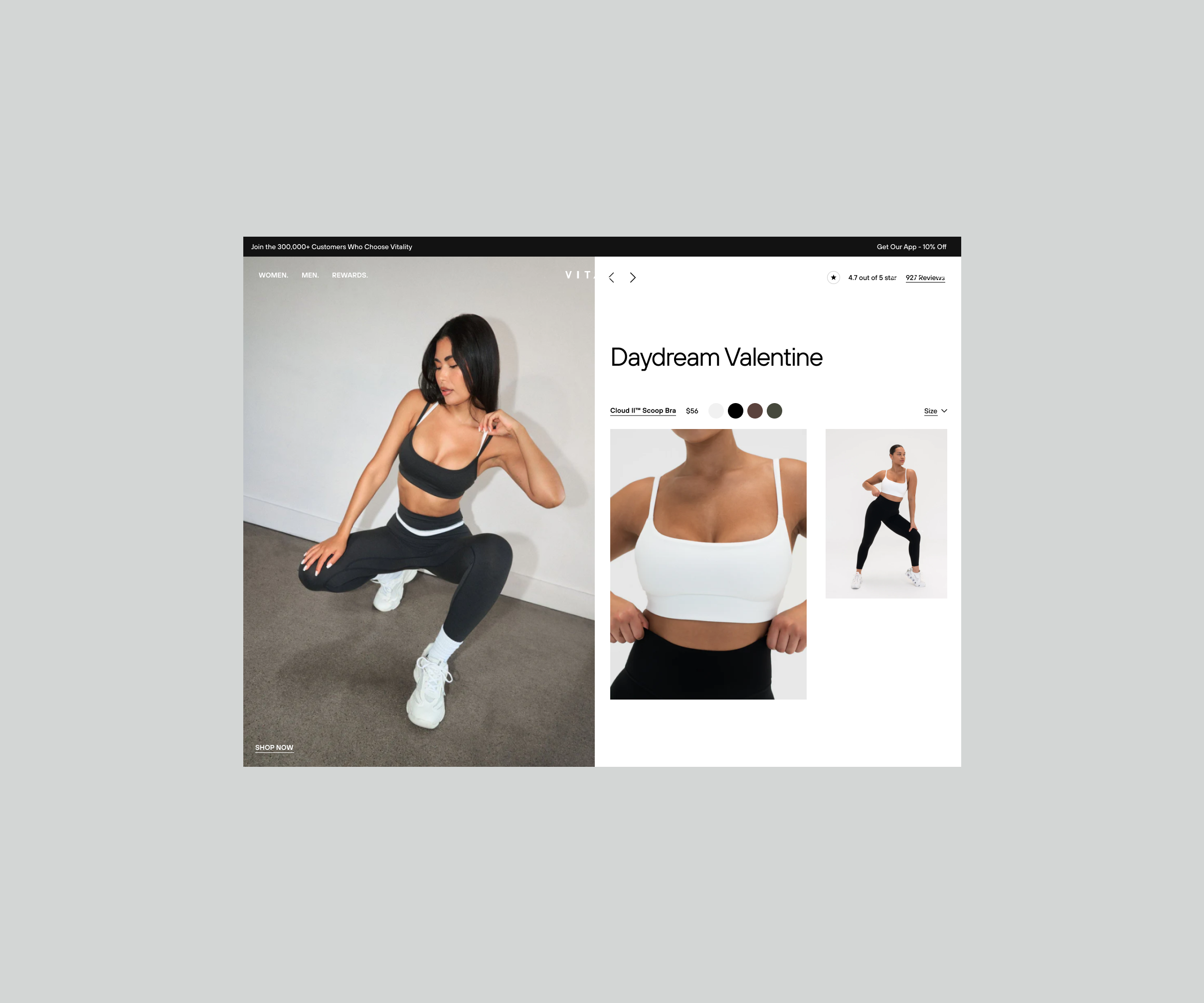
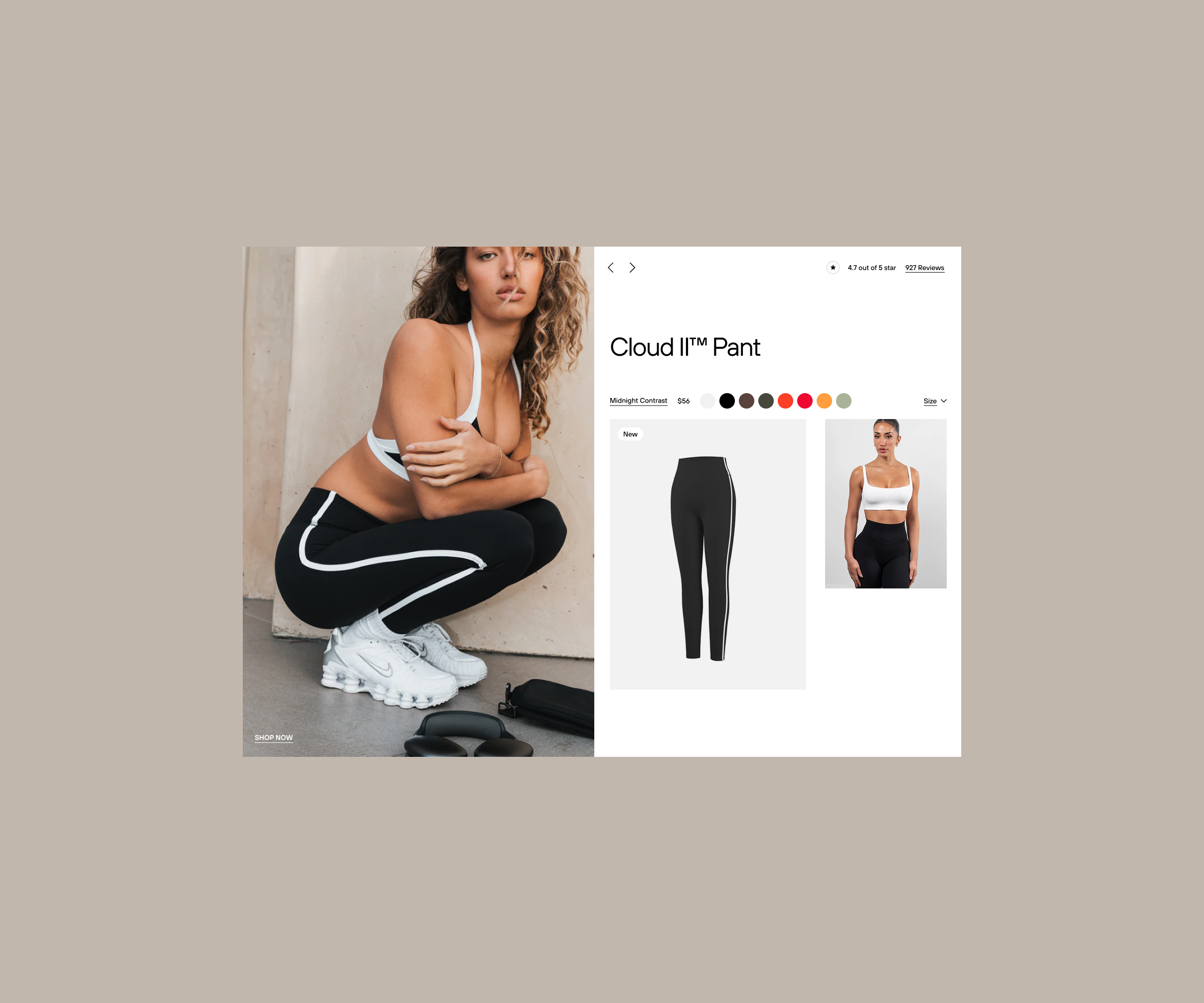
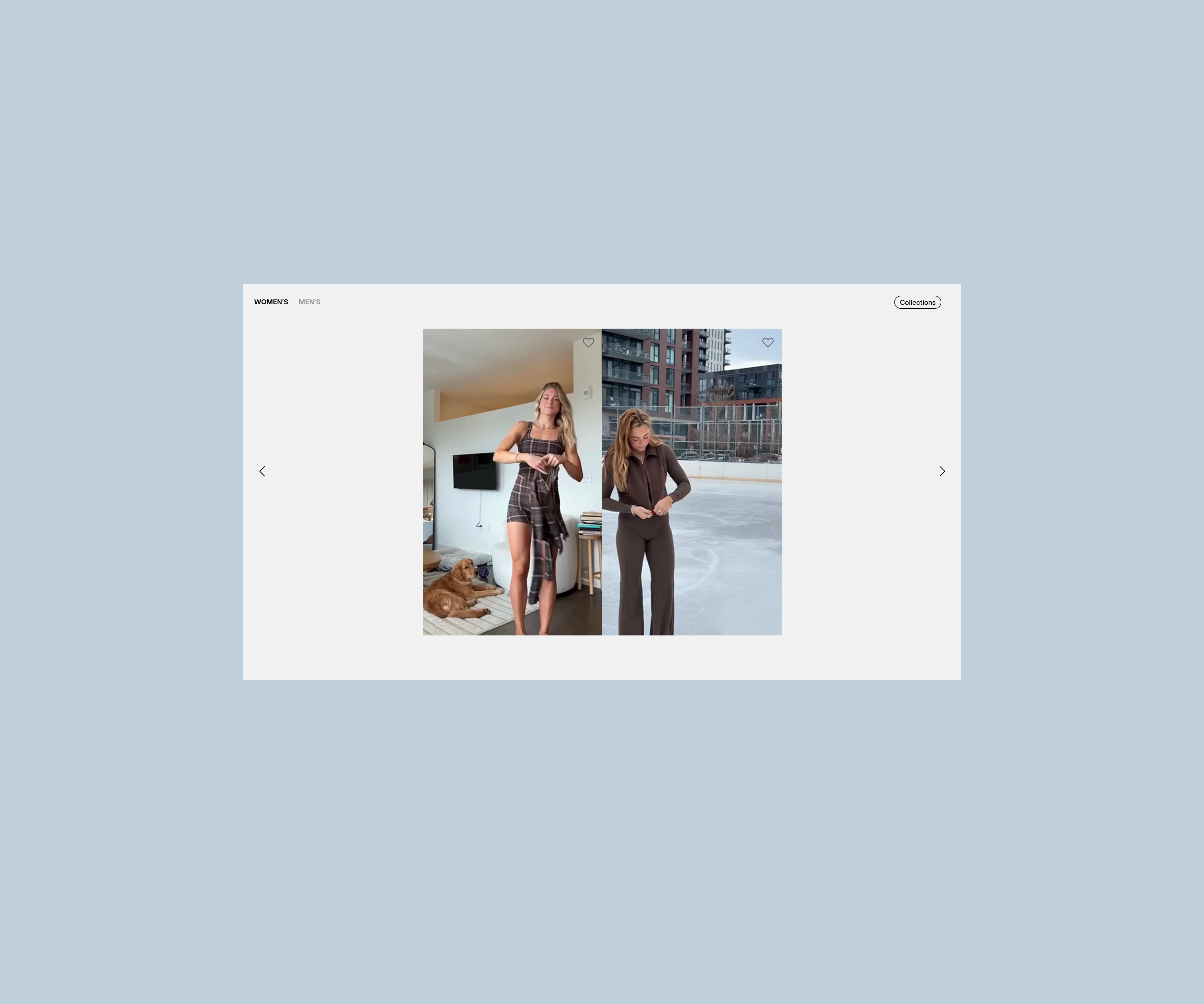
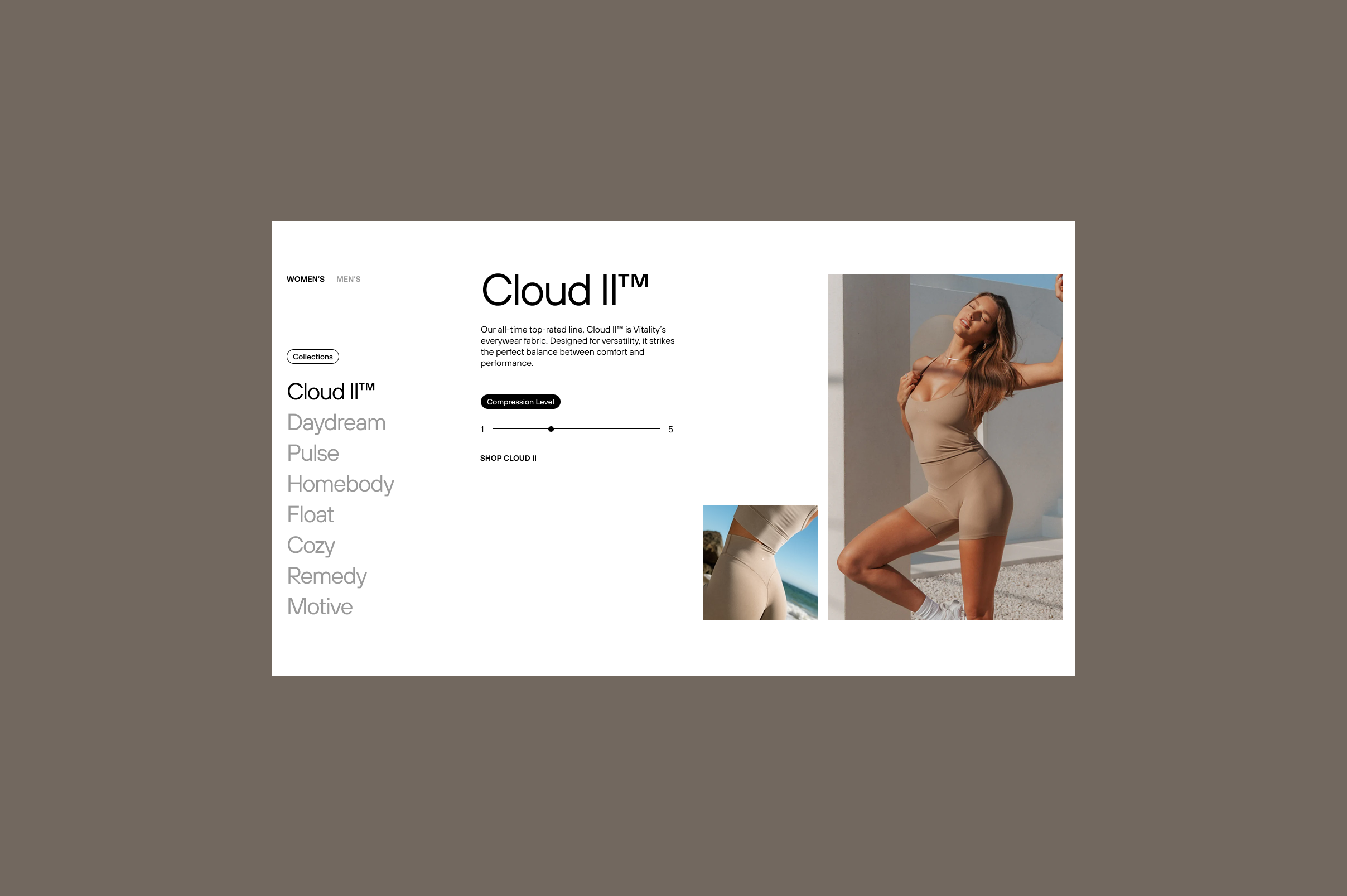
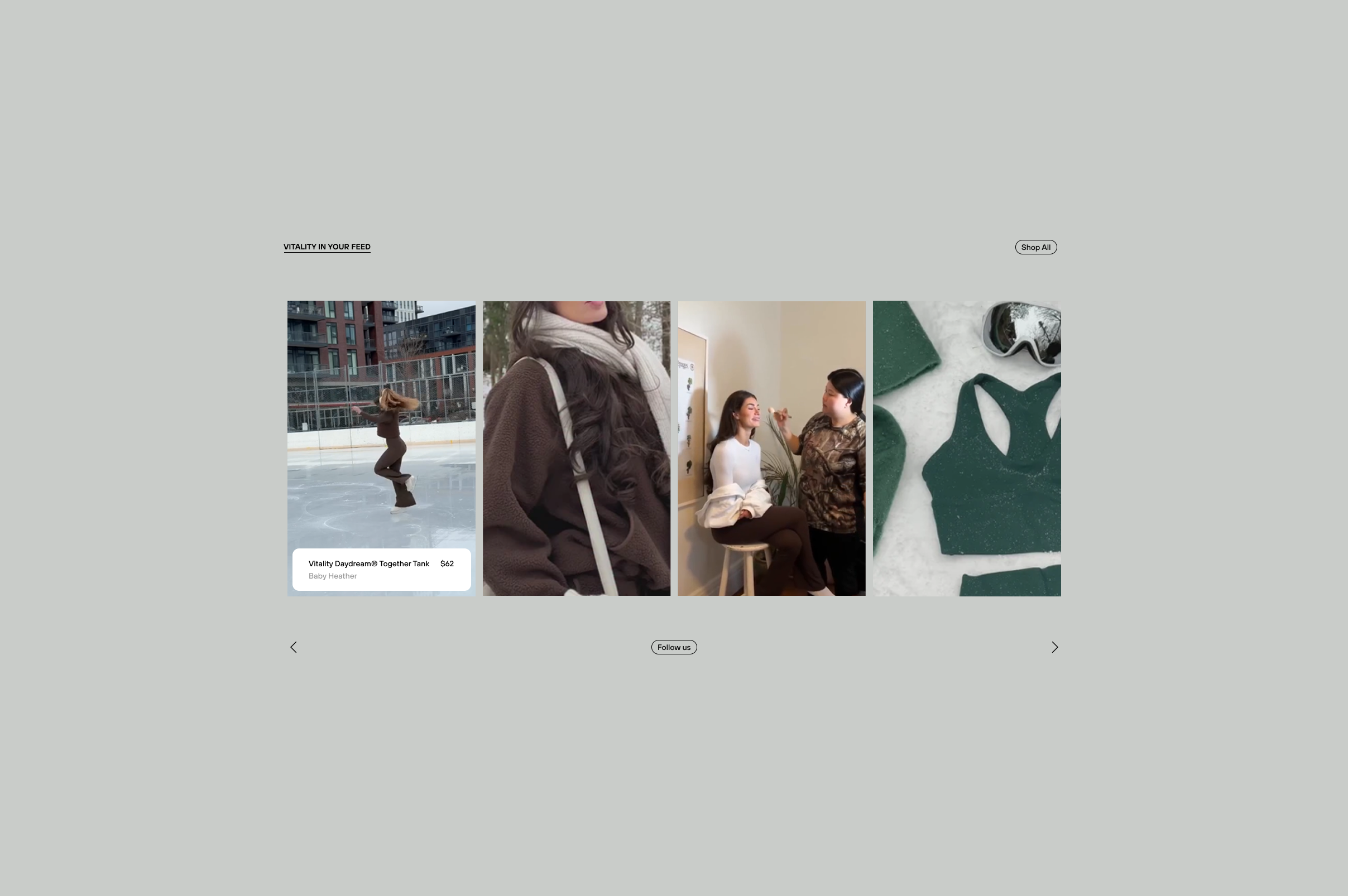
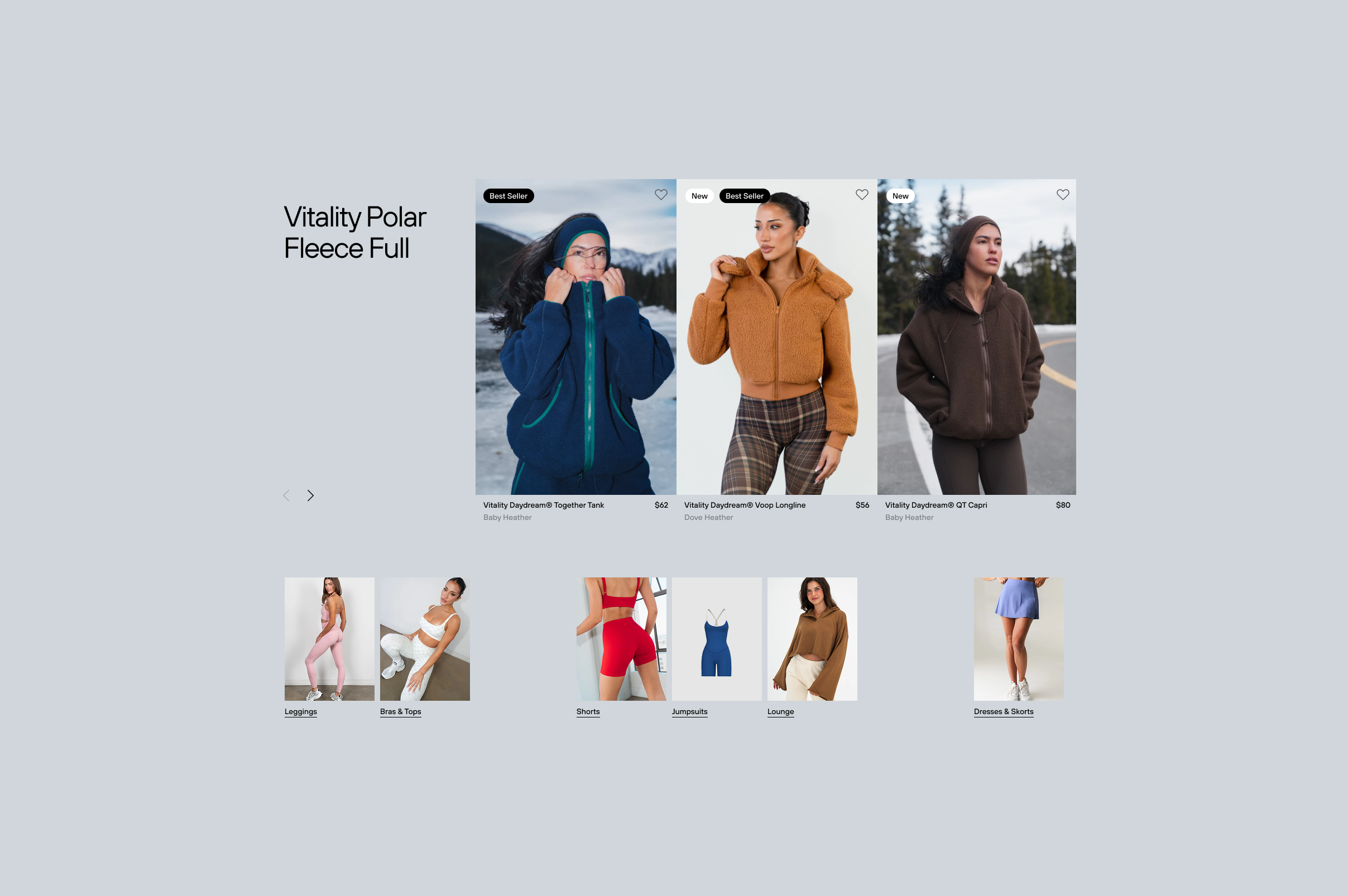
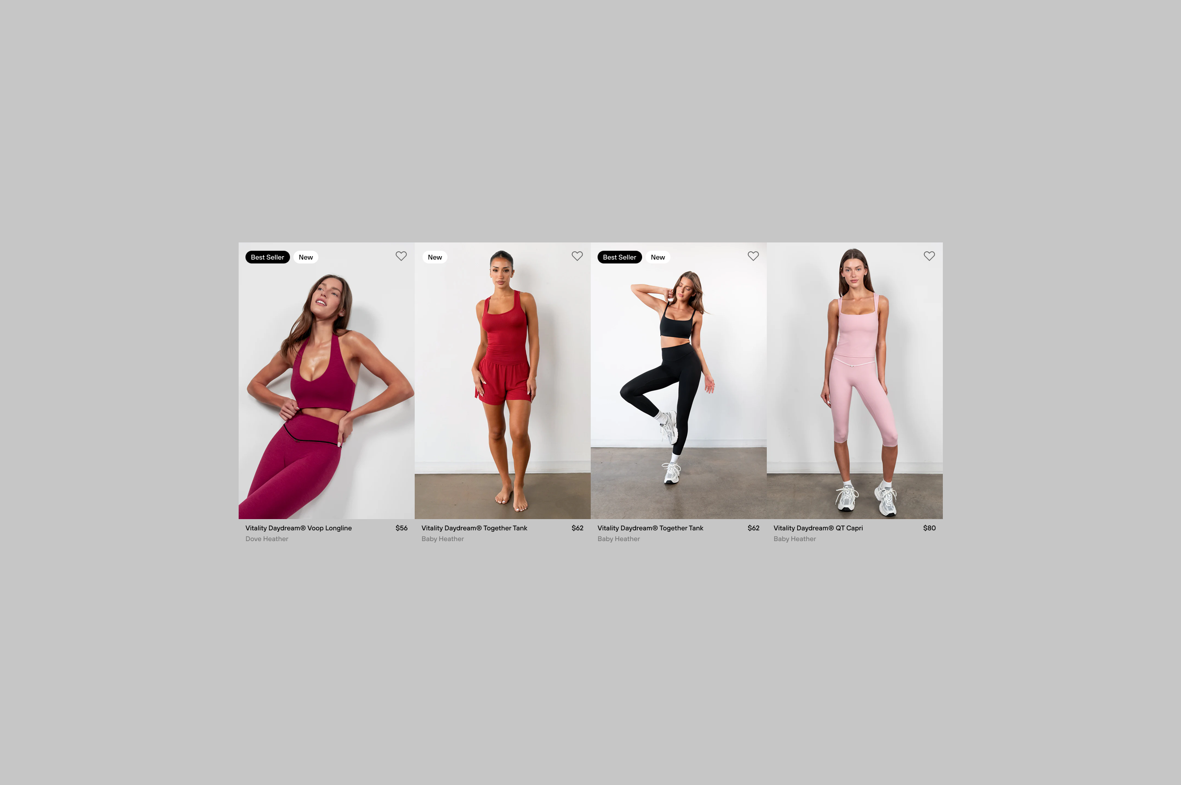
As a Senior Product Designer and Product Lead, I owned the redesign end to end. My responsibility covered the overall visual and UX strategy, the information architecture for the Shop, Product Detail Pages, and Homepage, as well as the product grid, filtering experience, PDP structure, and content hierarchy. My focus was on emotional UX, visual clarity, and building trust through design.

Key decisions

+ .5%

increase in visits to recommended products

+ %

improvement in user retention

I deliberately reduced interface noise to keep attention on the product and its material quality rather than on UI elements. I increased image scale and visual dominance to emphasize texture, form, and craftsmanship, allowing the product to visually justify its value. I rebuilt PDPs around product lines and comfort levels instead of feature-heavy descriptions, helping users make decisions based on feeling and perceived quality. Navigation and filtering were simplified to support calm, confident browsing without breaking the emotional flow. Spacing, typography, and restrained UI patterns were used intentionally to reinforce trust and a premium tone. Finally, I reframed the homepage from a traditional catalog into a brand presentation that sets mood, context, and expectations before purchase.

Outcome

Following the redesign, visits to recommended products increased by 75 percent, indicating significantly improved product discovery across collections. User retention improved by approximately 10 percent, and overall time on site increased as users engaged more deeply with the product range. Most importantly, the digital experience began to match the quality of the product itself, strengthening trust and establishing a clearly elevated premium perception.