Online store of phone cases
• 8.8% increase in homepage retention
How I increased homepage retention and improved cold traffic conversion by redesigning only the homepage.
Context
Native Union’s homepage was visually clean but under-leveraged from a product and conversion perspective. Traffic included a high share of cold users who were not yet familiar with the brand. The homepage needed to function as a stronger decision architecture layer rather than a static visual showcase.
Problem
The existing layout diluted attention. Product visuals were not dominant enough, typography hierarchy was too subtle, and excessive negative space reduced perceived density of value. As a result, cold users were not engaging deeply enough before deciding whether to continue.
What I owned
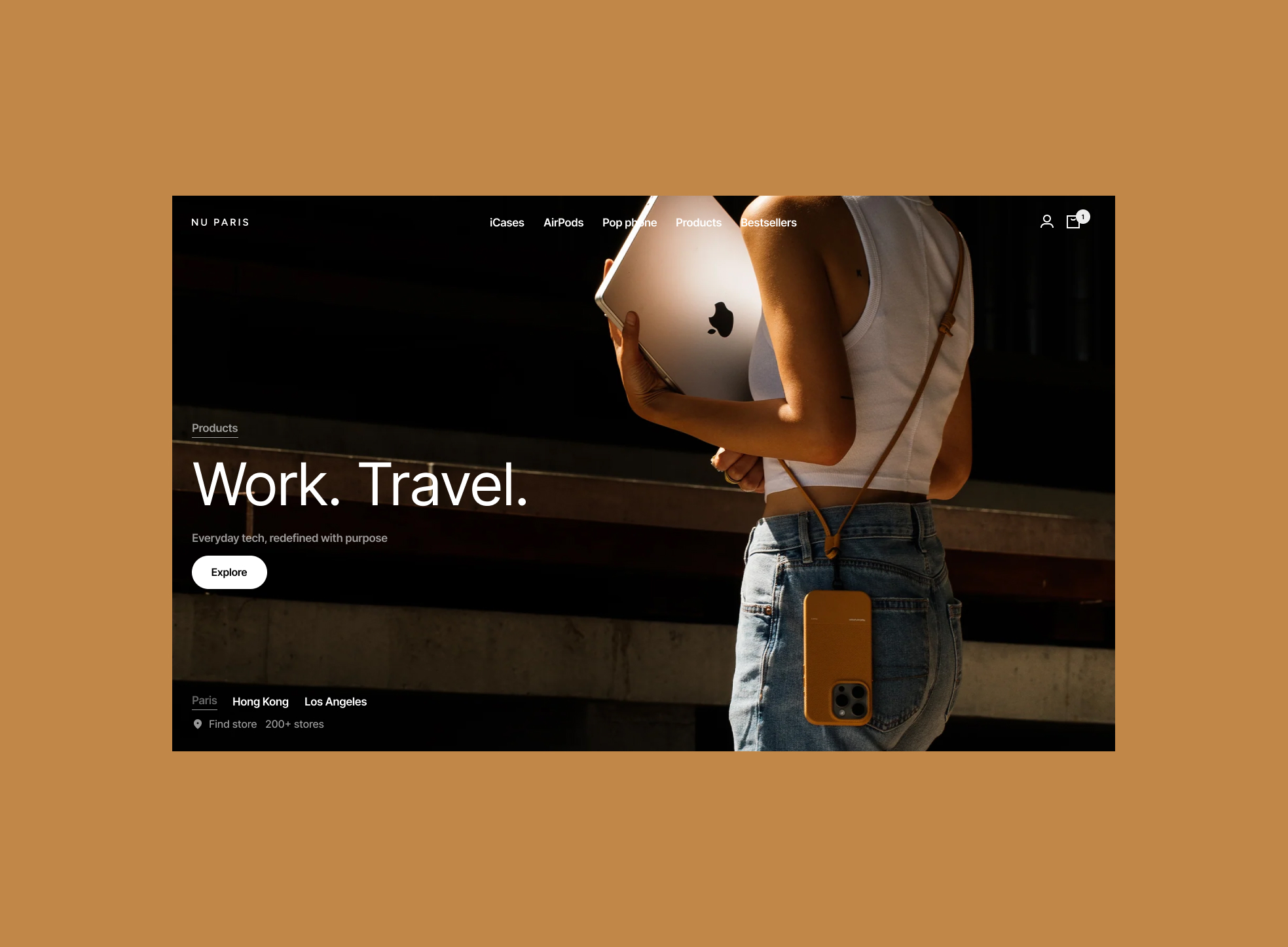
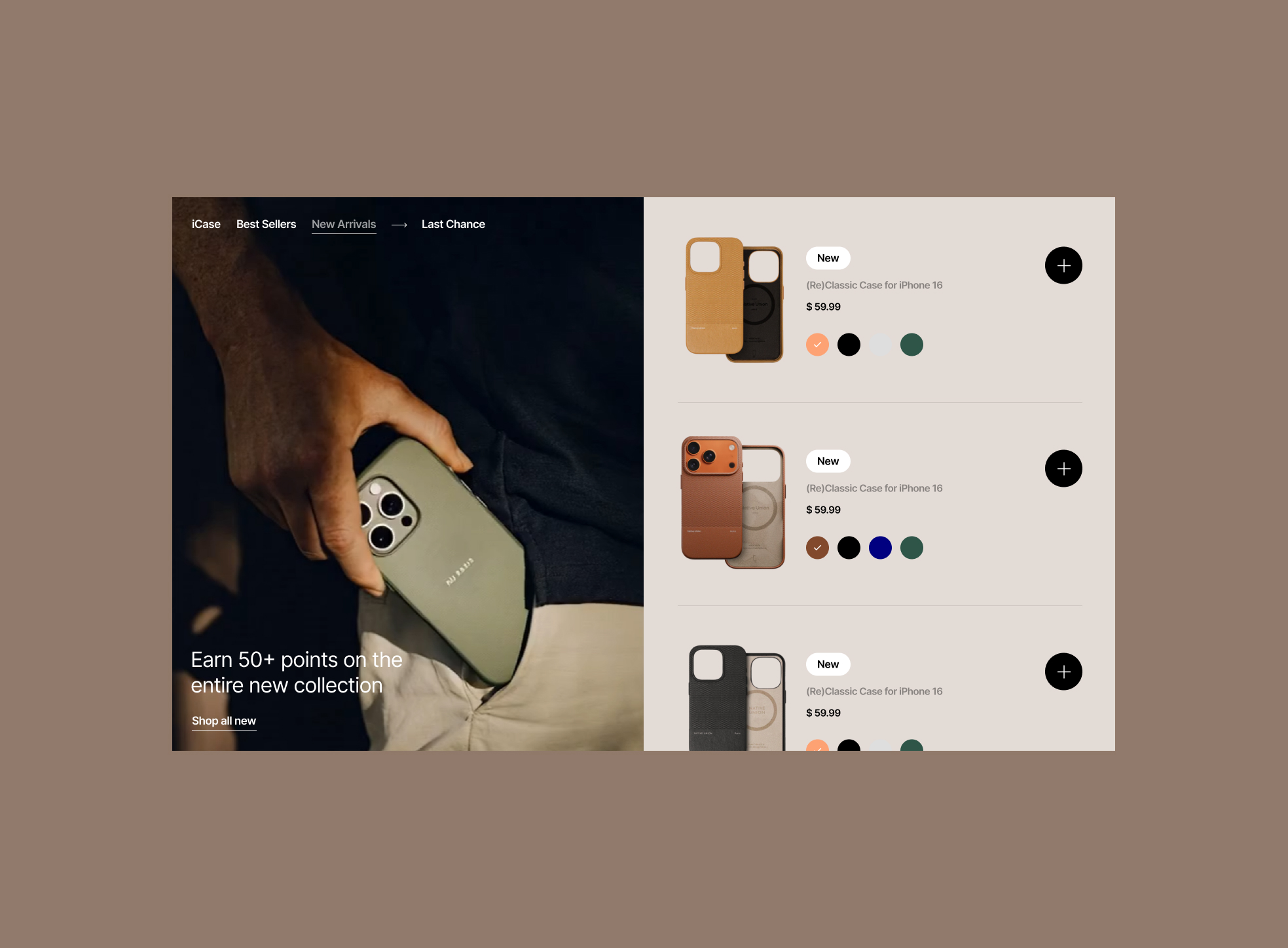
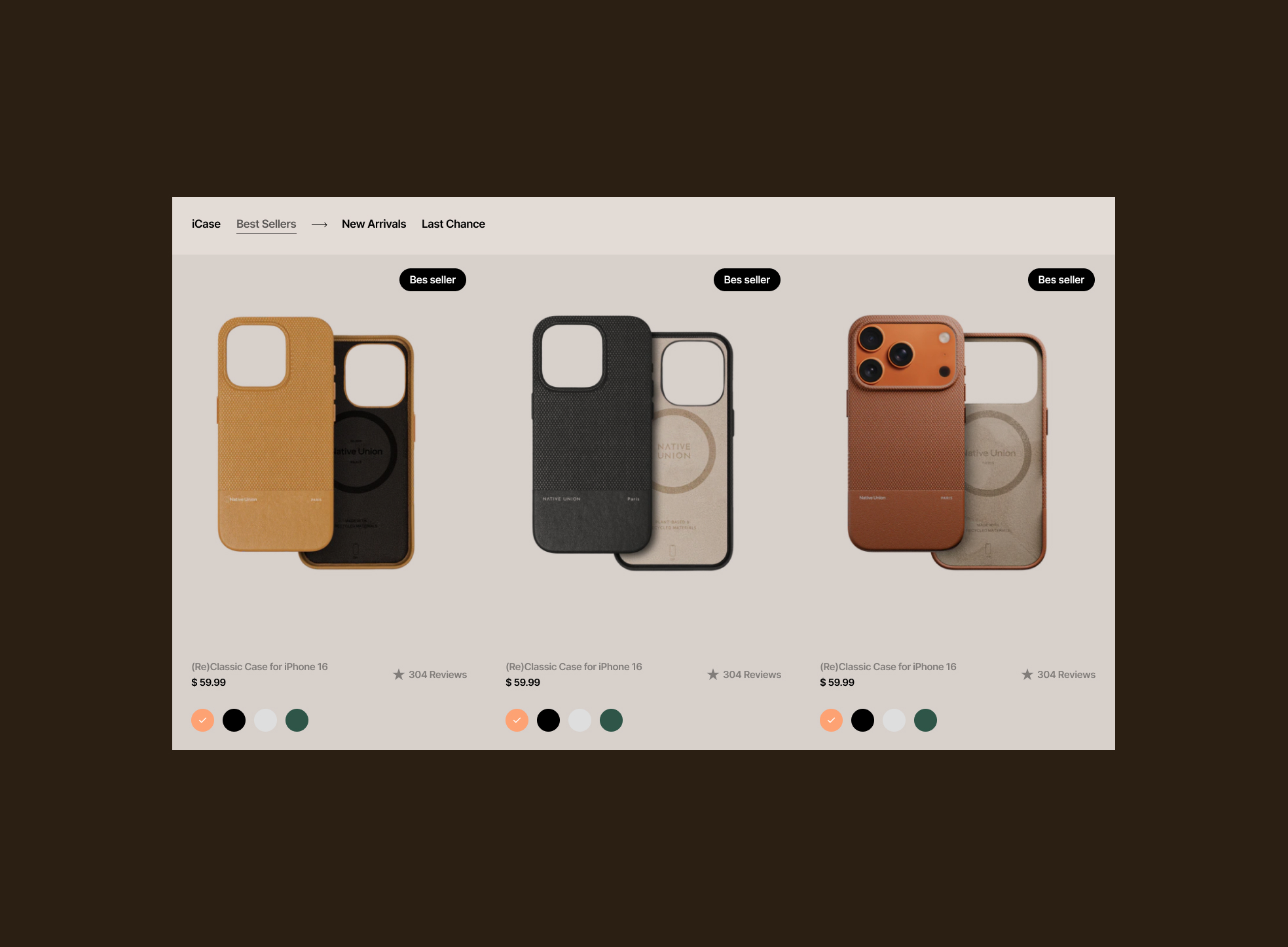
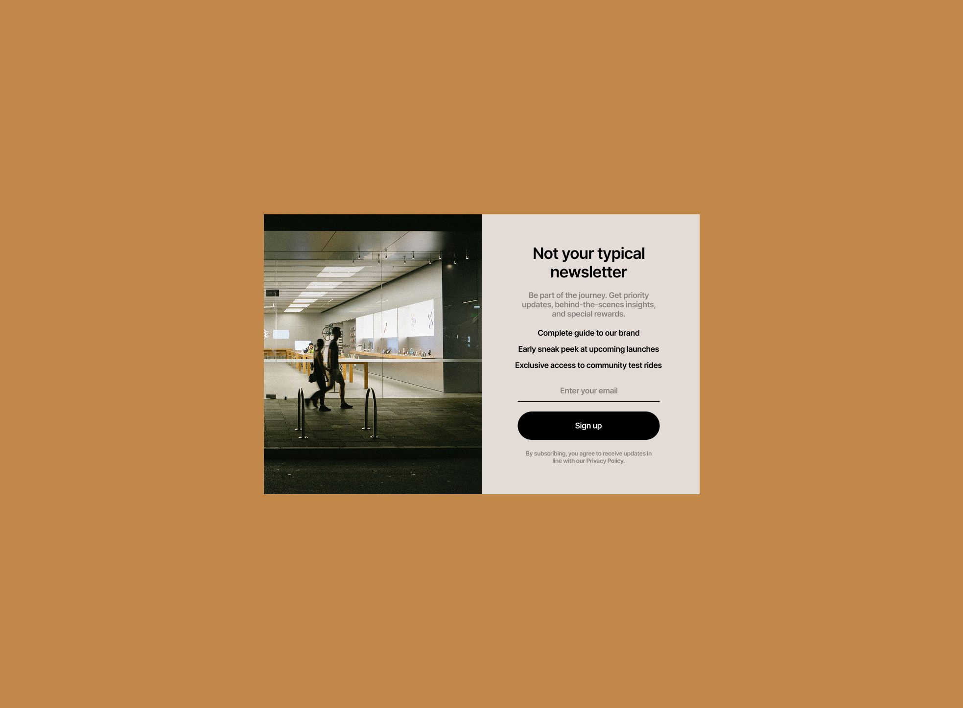
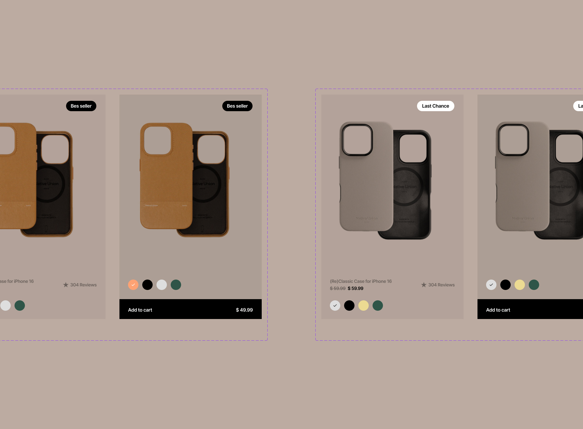
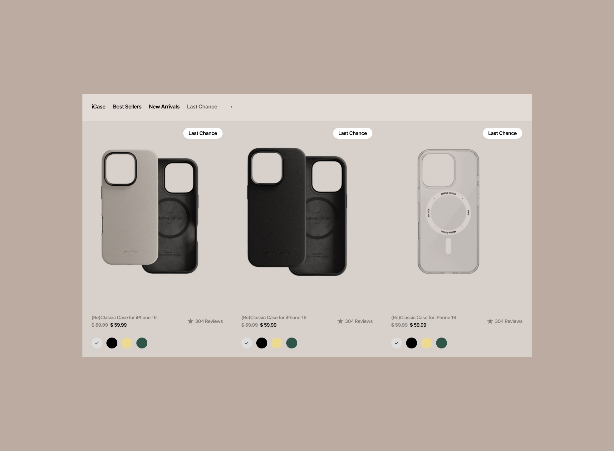
I fully owned the homepage redesign strategy and execution as a test prototype. This included restructuring the layout, redefining visual hierarchy, adjusting typography scale, increasing image dominance, compressing ineffective spacing, and modernizing the overall visual language. No new features were introduced. The experiment focused purely on structural and visual optimization.
increase in homepage retention
Key decisions
Instead of adding functionality, I treated the homepage as a conversion instrument. I increased product scale, amplified visual impact, reduced non-performing whitespace, strengthened typographic contrast, and rebalanced content density to guide attention more intentionally. The redesign was launched as an A/B test prototype to measure behavioral impact.
Outcome
Cold traffic conversion into click-to-booking reached up to 81% within the tested segment. The growth was achieved purely through visual restructuring and decision architecture optimization, without expanding scope or adding new mechanics.
