Loading, please wait..

Byoma

• 48% increase in average on-site engagement duration

• Homepage

How I improved engagement and product discovery by simplifying structure, navigation, and visual focus on a skincare homepage.

Context

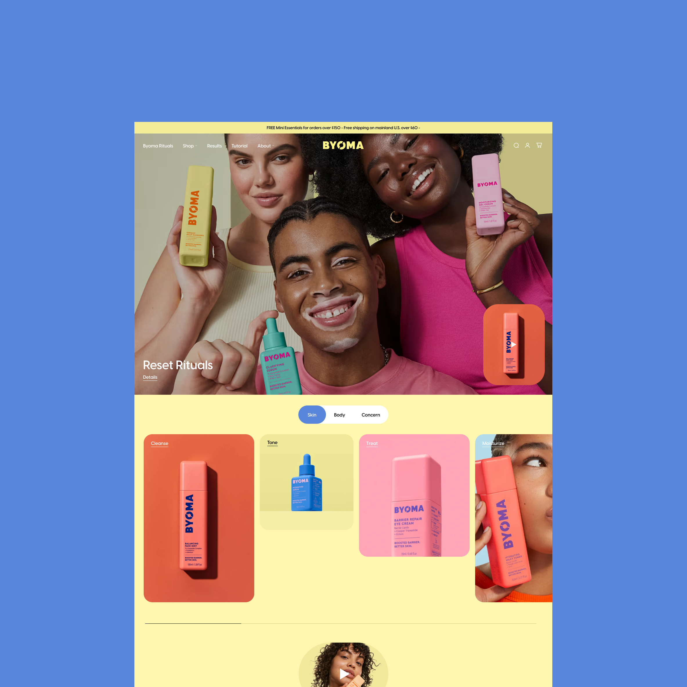
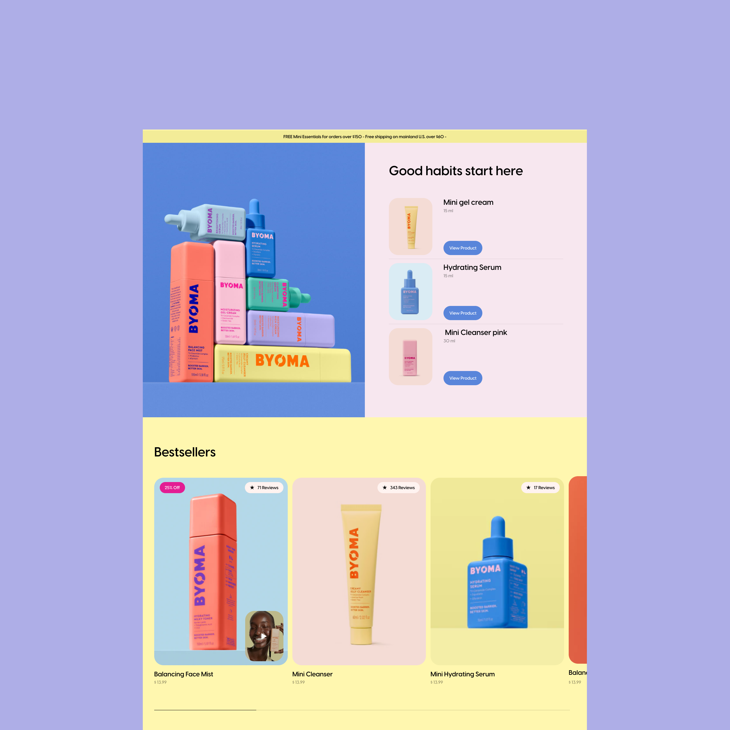
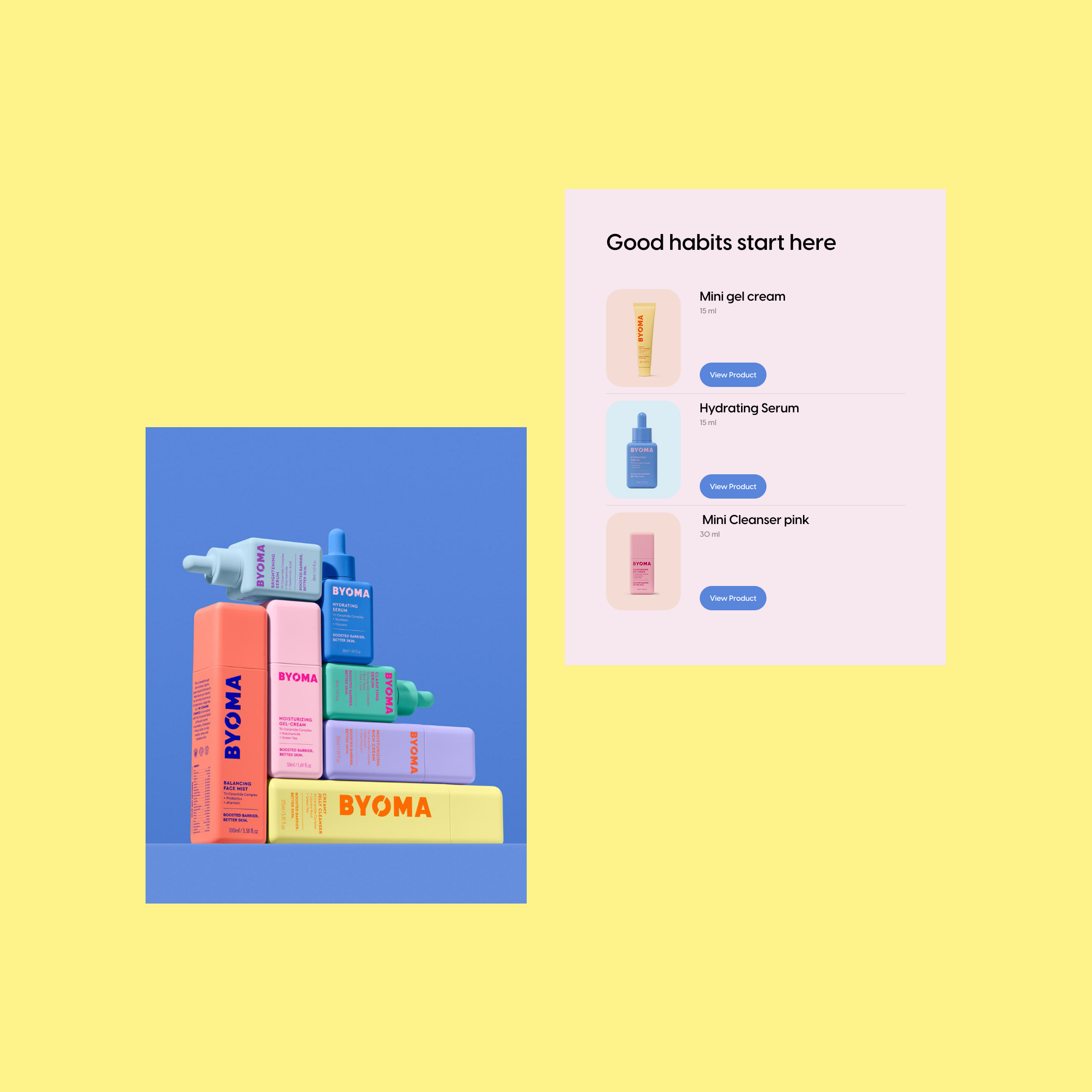
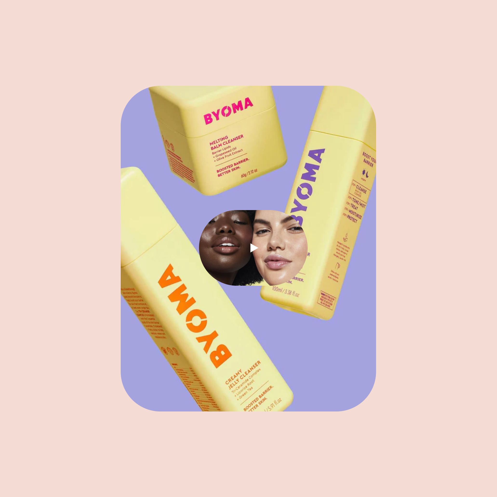
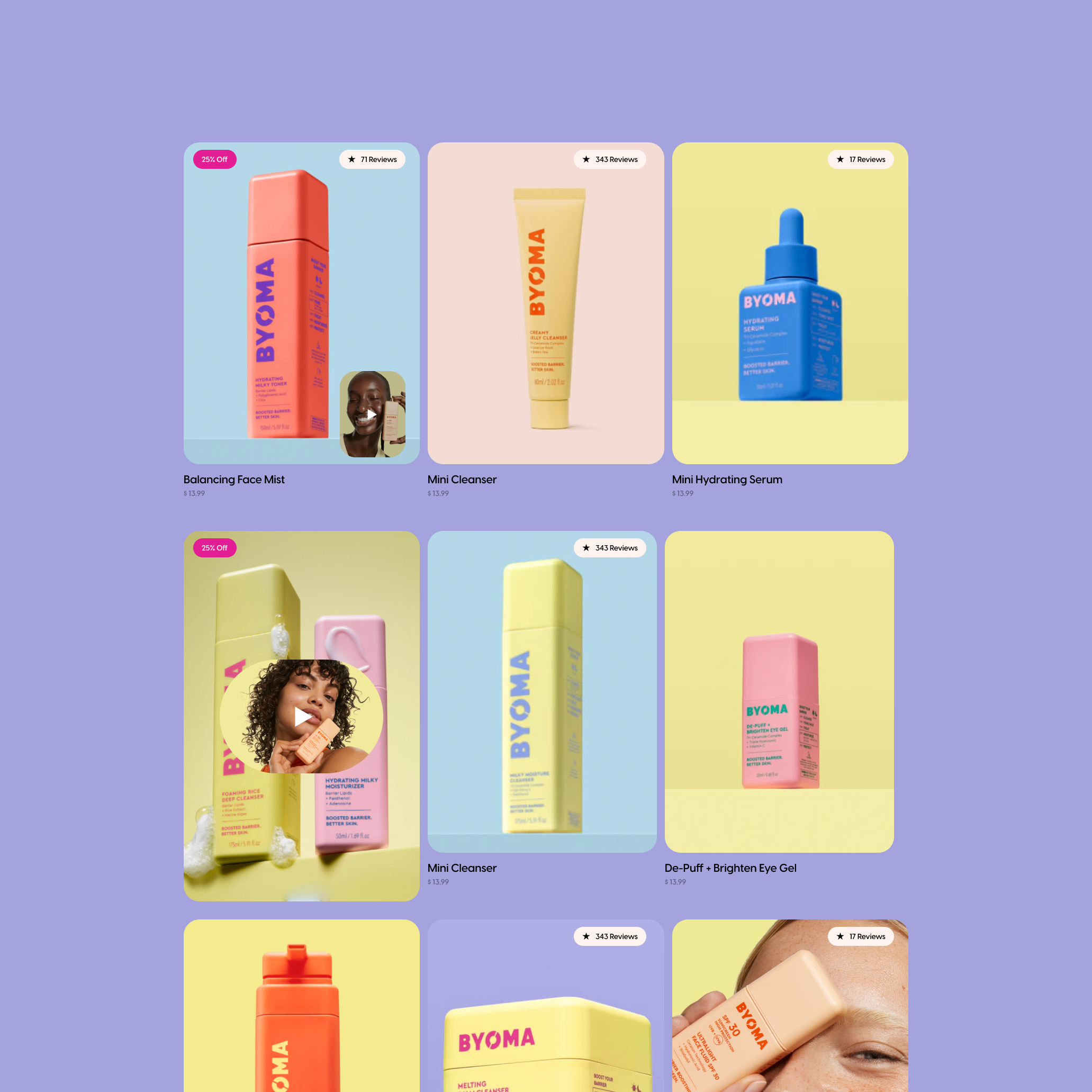
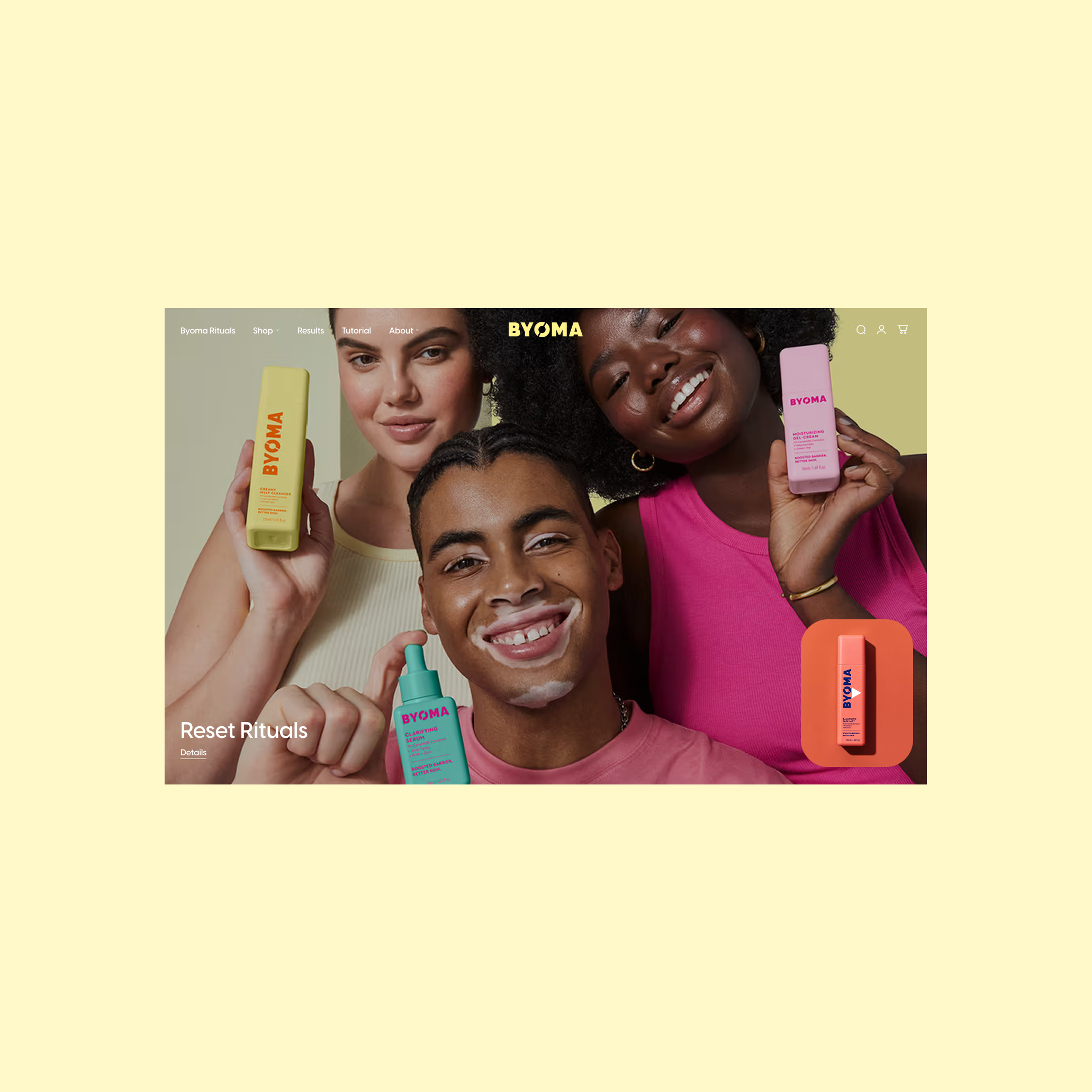
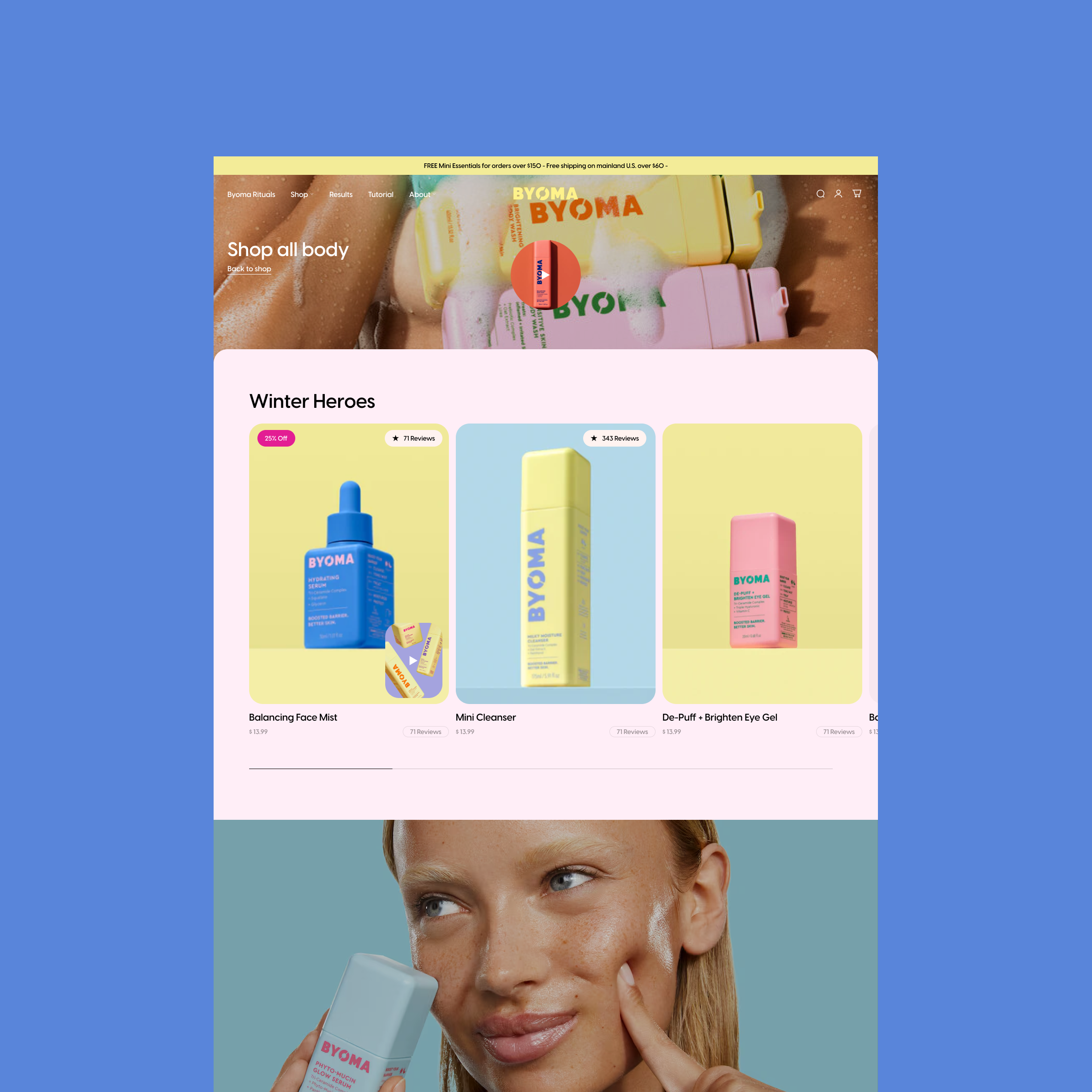
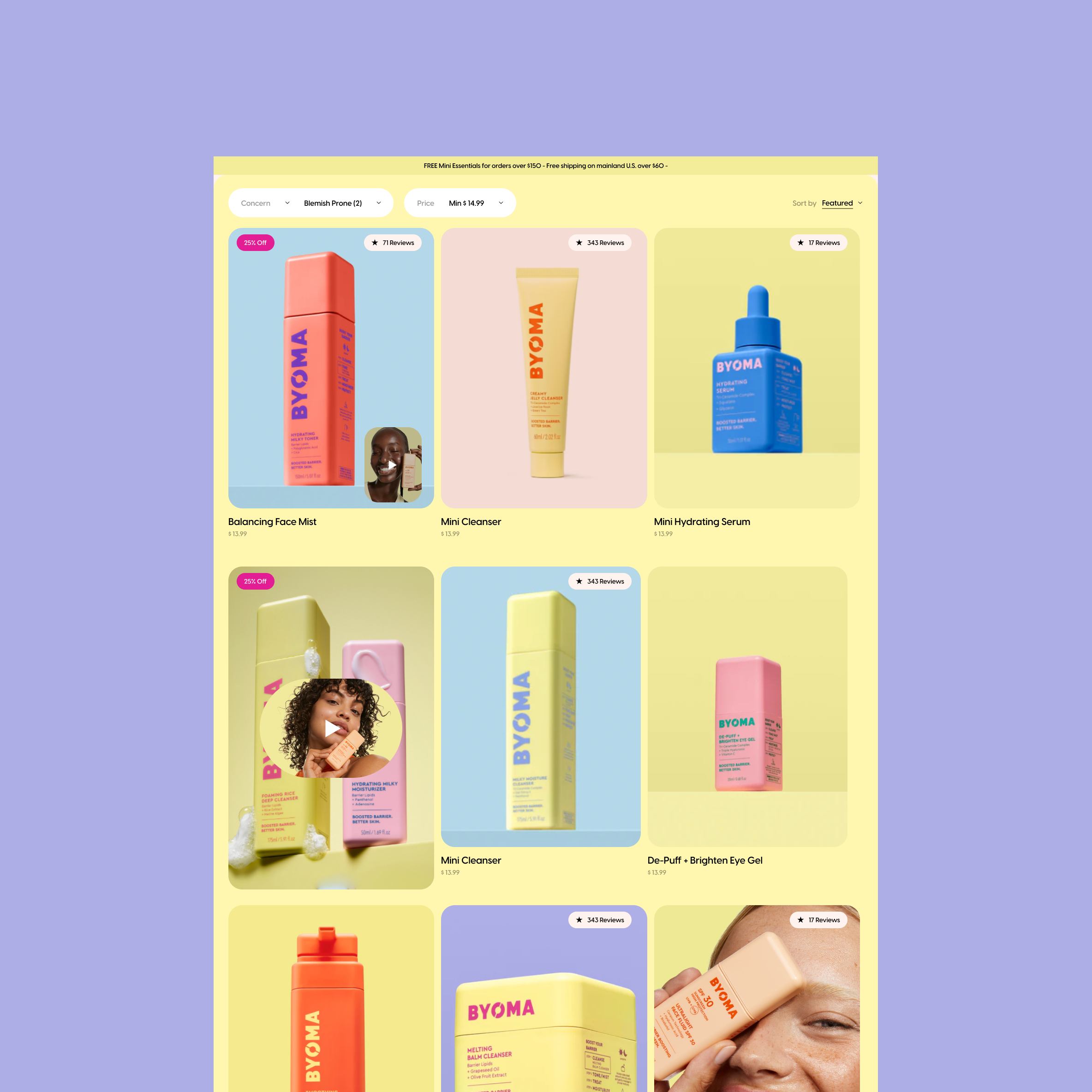
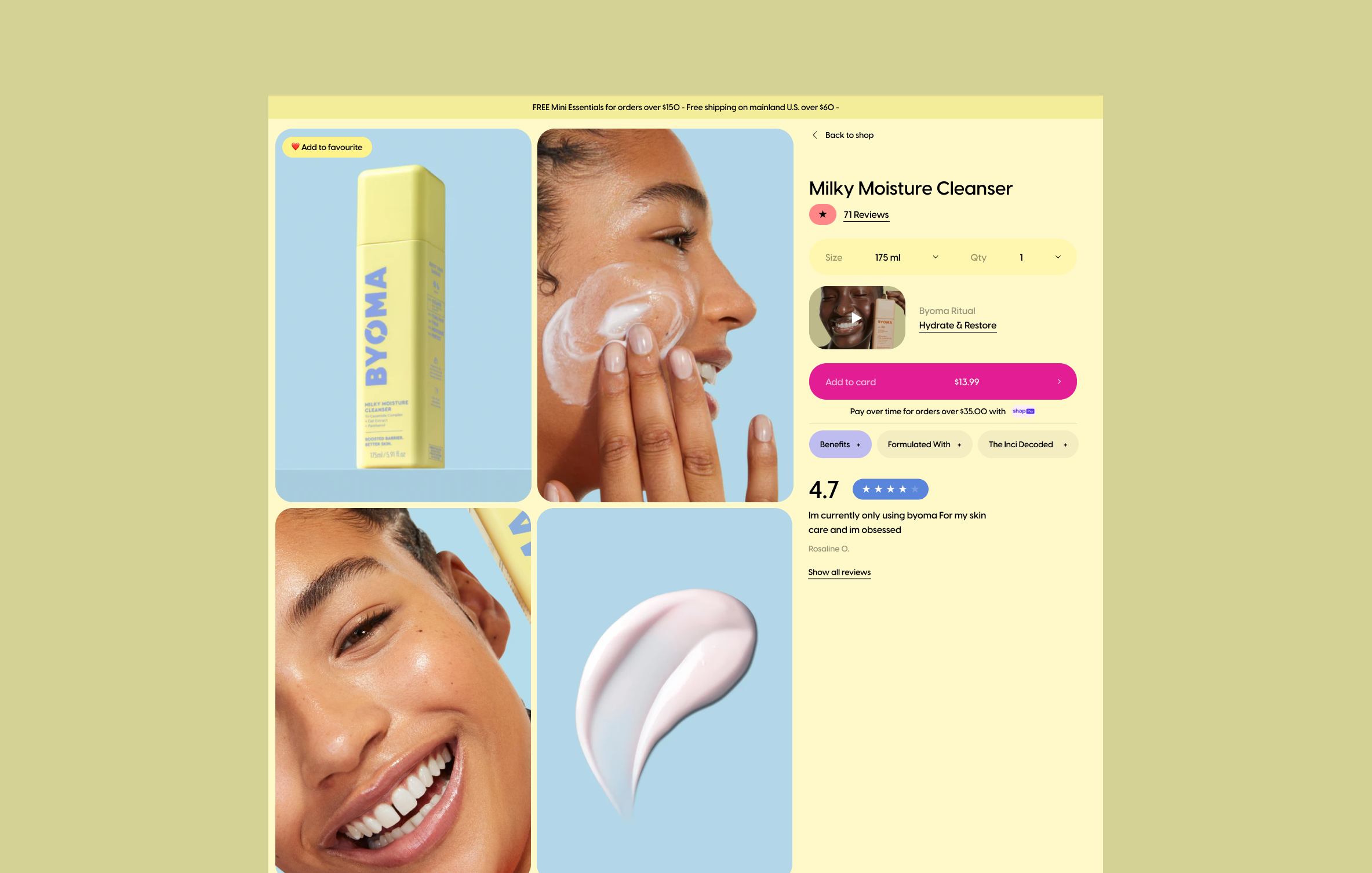
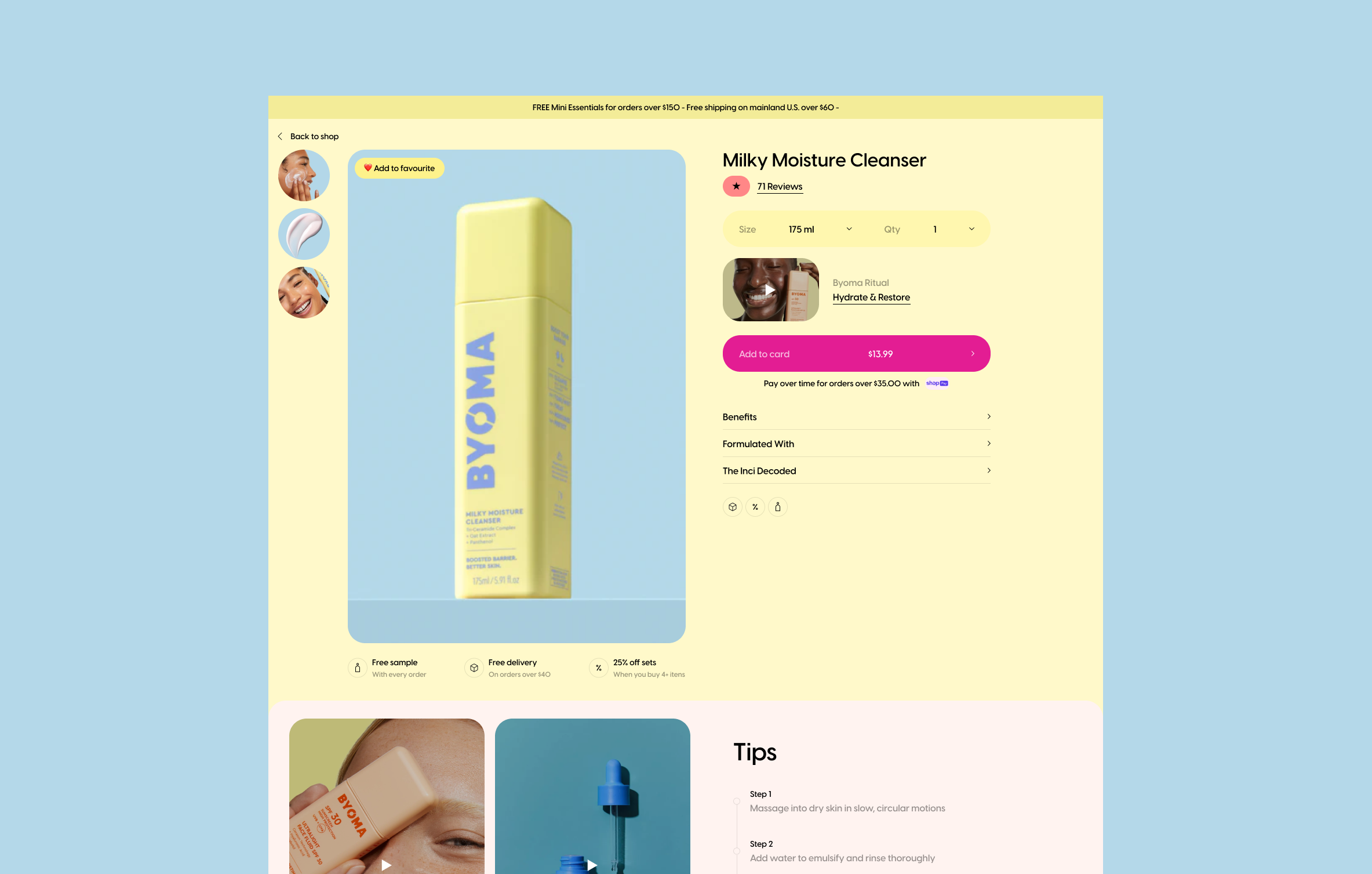
BYOMA is a bold skincare brand with a strong visual identity and a wide product range. While the brand was highly recognizable, the homepage experience was difficult for first-time users. An abundance of colors, sections, and competing visual elements made it hard to understand where to start, how products related to each other, and how to build a routine. The experience felt loud, fragmented, and cognitively demanding, especially for new visitors.

Problem

The core issue was not traffic or product quality, but structure and perception. The homepage lacked a clear hierarchy and visual focus. Navigation was overloaded and required too much decision-making early in the journey. Too many sections carried equal visual weight, and color saturation amplified the feeling of chaos rather than clarity. As a result, users struggled to orient themselves, product logic was unclear, and engagement dropped early in the session.

What I owned

As a Senior Product Designer and Product Lead, I owned the homepage and navigation redesign end to end. My responsibility covered information architecture, homepage sequencing, navigation logic, visual hierarchy, and the overall clarity of the first-time user experience. The goal was to reduce cognitive load while preserving the brand’s bold visual character.

• Store

Outcome

+ %

percent increase in average on site engagement duration

+ %

percent increase in scroll depth

+ %

percent increase in interactions with routines and sets

+ %

percent increase in product discovery from the homepage

Key decisions

I simplified the homepage structure to create a clear and readable flow instead of a dense visual collage. I reduced competing sections and reordered content based on user intent rather than brand messaging. Navigation was reorganized to make product discovery more intuitive and predictable. Visual noise was intentionally reduced by limiting color competition and restoring focus to key entry points. Routines, sets, and bundles were surfaced more clearly to help users understand how products work together. The homepage was reframed from a visually loud showcase into a guided experience that helps users orient themselves quickly and confidently.

Impact

During pre-launch testing, the simplified structure and clearer navigation led to a 48 percent increase in average on-site engagement duration. Scroll depth across the homepage increased by 32 percent, indicating stronger content comprehension and flow. Interactions with routines and sets grew by 27 percent, and product discovery from the homepage increased by 21 percent. Early session drop-off was reduced, particularly among first-time visitors, confirming that improved clarity directly translated into better engagement.

• PDP