Loading, please wait..

Online furniture store

• 1,280 elements of UI

How I restructured a complex furniture eCommerce interface into a clear, hierarchy-driven system that improves navigation clarity and buying confidence.

Context

Castlery is a furniture eCommerce brand with a wide catalog and layered category structure. The store had strong products and solid brand foundations, but the interface lacked a clear visual hierarchy. Too many elements competed for attention, color was decorative rather than functional, and navigation required cognitive effort instead of guiding users intuitively.

Core Problem

How to simplify and restructure a visually heavy interface into a clear, hierarchy-based shopping system that improves subconscious navigation and decision-making.

Decision Logic

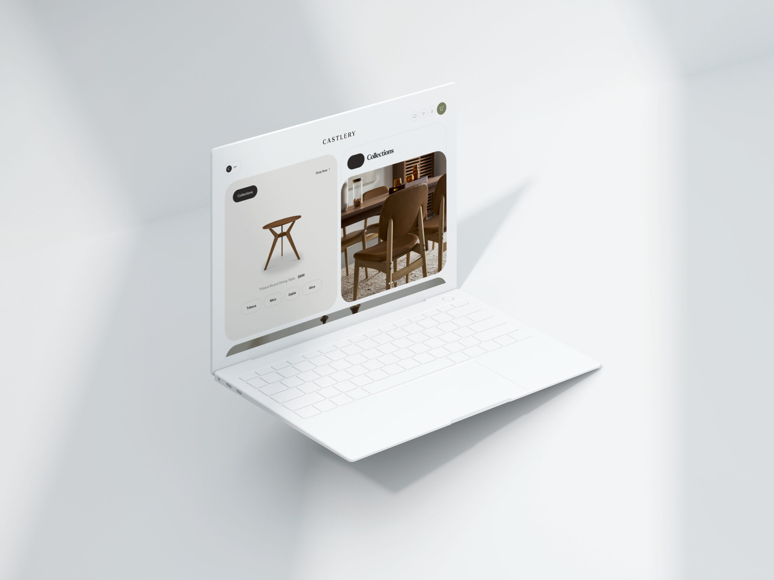
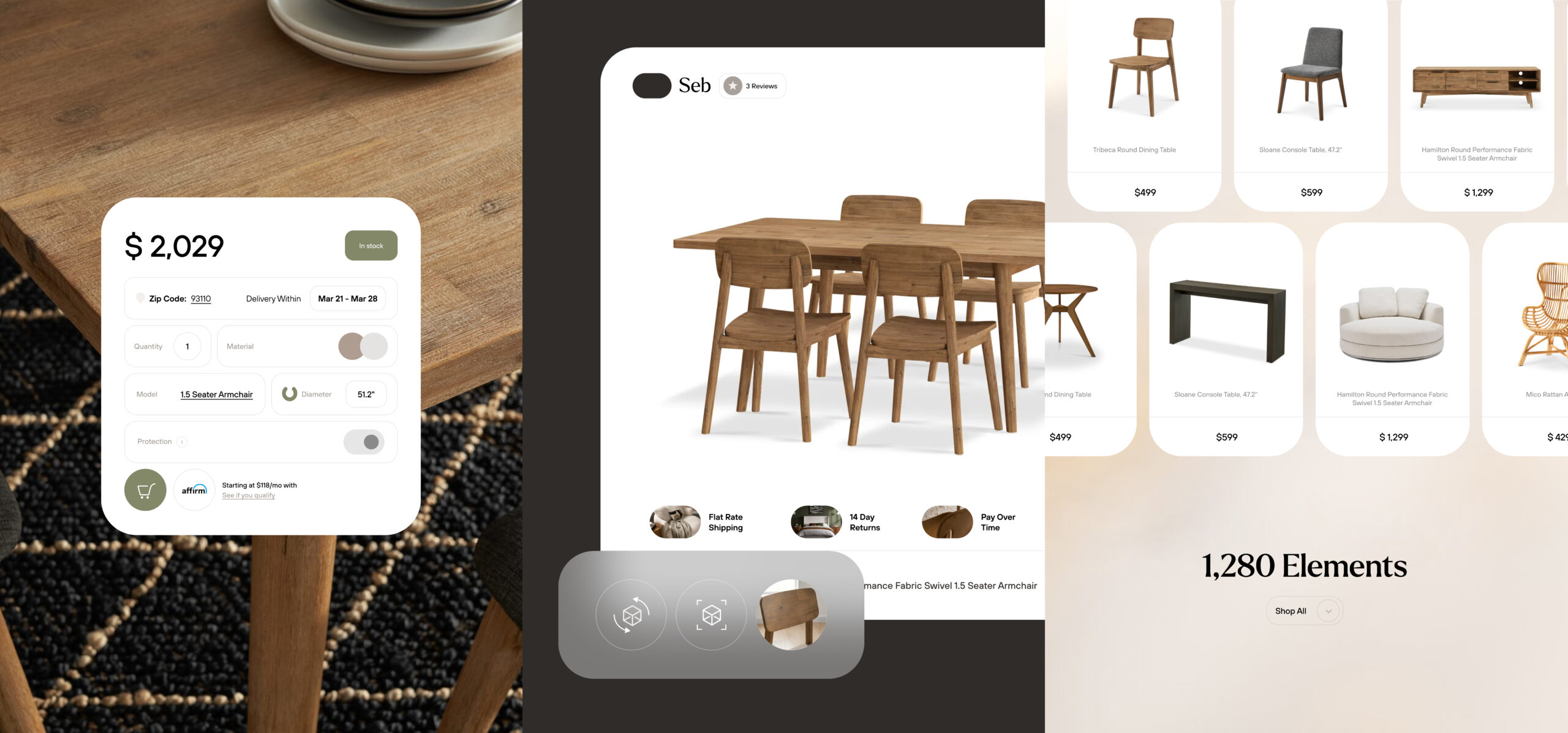
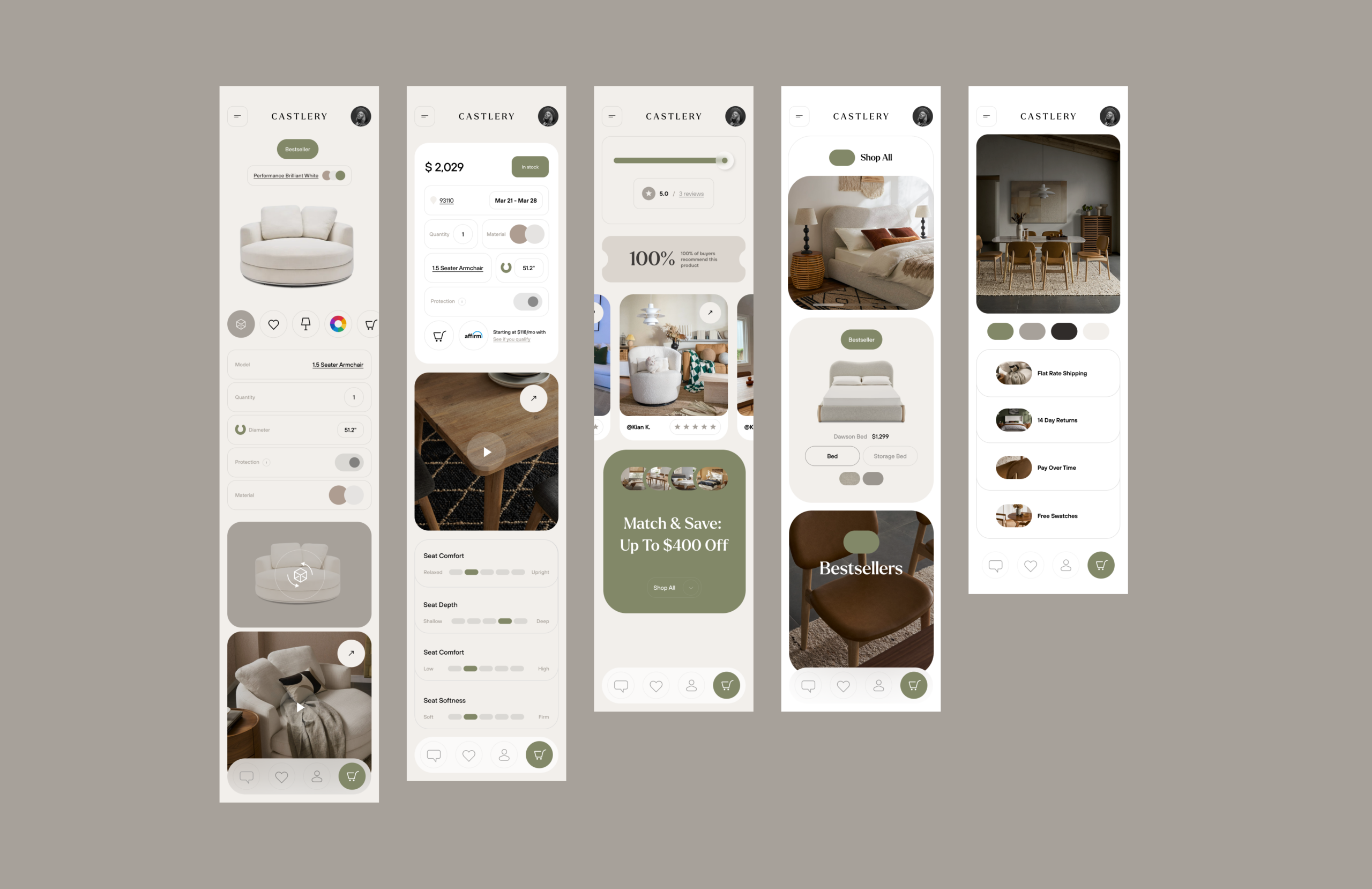
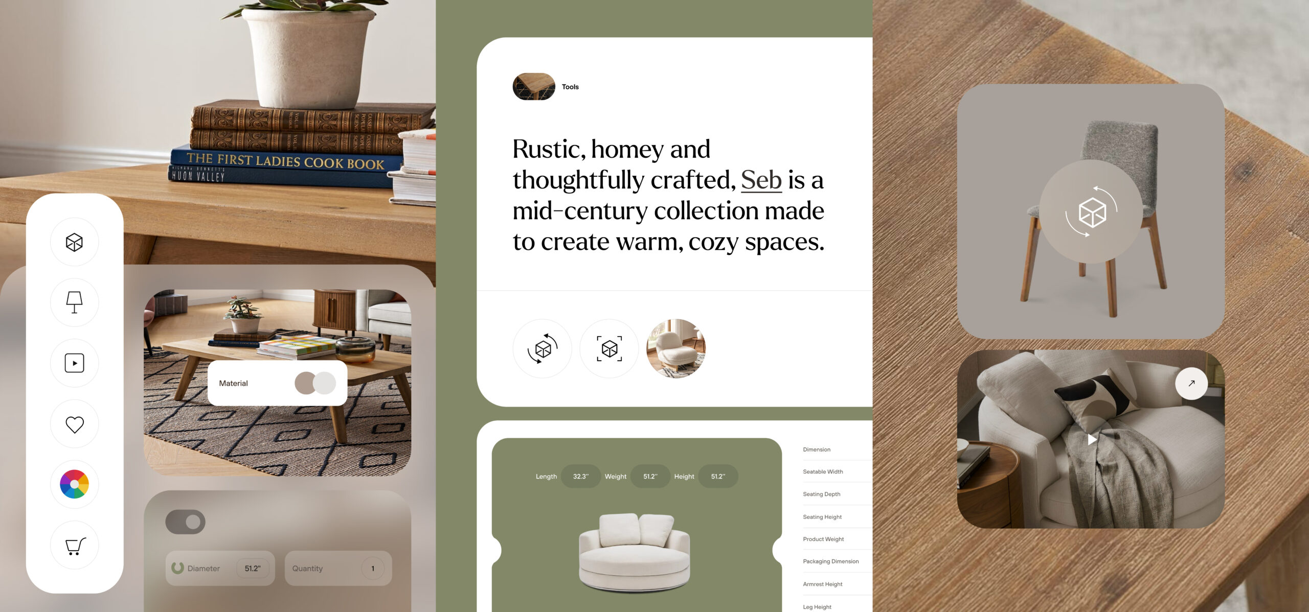
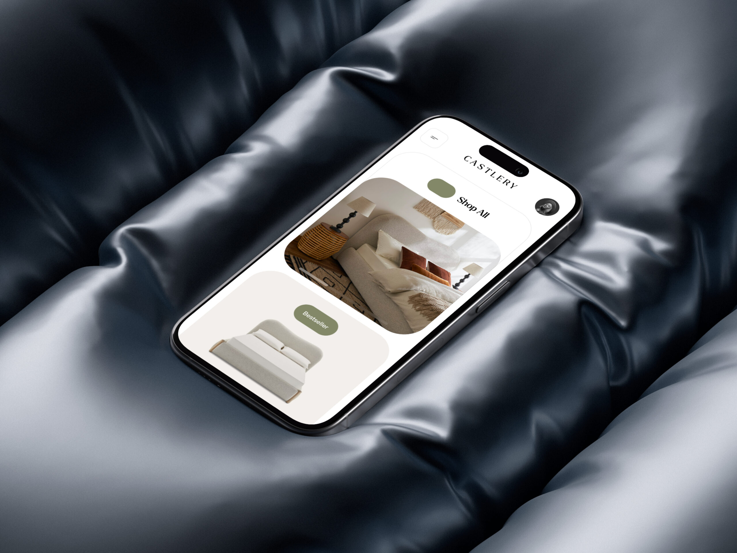
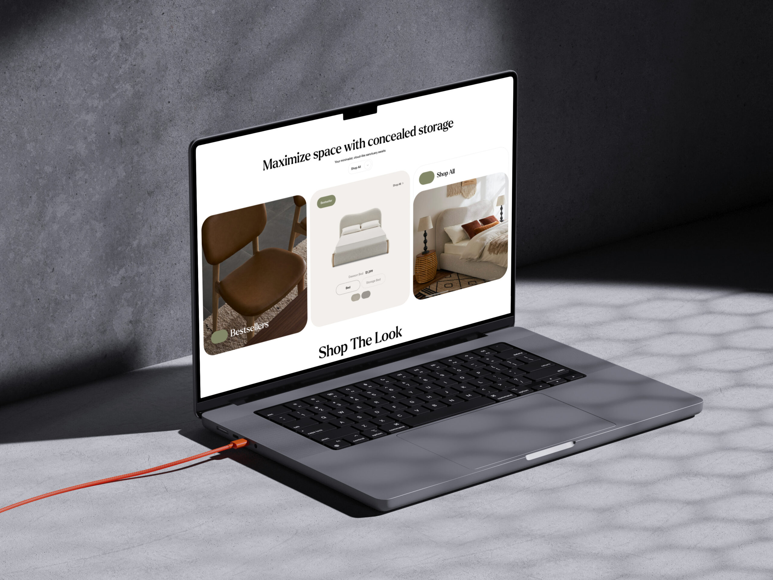
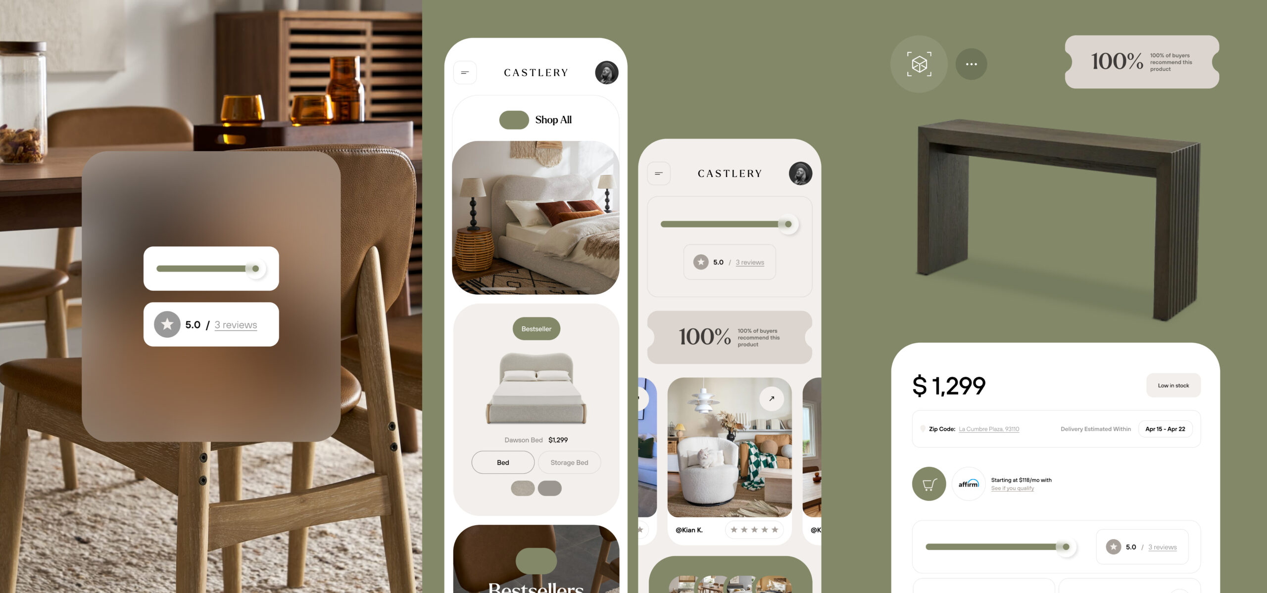
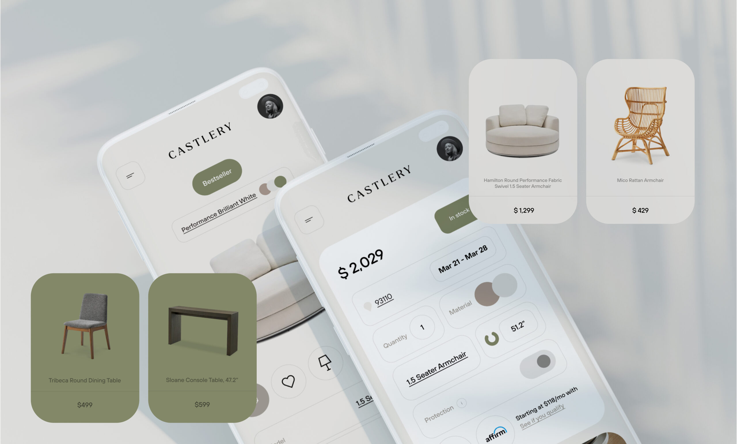
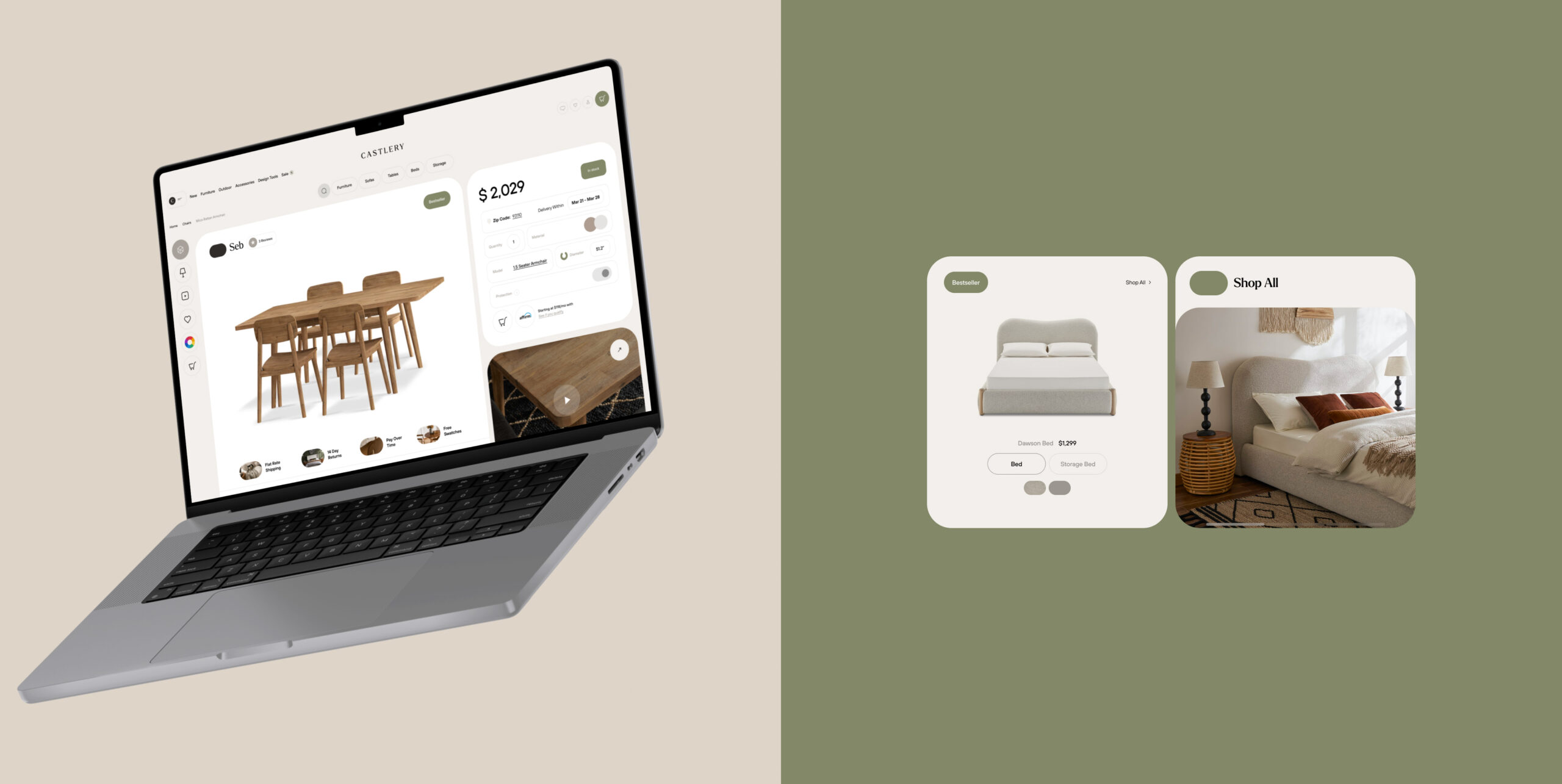
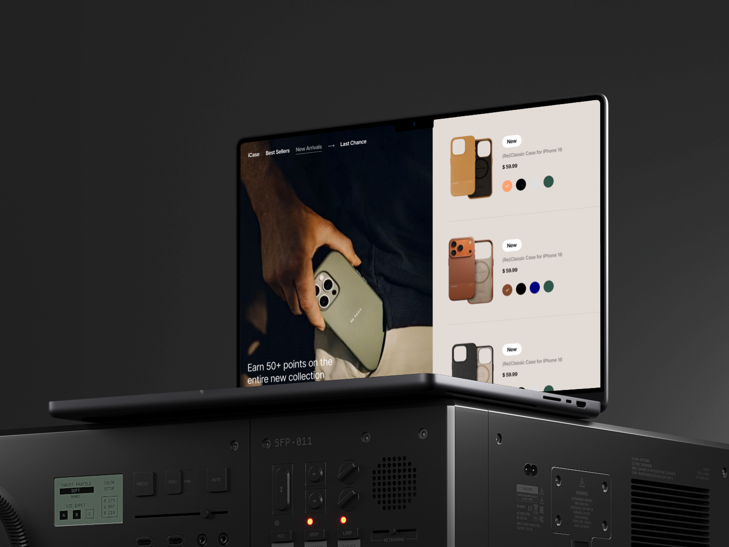
I reduced the interface to first- and second-priority elements only, removing all third- and fourth-priority visual noise to test clarity and efficiency. I transformed color into a navigational language that helps users identify departments and subcategories at a glance. Typography, spacing, and shapes were recalibrated to create a predictable reading flow. The goal was not to add features, but to remove friction and create subconscious guidance through structure.

Product Move

I rebuilt the UI system around hierarchy. Category identification became color-driven. Navigation was simplified to reduce decision fatigue. Visual density was lowered to improve scanning. I introduced unique iconography and custom UI components, including dedicated elements for 3D furniture viewing, to strengthen clarity while elevating perceived product value. The redesign focused on structural simplification rather than surface decoration.

+ .5%

increase in product discovery efficiency

+ %

increase in time on site

+ %

increase in overall conversion rate

Metrics

The projected impact was an 18% improvement in product discovery efficiency, reflected in faster navigation between categories and deeper interaction with collections. The simplified hierarchy was designed to increase time on site by an estimated 12% percent and improve overall conversion rate by 8% percent due to reduced cognitive load.

Outcome

The store shifted from a visually dense catalog to a structured commerce system. Navigation became intuitive, category logic became visible, and the interface supported decision-making rather than competing with it. The product experience moved closer to a luxury-perceived, systemized eCommerce environment.