App for local coffee shop
• +87% faster path from menu browse to a confirmed order
How I designed a premium coffee ordering app for a local new coffee shop in Los Angeles.
Context
Chakra is a premium local coffee shop in Los Angeles that wanted to turn in-store loyalty into a fast, repeatable digital ordering habit. The client had only a name and a few visual references — no logo, no brand system, and no product structure. The goal was to build a lightweight ordering experience that feels premium, works fast on mobile, and supports pickup, delivery, and loyalty in one flow.
Problem
Coffee ordering is time-sensitive and habit-driven. Without a clear IA and a “reorder-first” structure, users drop off when menus feel long, customization is hidden, and checkout takes too many steps. The shop also needed delivery logic (including a minimum threshold) and group ordering, without turning the product into a cluttered marketplace. The biggest risk was building something visually beautiful but operationally slow — which would kill repeat usage.
What I owned
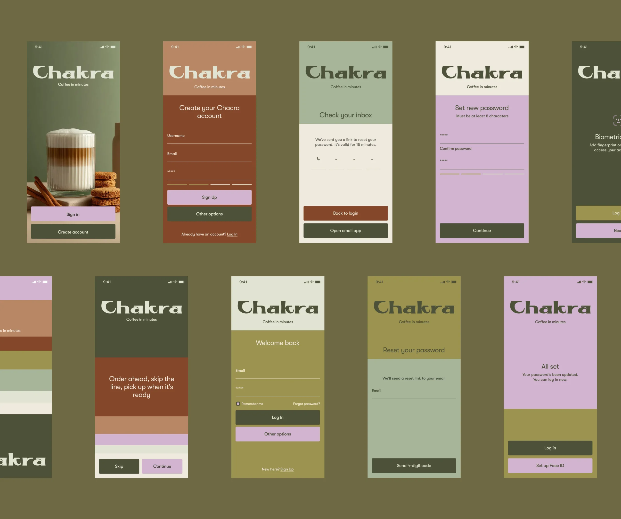
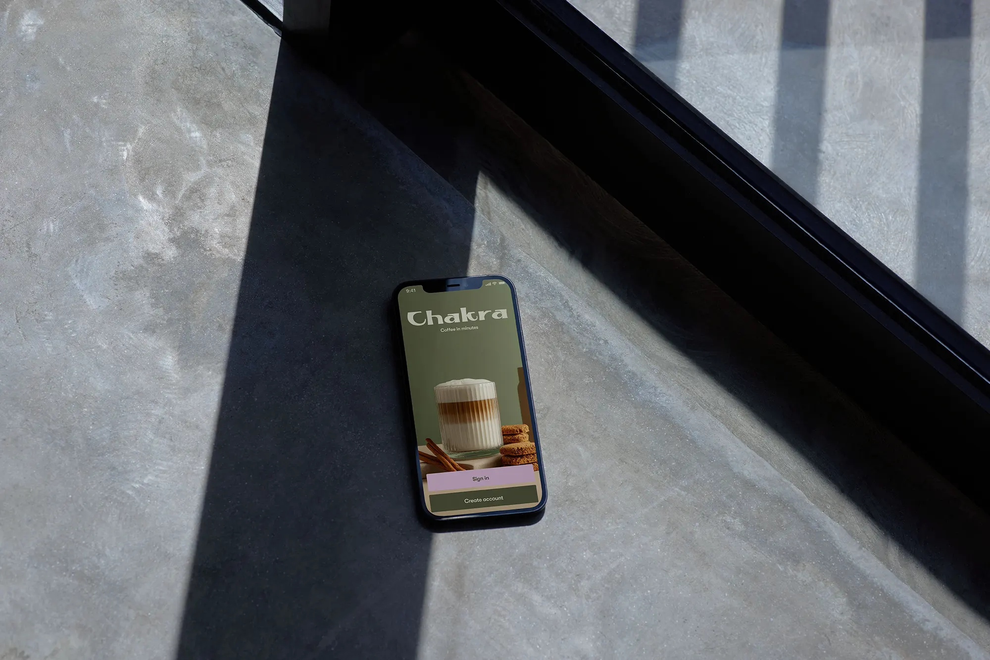
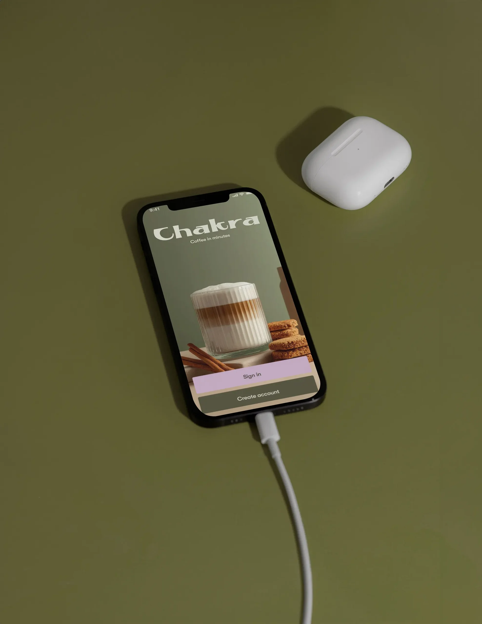
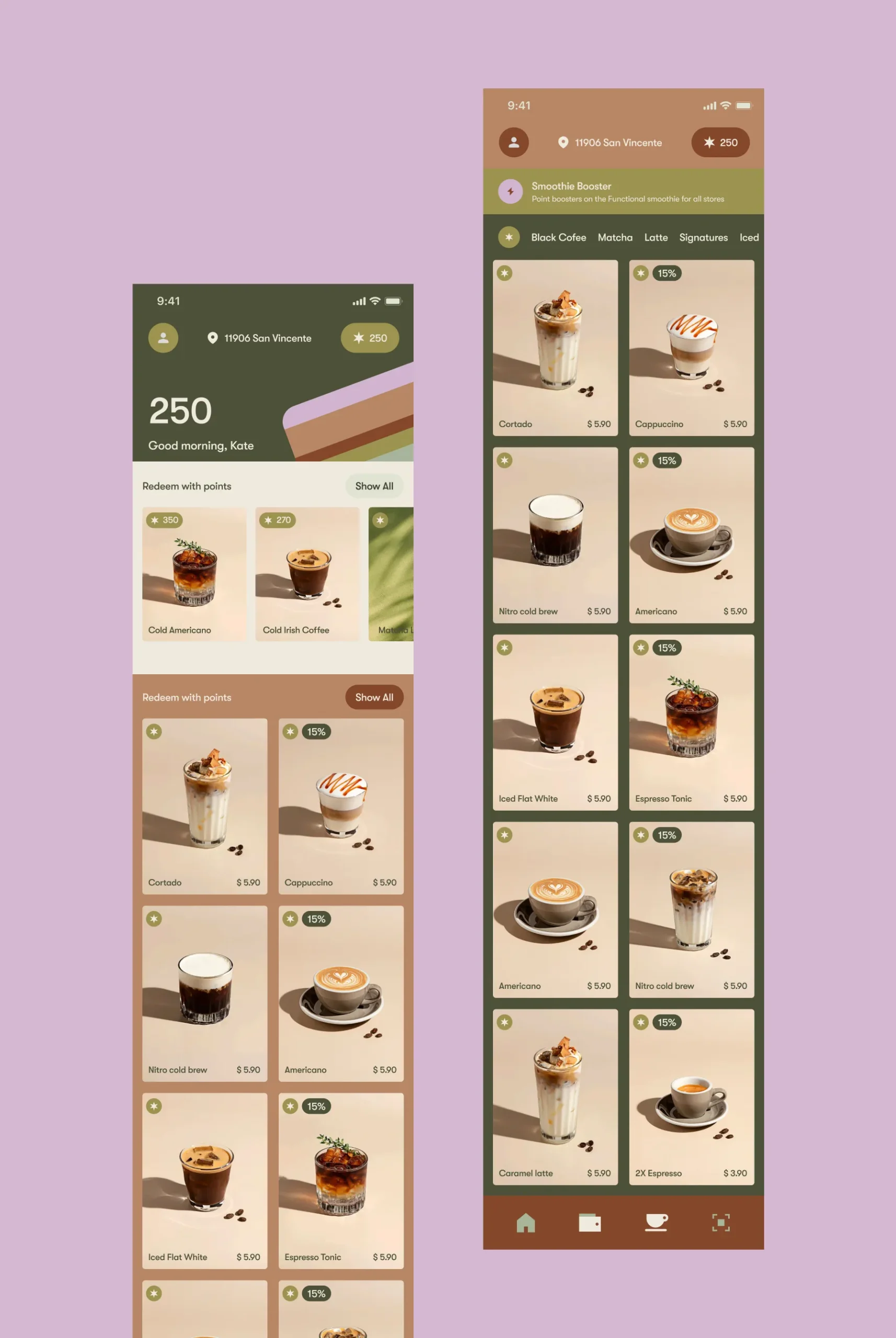
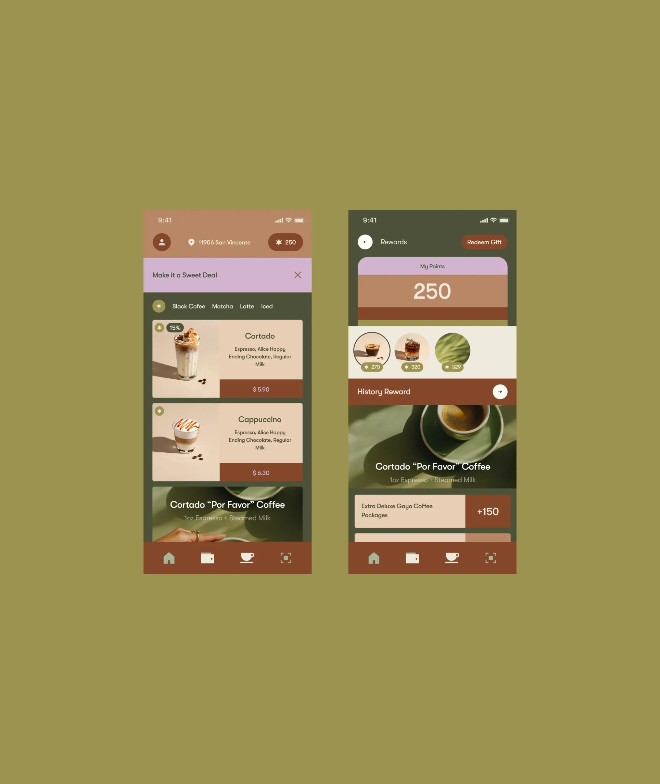
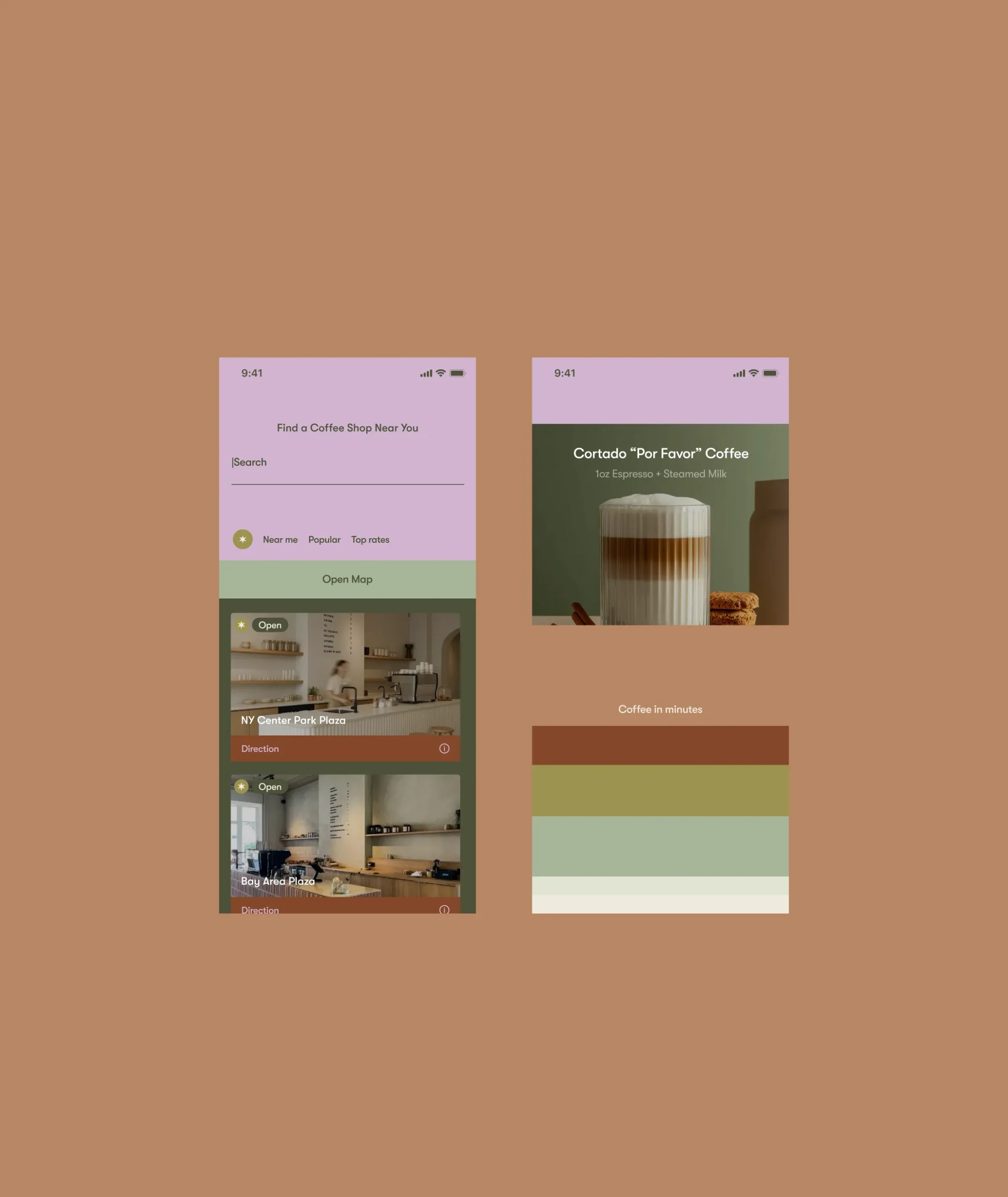
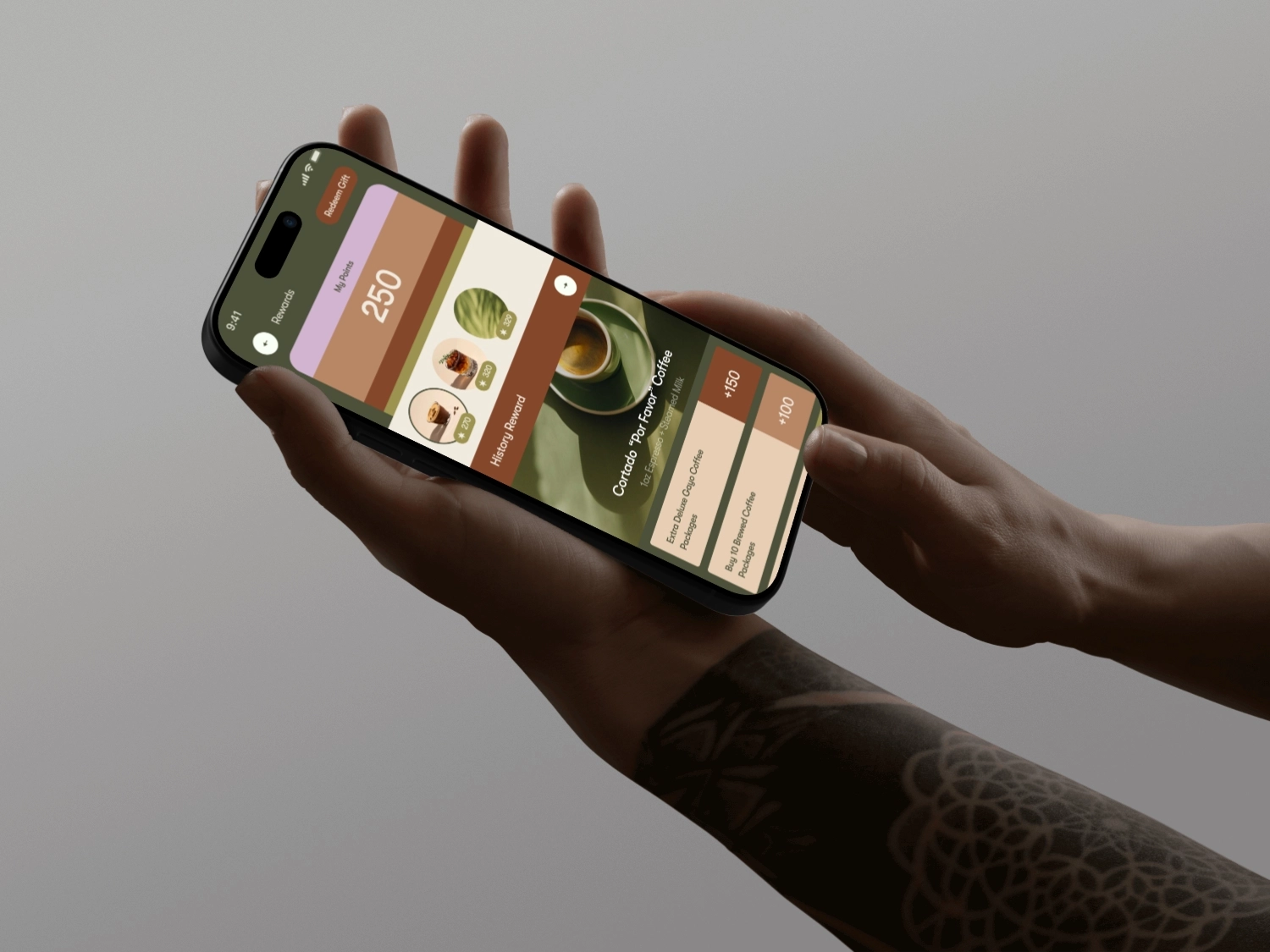
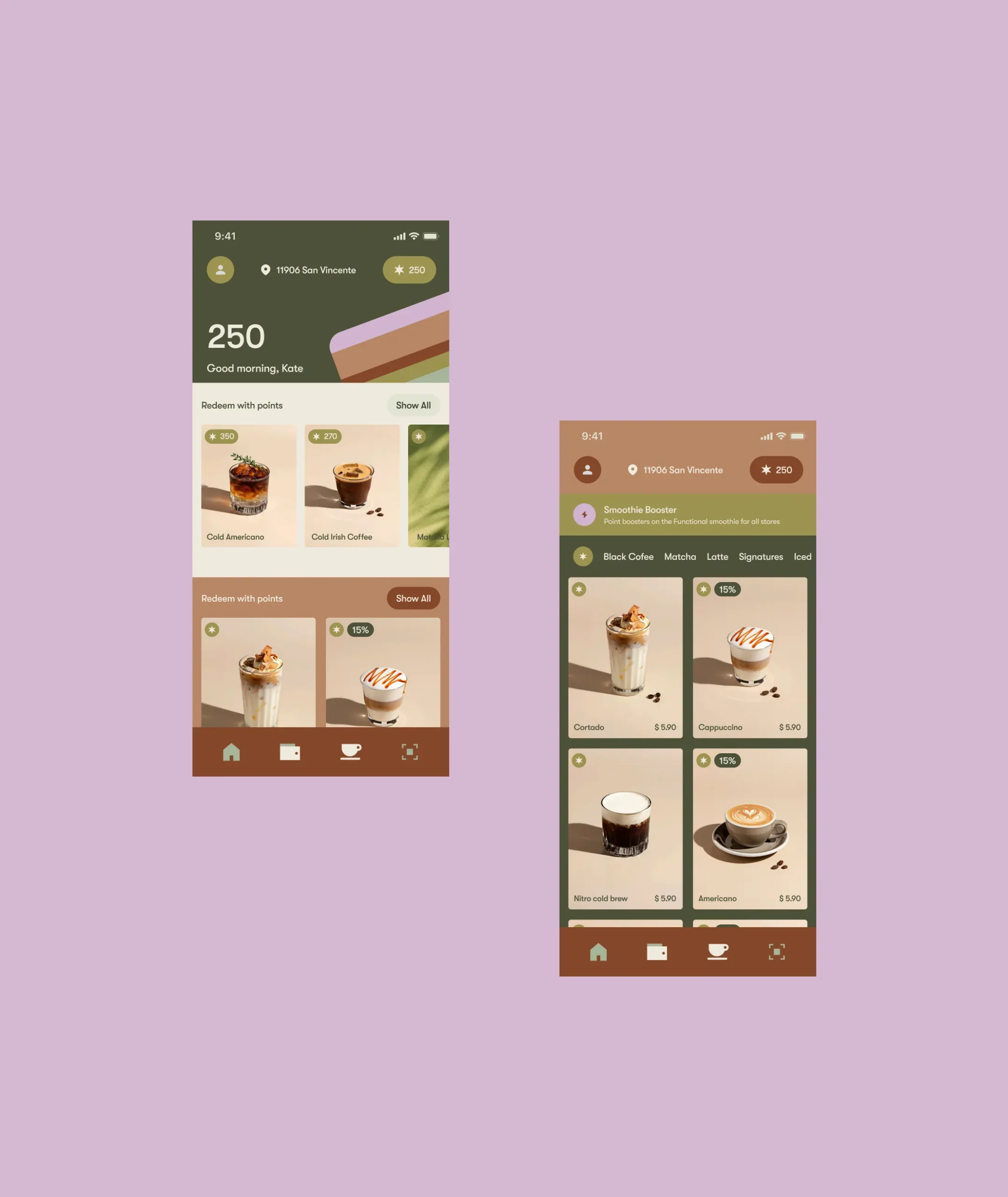
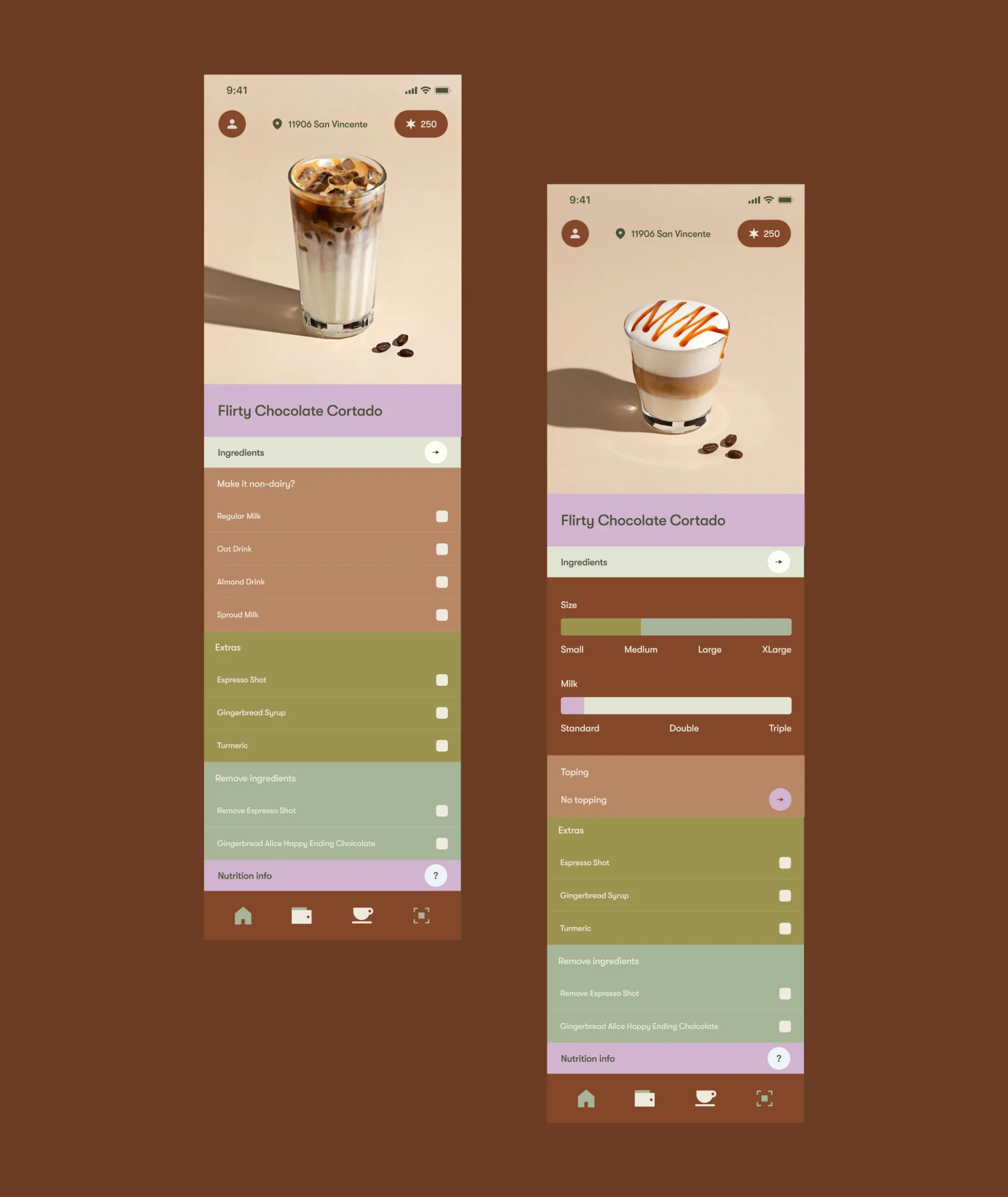
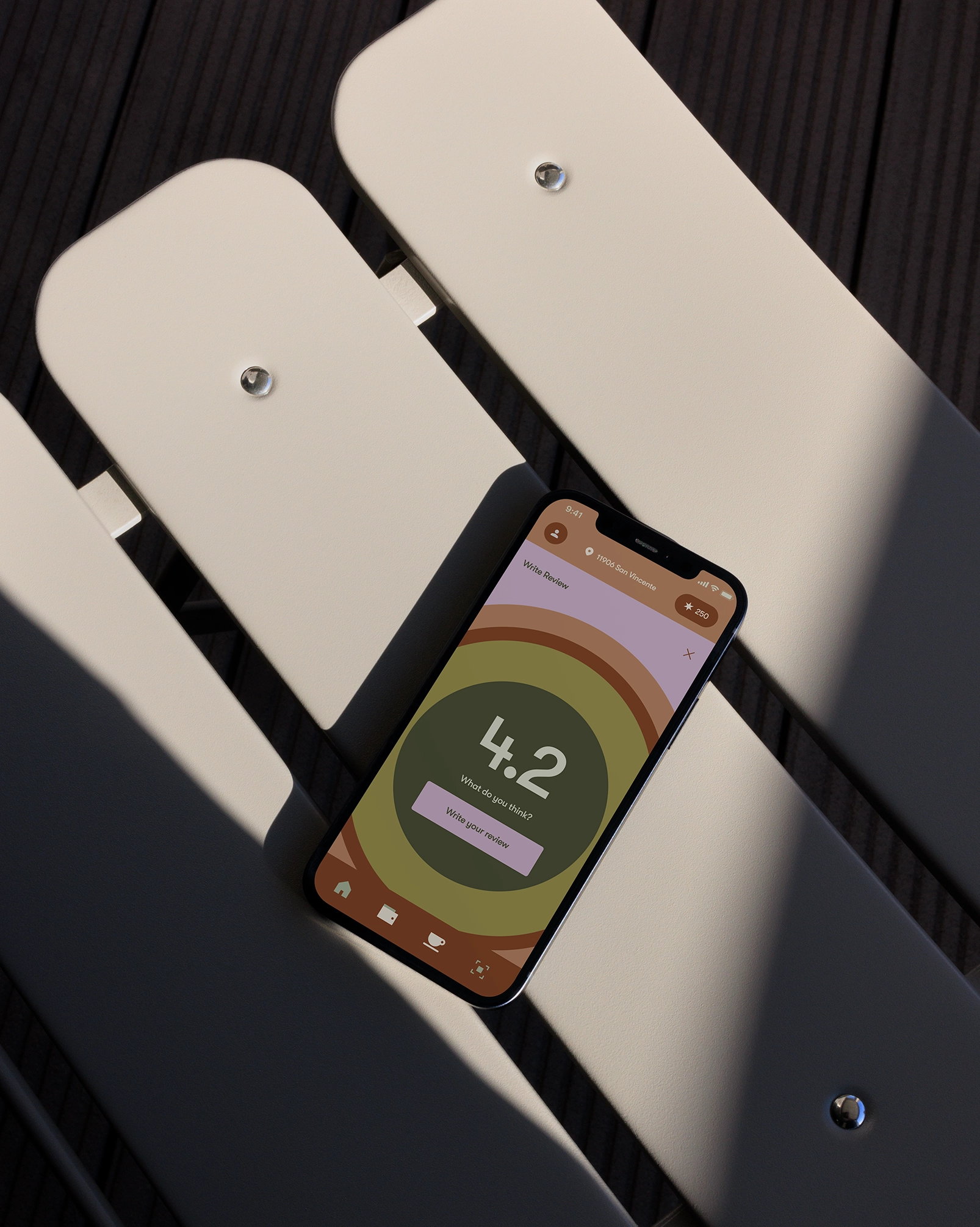
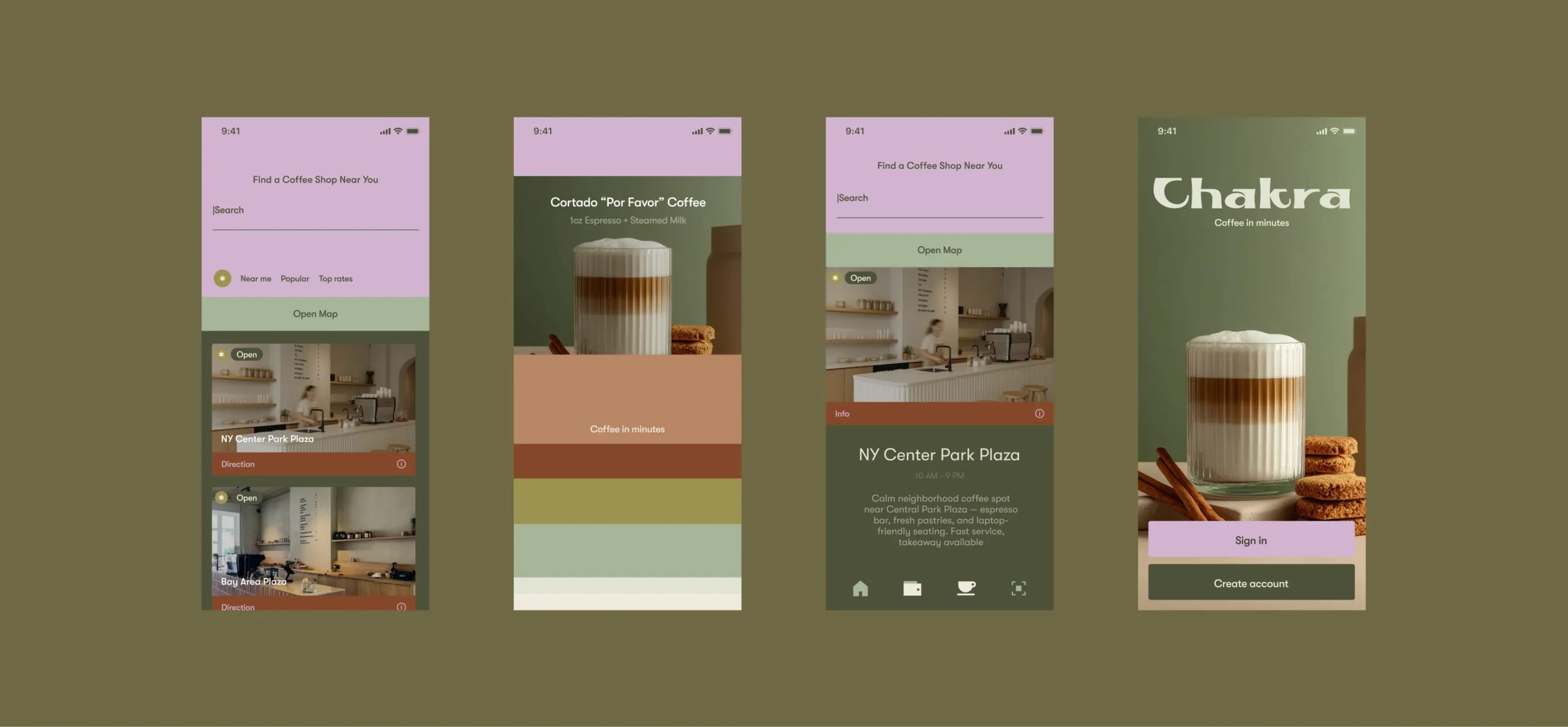
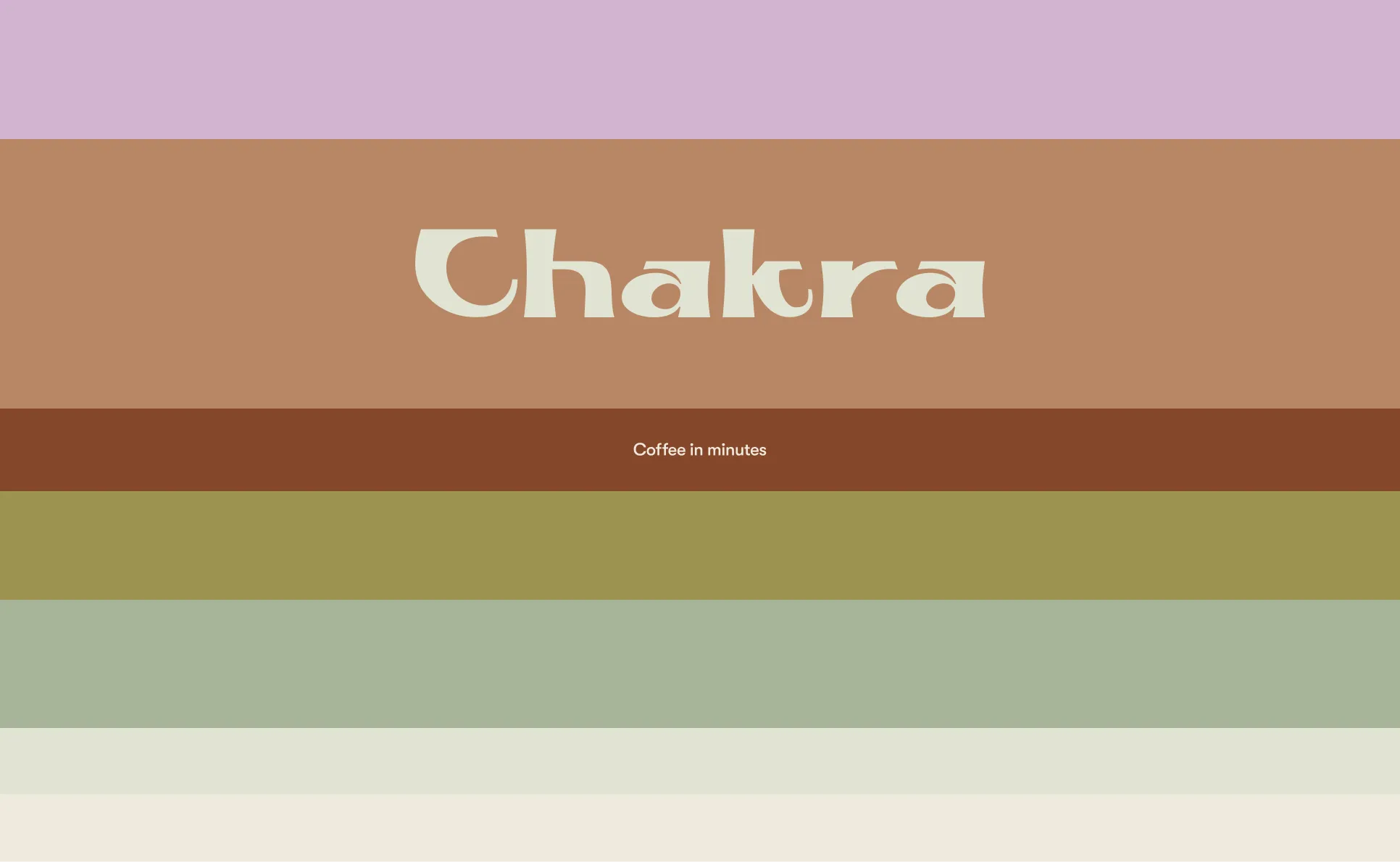
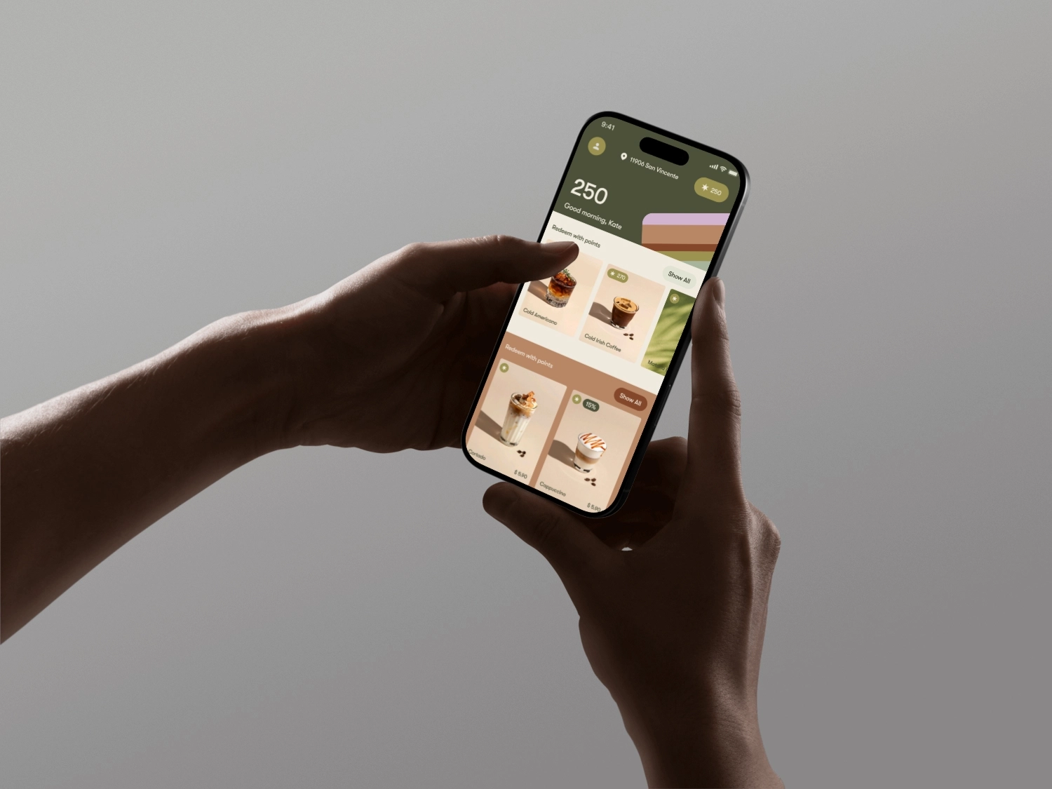
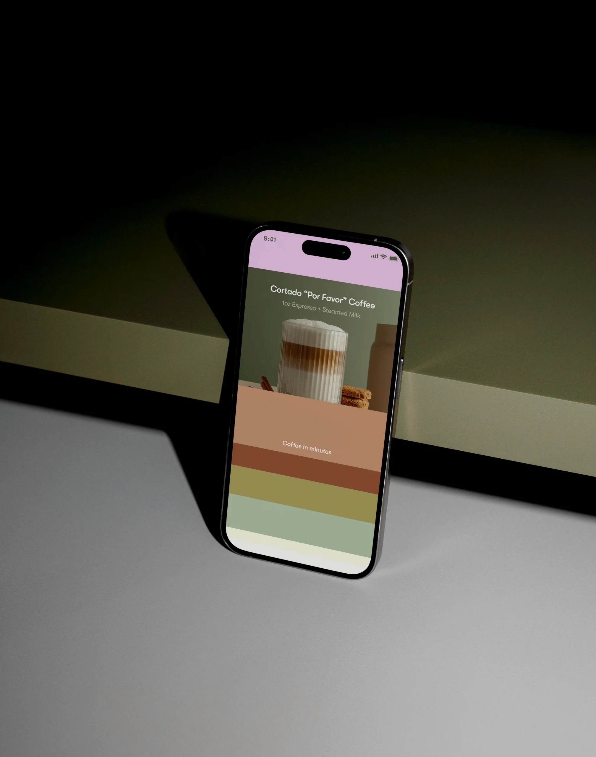
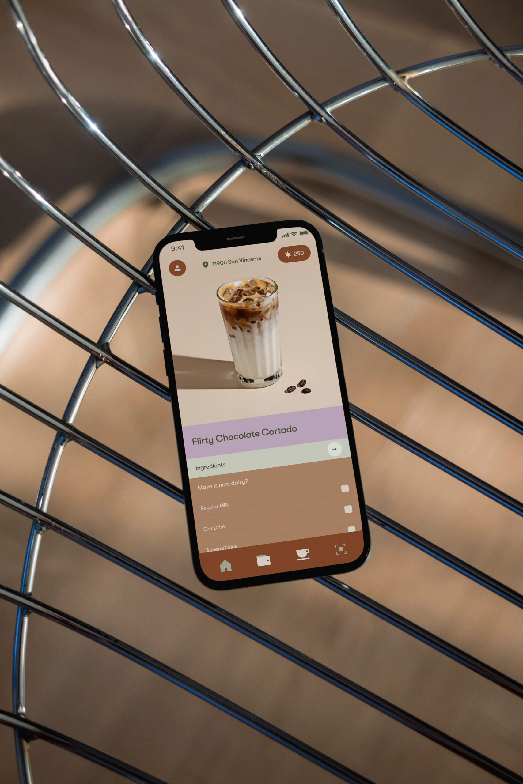
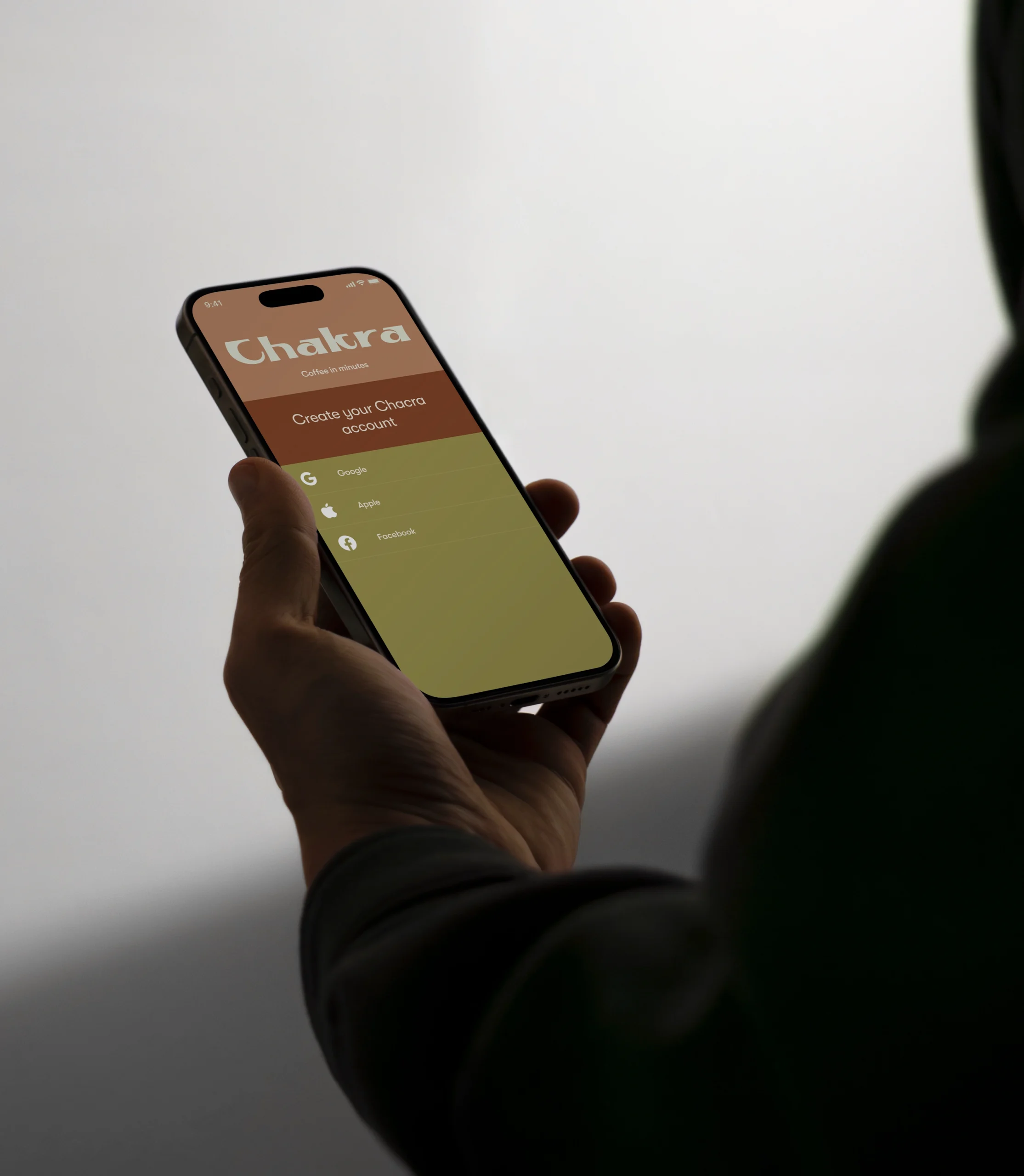
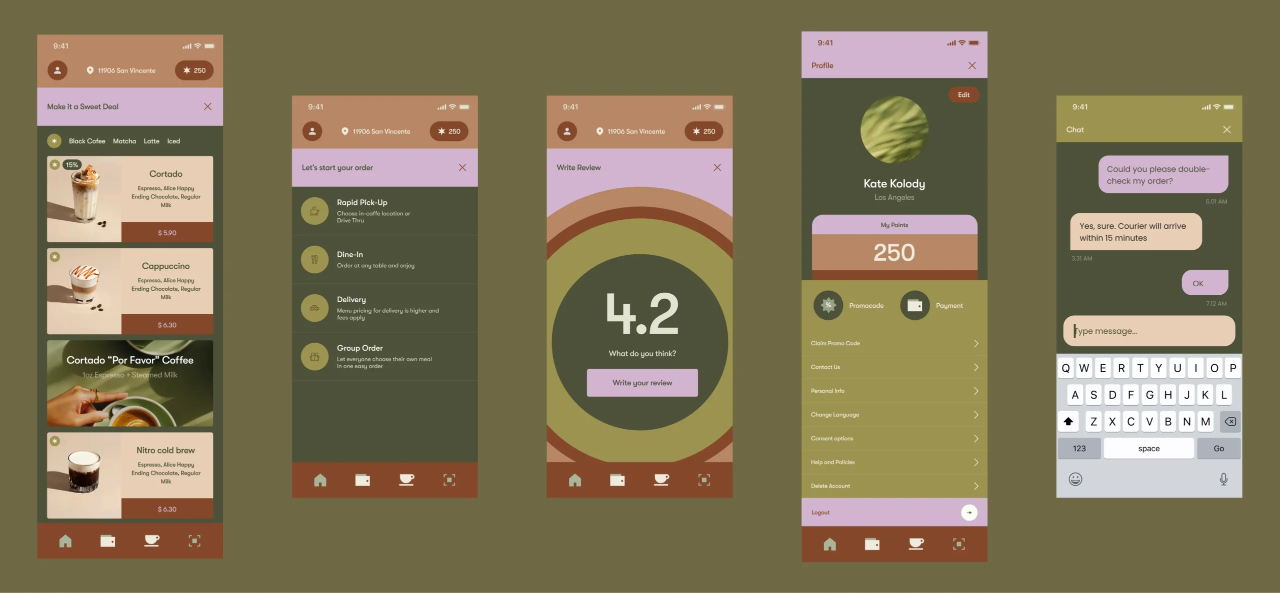
I owned the full product design and brand foundation from zero: brand concept, logo direction, visual system, UX research of comparable premium coffee apps, information architecture, menu and category logic, product card behavior, customization rules, pickup vs delivery vs group order flows, cart mechanics, checkout structure, and the loyalty program UX (points, redemption, and rewards surfaces).
path from menu browse to a confirmed order
increase in repeat purchases driven by a reorder-friendly menu + visible rewards.
fewer checkout drop-offs after separating pickup vs delivery logic upfront
Key decisions
I designed the app as a “coffee in minutes” product — optimized around speed, recognition, and repeat behavior. The menu was structured as a scannable grid with clear category segmentation and visual hierarchy anchored by product imagery. I kept customization lightweight and progressive (only when needed), so users could add-to-cart without entering a long configuration tunnel. I separated order modes early (pickup, delivery, group order) to prevent late-stage friction, and I made delivery constraints explicit to avoid checkout surprises. Loyalty was integrated as a behavior driver, not a separate page: points visibility, redeemable rewards, and “deal” prompts were designed to feel premium, not pushy.
