2007 — 2026©
(Los Angeles, CA)
Hi, I'm Kate
Senior Product Designer focused on e-commerce, growth, and conversion for DTC brands, subscription products, and digital marketplaces. I design scalable, conversion-driven experiences that combine UX strategy, business logic, and data-informed decisions.
Top skills
Product Design
Saas/MVP
Branding
Growth Design
E-commerce
Digital Product Design
Tools
Figma
Sketch
Adobe CC
HTML, CSS
Google Analytics
Hotjar
Shopify
WordPress
AI Tools
Graphic design
Professional photography
Video Production
2007 — 2026©
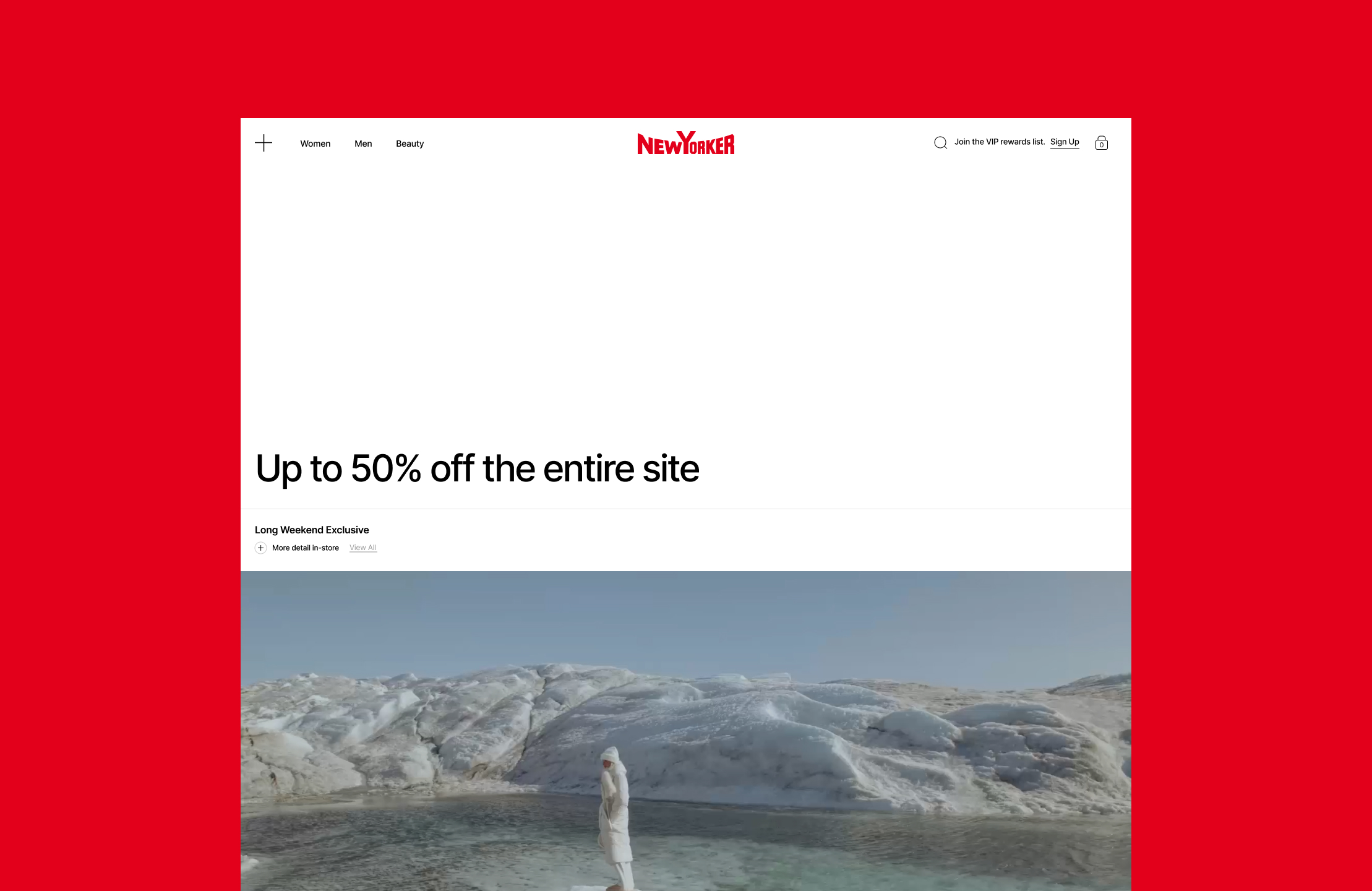
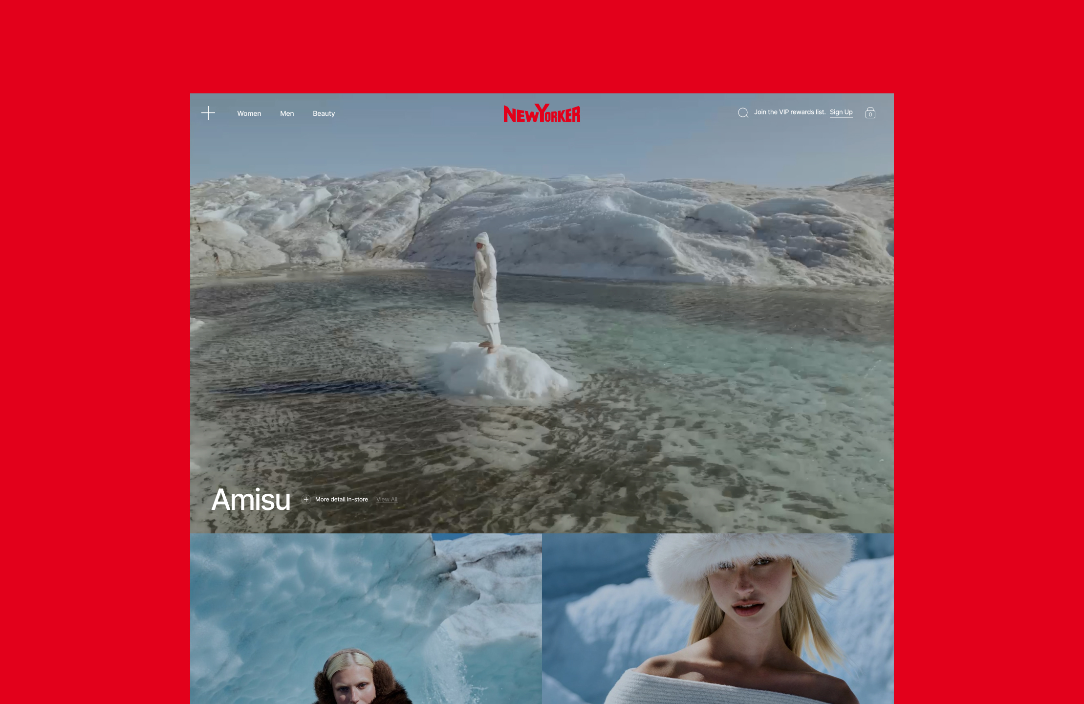
NewYorker
• +24% average session duration
Website reconstruction
How I redesigned the core UX system, built a scalable UI kit, and simplified navigation across homepage, collections, and mobile flows for a high-traffic fashion e-commerce platform.
Context
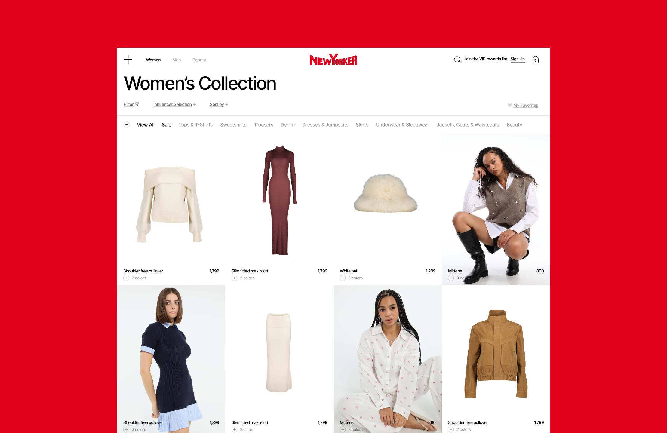
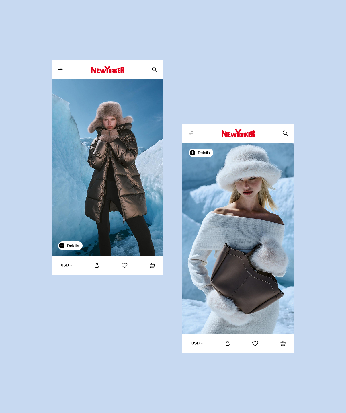
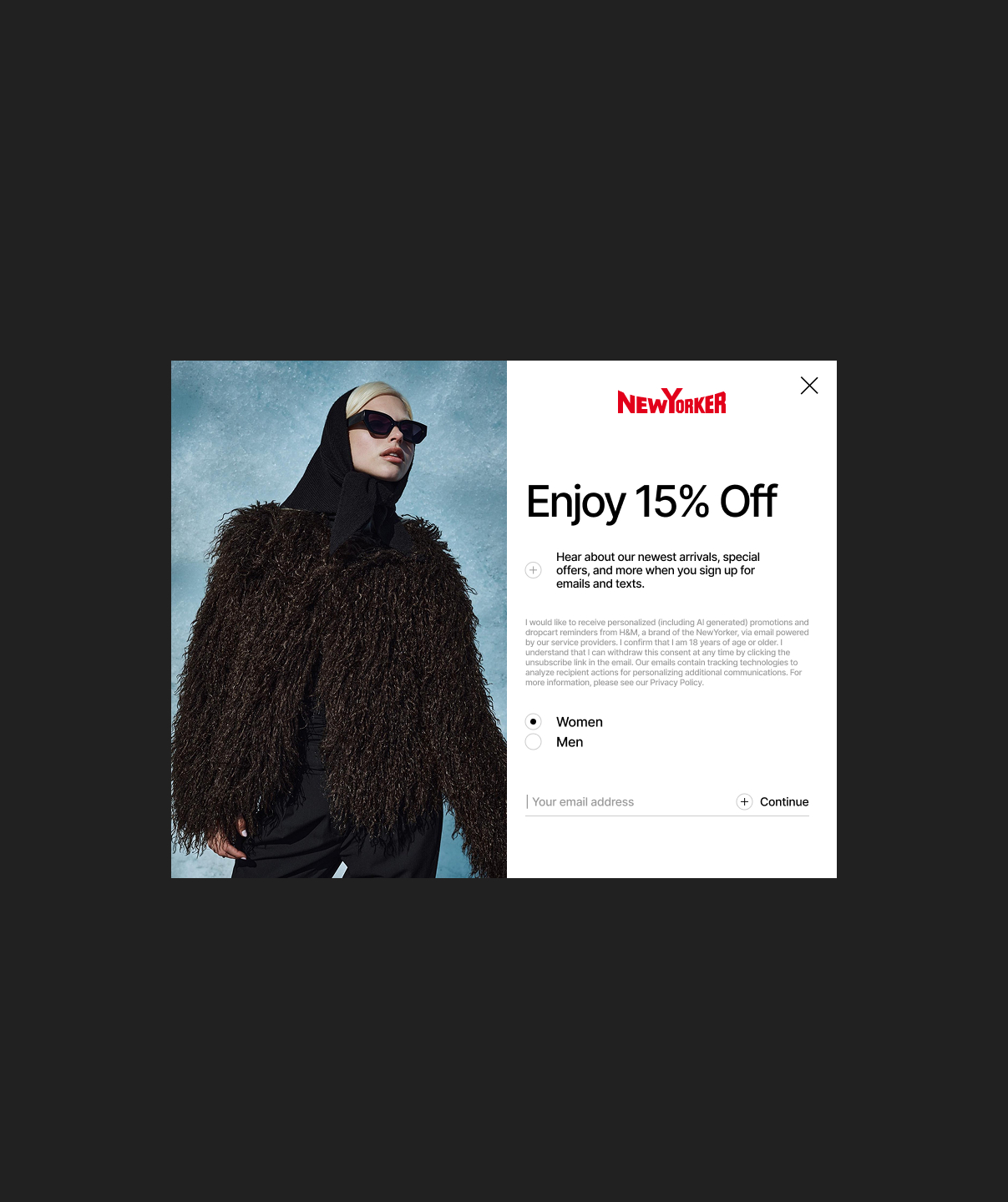
New Yorker is a large-scale fashion retailer with high content turnover, frequent promotions, and complex category structures. The existing website felt visually heavy, inconsistent across pages, and difficult to navigate, especially on mobile. The primary business goal was to improve usability, make the interface cleaner and more intuitive, and create a scalable design system for future growth.
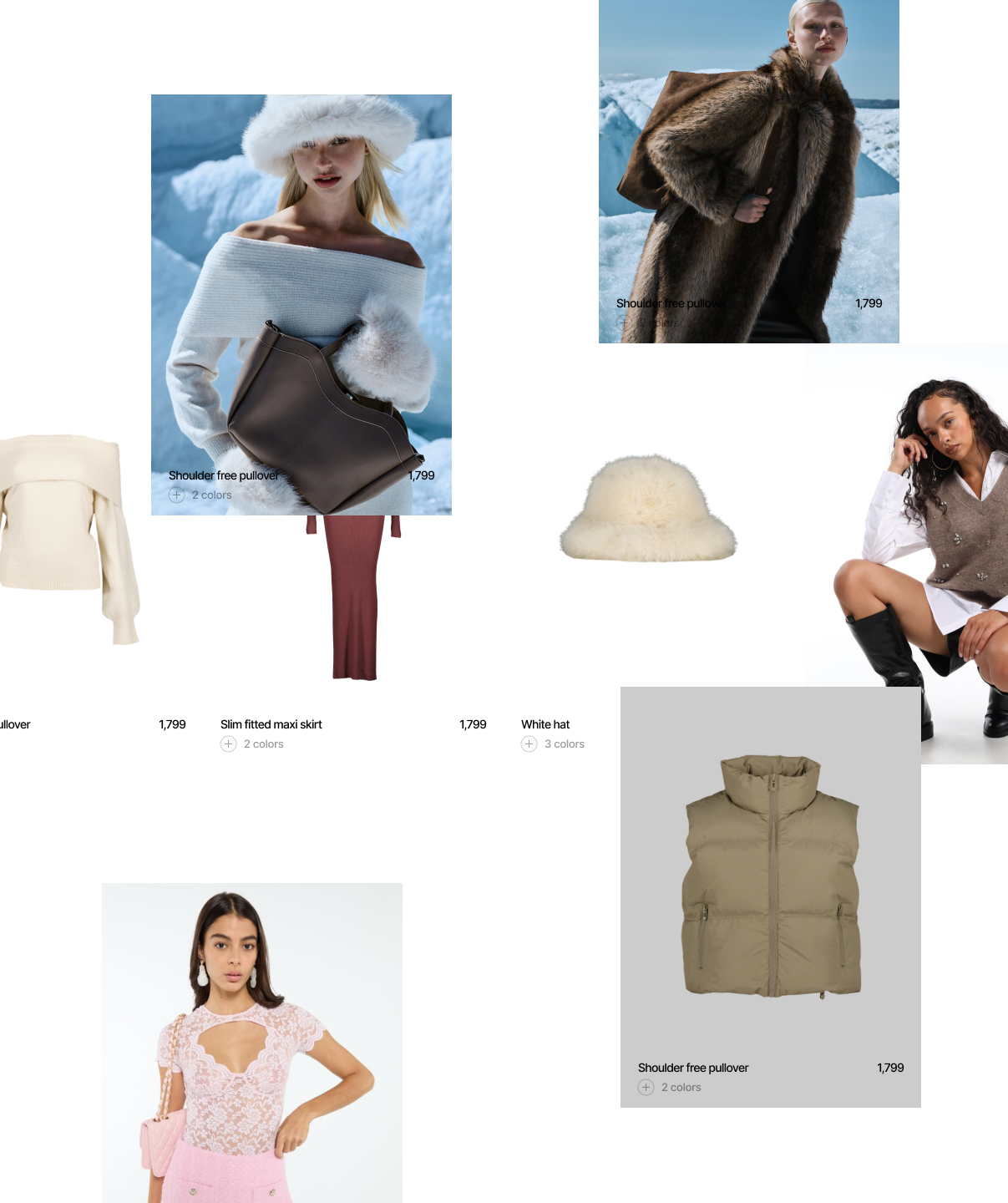
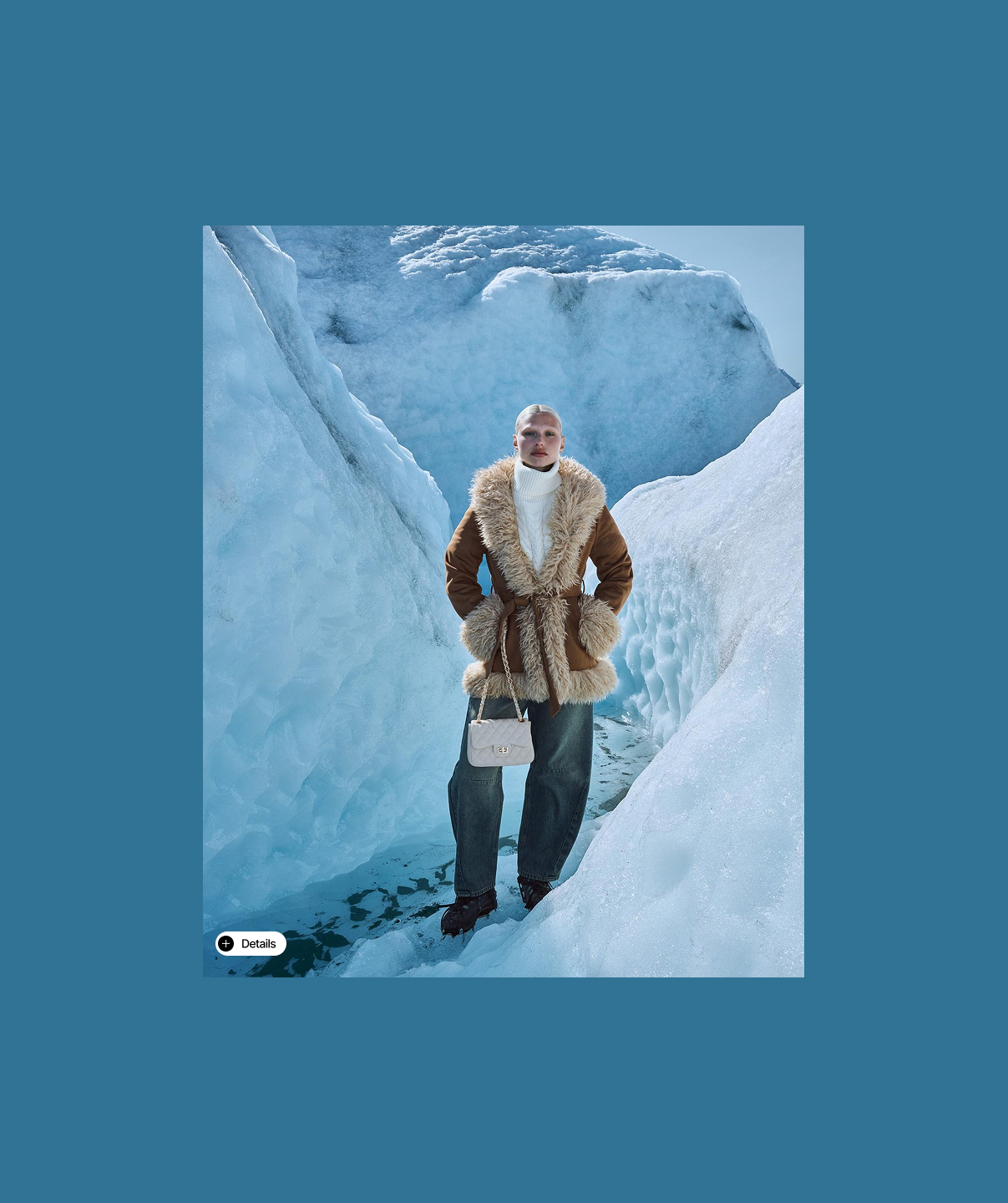
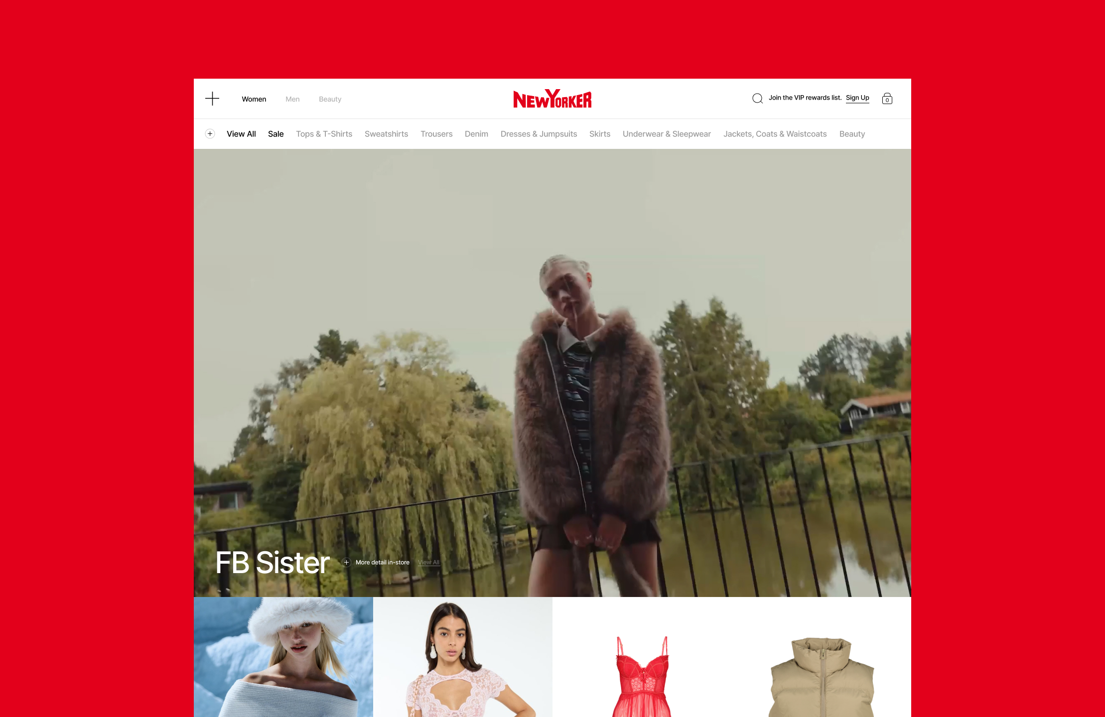
Homepage
Menu
Problem
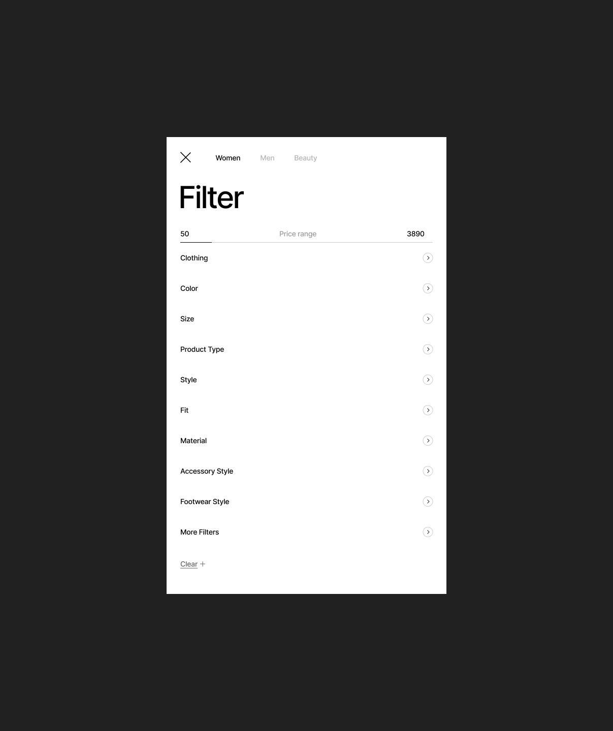
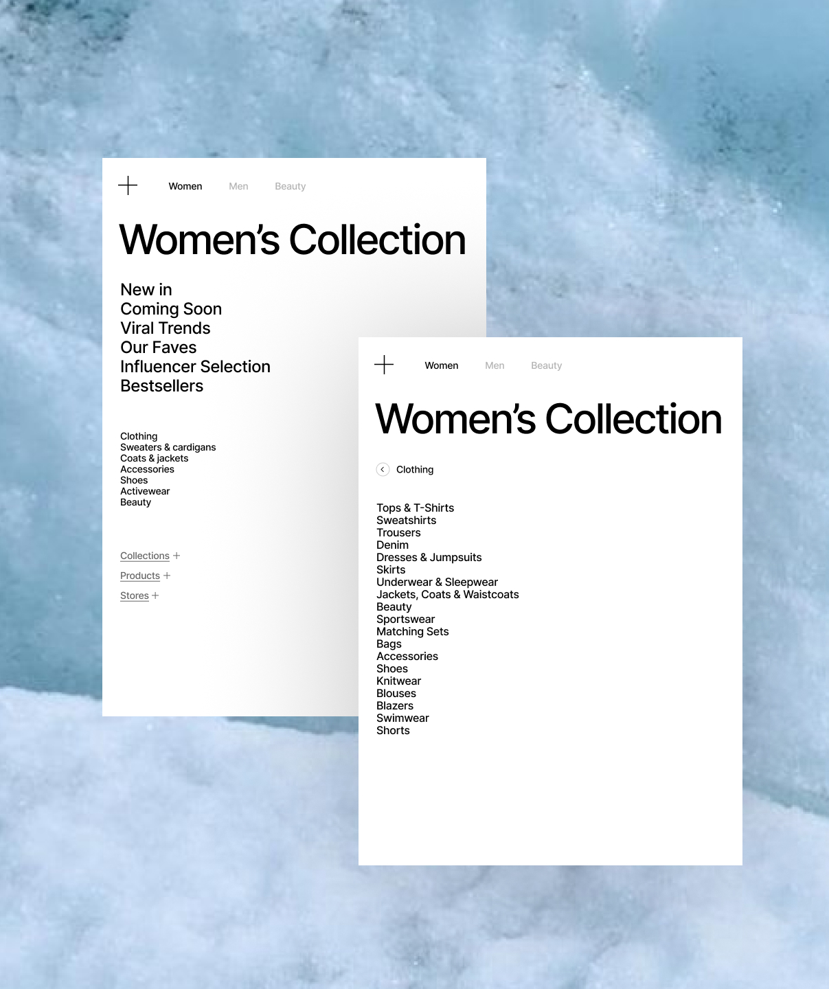
The interface lacked a unified UI system, which led to inconsistencies between homepage, category pages, and promotional collections. Navigation required too many steps, filters overloaded the visual space, and the mobile cart experience disrupted the browsing flow. The structure did not clearly support fast product discovery or seasonal campaign switches.
What I owned
I led the UI system redesign and structural UX improvements end to end. I created a unified UI kit, defined reusable components, and rebuilt structural templates for homepage, category pages, store listings, and promotional collections. I redesigned sidebar navigation to make category exploration clearer and faster. I restructured filters in collections by hiding them behind a cleaner interaction layer to reduce cognitive overload. I also redesigned the mobile cart into a dropdown-style interaction to preserve context and reduce friction during checkout.
Shop
Shop Filter
improvement in user retention
Key decisions
I introduced a modular UI system to ensure consistency across all templates. I designed scalable templates for homepage, store, and campaign collections to support frequent fashion drops without redesigning from scratch. I simplified category hierarchy and improved sidebar navigation for faster scanning. I reduced visual noise by hiding filters until activated, improving clarity and focus. I optimized the mobile cart experience to maintain continuity and shorten the path to purchase.
Outcome
Structural simplification and navigation optimization in high-SKU fashion stores typically drive measurable performance improvements. The redesigned homepage and clearer campaign modules could increase engagement depth by 12–20%. Improved shop structure and simplified navigation could increase category-to-product click-through by 8–15%. Reduced friction in browsing may reasonably improve add-to-cart rate by 5–10%. Additionally, modular campaign templates reduce production time for new drops, improving operational efficiency.
Shop Menu
Collection